Showing posts with label abstract calligraphy. Show all posts
Wednesday, October 03, 2012
Scribbled Paintings
James Hoff is not the first and certainly not the last artist to scribble "like a child", with oil paint on canvas. There's a grand tradition of "letting loose", all in the pursuit of abstraction. Whether you like or appreciate this genre or not, this is something that a lot of artists try their hand at on the journey towards their own personal style.
Image is from VI, VII.
Sunday, September 16, 2012
Homage To Writing
Writing and Painting are both vehicles for expressing ourselves and telling stories. Or not! Friederike Feldmann makes a point of writing in a certain way so we'll never understand it. His paintings become a stage where we see calligraphy as a player and not as an informant. Our only choice is to see the designs that lettering makes in these works: to appreciate the gestures only. Most, are simple exclamations of nothing and yet we're drawn to them because they seem to have meaning.
The image is from his Website.
Thursday, August 16, 2012
Gettin' Jiggy
There's no doubt that Karl Hyde pretty much lets loose when he paints using calligraphic gestures and graffiti stylings. Sometimes he uses normal supports, like this piece on watercolor paper, but he's been known to just grab pieces of cardboard or whatever else catches his fancy. As for mediums, he stretches things a bit and shows us the possibilities of unusual products and procedures.
This image (and more) is from an interview at abstract critical.
You'll see some interesting works on his page at Bernard Jacobson Gallery and installation shots from his Exhibition. (be sure to click on the e-catalogue at the top of the page)
You'll find a very interesting work at White Hot Magazine.
But the best overview of his oeuvre is his Flickr stream with 84 pics.
Monday, August 13, 2012
Visual Maestro
This picture pretty much sums up Allen C. Smith conducting business; the business of making art. His brush strokes are very fluid and I'm sure that like me, you too are reminded of calligraphy. Even though his work could fall into several categories, Allen's paintings are all about gesture and action; but with control. Graphite, watercolor, acrylic and oil are mediums that he easily turns into visual delicacies. And even though they're "easily read", if you'll take just a moment, they will pull you into a beautiful and surprising world of relaxing rhythm. Actually his paintings work in several ways - soothing and calming or refreshing and exhilarating. "The joy of painting" seems to permeate his work.
This image is from his Blog and you'll certainly want to visit his Website.
Monday, July 16, 2012
Contemporary Persian Calligraphy
Most of Feredoun Omidi's work is very formal; his repetitious style giving them an almost geometric balance. So I was a bit surprised in finding some pieces where he gets a little jiggy. They are a relief from, and a compliment to, each other.
This image is from the Payvand Website, where you can see and enjoy both styles.
XVA Gallery has a nice slideshow of his work.
Monday, July 09, 2012
Graphics and Calligraphy
As you can see, the adults are enjoying this painting by Nils Erik Gjerdevik; as for the youngster, it's getting close to either lunch time or play time. I wouldn't mind visiting this exhibit myself. Neil's oeuvre seems to wander around in a fantasy area somewhere between graphics and calligraphy; and mostly with a light touch. His sometimes, spare use of the surface fascinates me as well as how he places and spaces his compositions. He's taken calligraphy and abstracted it down to the essence of the gesture so that the lines now describe shapes instead of words.You'll see what I mean when you visit his Website which is very organized and has plenty of images.
Image is from Kopenhagen Magasin.
Wednesday, March 14, 2012
Autism Speaks
Reporting on the Art Fairs in NYC this week is finally winding down and I came across this gem by Dan Miller. To be sure, there was a lot of great art to be seen, and an even greater amount of ridiculous junk with high price tags. But knowing that this particular piece was made by someone with Autism makes you rethink a whole lot of things. He's "represented" by Creative Growth, where you'll find some answers to your questions.
Much more of his work HERE.
Image from Art Critical.
Saturday, December 31, 2011
Fluid Lines (with meaning)
.
Smash 137 - a fine contemporary Artist who's successfully transitioned his graffigraphy from the street to the gallery; deftly refocusing his abilities. This video from Graffuturism (and still images) gives a pretty good over view of the studio side of his oeuvre. Watching a b&w slideshow (complete with scintillating jazz) at Ruedione shows the strength of his compositions even without color.
I've had a "Smash File" for some time now; collecting links and wondering when I could properly present this artist's work. He is yet another example of how the many, familiar classic styles(schools) of modern and contemporary art are filtering through into street art today. His Diptych on concrete (below), with one panel empty is a familiar Andy Warhol trope. A short video of a Show at Speerstra has other examples that help make my point.
Justifiably proud of his work, his Website has 259 quality images. If that's too daunting for you, try skipping ahead by 3's or change the page number in your browser window. Besides traveling around the world, you'll soon notice that each piece (which is an iteration of his name) is titled and has it's own theme and color palette. The words "practice, practice, practice" come to mind and by-Jove, I think he's "got it". And yet, I much prefer his gallery pieces and hope this is just the beginning.
Saturday, October 01, 2011
Painting Numbers
Agus Baqul Purnomo's career really began to take off when he started painting numbers. (You can read about that here.) He also paints words, phrases, letters and Arabic Calligraphy and you'll find many beautiful examples of the calligraphy at the Annexe Gallery. Some installation shots from his Solo Show at Trembi Contemporary give you a sense of scale and then, see three gorgeous number paintings here. Looking at the images from his 2009 Show at Valentine Willie Fine Art, I'm amazed at the commitment he's brought to his oeuvre and the breadth of serious experimentation.
Image from Art Triangle.
Sunday, September 25, 2011
Lovely, Lilting Letters
Barbara Rae Schaeffer's paintings are born from a fascination with ancient texts and affinity for the physicality of the paint itself. She seems to condense all that we love about calligraphy and script into these colorful works.
This image is from the Muriel Guepin Gallery and you can visit her Website for a more complete picture.
Thursday, August 25, 2011
Between Graffiti and Calligraphy
"Wishfull thinking"
The proponents of calligraphy and graffiti have been on a collision course for some time now. And by that I mean that there have been rapid advances in style in both camps which are beginning to blur the original descriptions that we still cling to. Although you have a general clue when you hear the words graffiti, street art and urban art, it doesn't begin to specifically convey a meaningful mental image of some of the new hybrid contemporary art that's being made. It's all Fine Art, but the above mentioned words and saying calligraphy and contemporary art still send your mind in quite different directions. It feels like there's a dire need for new and better labels as we make our way through this new hybridized, contemporary art scene.
And all of this makes me wonder where I stand; where I fit in.
The above 14 x 18 studio painting titled "Wishfull thinking" by Dean Aldrich (aka Adeaner), done with acrylics and graphite and colored pencils, seems to fit right in the middle of this whole conversation.
I might not have "street cred", but I certainly march to my own drum.
If you think urban art and street art are just more labels for graffiti, you need to check out the sites below.
Arrested Motion (surprisingly also carries posts about the likes of Damien Hirst, etc)
Graffuturism ( right away you'll see what I mean about style cross-fertilization and hybridism between genres )
Saturday, July 16, 2011
Asemic Chinese Calligraphy
Wenda Gu (b 1955) is a fascinating Chinese Contemporary Artist who challenges the notions of writing and language by inventing fake calligraphic script. The image is from a Post at Art Radar Asia, (a great site that I follow in my Google Reader) that will pretty much bring you up to speed.
When you visit his Website, you must check out the forest of stone stelas. Simply amazing.
.
Wednesday, March 02, 2011
Writing As Drawing
.
.
.
Abdoulaye Ndoye uses henna, ink and litho crayon and an invented script to turn his canvases into intriguing "antiquities". Visit the Bekris Gallery to see more images; read his Bio to understand the oeuvre.
.
Image is from Bekrin Gallery.
.
.
.
.
Abdoulaye Ndoye uses henna, ink and litho crayon and an invented script to turn his canvases into intriguing "antiquities". Visit the Bekris Gallery to see more images; read his Bio to understand the oeuvre.
.
Image is from Bekrin Gallery.
.
.
Monday, January 24, 2011
Monolithic Calligraphy
.
.
.
.
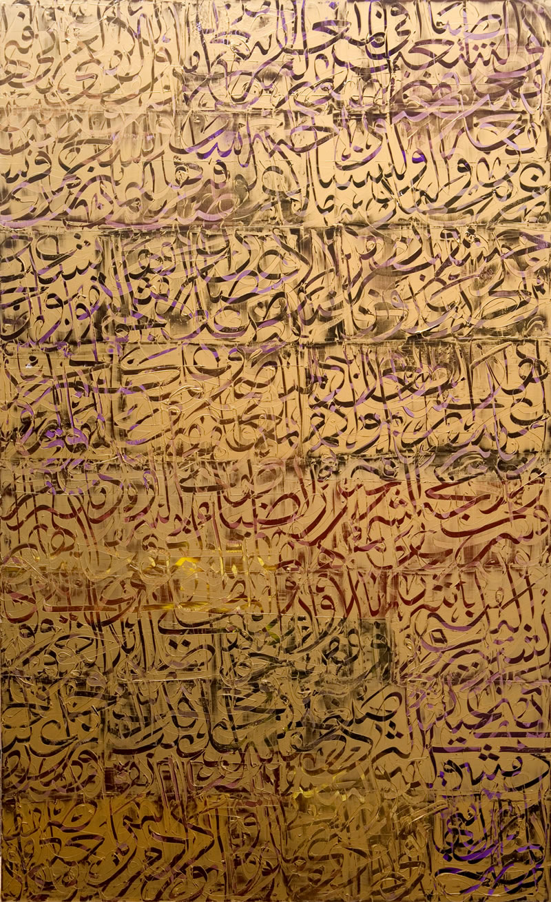
The calligraphic paintings of Ahmad Moualla take that genre to a whole different level. Arttattler has more images and a nice, concise bio that explains what's going on here.
For lots of images of different facets of his oeuvre, but no usefull English information, you can visit his Website.
.
The image is from Kashya Hildebrand.
.
.
.
.
.
The calligraphic paintings of Ahmad Moualla take that genre to a whole different level. Arttattler has more images and a nice, concise bio that explains what's going on here.
For lots of images of different facets of his oeuvre, but no usefull English information, you can visit his Website.
.
The image is from Kashya Hildebrand.
.
.
Monday, December 20, 2010
Beautiful Pwrainting
.
.
pwrainting - writing/painting
.
Eastern, abstract calligraphy took center stage last week at Sotheby's HUROUF: THE ART OF THE WORD Auction. It was a real pleasure for me to see some of my favorite artists get even more, well deserved exposure and attention. And it's always fun to see how much money goes for what. The only disappointment came from researching some unfamiliar names; a real dearth of images in some cases.
.
Image is from ArtMarketMonitor.
.
.
pwrainting - writing/painting
.
Eastern, abstract calligraphy took center stage last week at Sotheby's HUROUF: THE ART OF THE WORD Auction. It was a real pleasure for me to see some of my favorite artists get even more, well deserved exposure and attention. And it's always fun to see how much money goes for what. The only disappointment came from researching some unfamiliar names; a real dearth of images in some cases.
.
Image is from ArtMarketMonitor.
.
.
Sunday, November 14, 2010
Turning Japanese
.
.
..
I'm not referring to the pop-rock, song by The Vapors, but to the way Kaoru Mansour updates some of the visual icons we associate with Japanese-style art and makes them her own. You'll see what I mean when you visit her Website and explore the different facets of her oeuvre. Several paragraphs Here, fill in some of the blanks.
.
Image from LaArtcore.
.
.
Monday, August 09, 2010
Abstract Calligraphy w/ Eastern Accent
.
.
.
Lisa Travers work seems to simultaneously mimic eastern and western alphabets. The gestures are so lyrical, like eastern script and yet you swear you might be able to read them.
.
This image is from her Blog, where you'll find more images and information.
.
You'll especially want to read the Post, "Writing Without Meaning" Part II. Her Thesis so easily explains the things I've wanted to say about abstract calligraphy and writing.
.
.
.
Lisa Travers work seems to simultaneously mimic eastern and western alphabets. The gestures are so lyrical, like eastern script and yet you swear you might be able to read them.
.
This image is from her Blog, where you'll find more images and information.
.
You'll especially want to read the Post, "Writing Without Meaning" Part II. Her Thesis so easily explains the things I've wanted to say about abstract calligraphy and writing.
.
Saturday, July 31, 2010
Artistic Harbinger
.
.
Brion Gysin is getting a lot of attention this week because of his show at the New Museum. It's a better-than-ever time to research this man who had and continues to have so much influence on drawing, painting and collage. Near the end of the Review in the NYTimes, Martha says the Show presents him as a harbinger rather than an historical leader. And till you read this Review in Artnet (with lots of images), you'll begin to understand that positioning.
Five other images here and a good overview of the artist at ArtDaily. Even more story Here and then some more in depth text.
.
Top image is one of eight fascinating examples of his work at WhiteWall Magazine.
.
.
Brion Gysin is getting a lot of attention this week because of his show at the New Museum. It's a better-than-ever time to research this man who had and continues to have so much influence on drawing, painting and collage. Near the end of the Review in the NYTimes, Martha says the Show presents him as a harbinger rather than an historical leader. And till you read this Review in Artnet (with lots of images), you'll begin to understand that positioning.
Five other images here and a good overview of the artist at ArtDaily. Even more story Here and then some more in depth text.
.
Top image is one of eight fascinating examples of his work at WhiteWall Magazine.
.
Monday, June 28, 2010
Advanced Calligraphy
.
.
.I get such a kick out of creative calligraphers who try to "draw outside the lines" so-to-speak. Becoming good at that craft is all about rules and control, so it's fun to see them "let loose'
Would love to find more work (and English explanations) by Helga Ladurner. This image is from Here (German) where you'll find many more artists and examples of calligraphic creativity. Moving your mouse over the names shows the works.
.
Sunday, March 21, 2010
Calligraphic Landscapes
When you go to Gilman Contemporary to see work by Abby Grosvenor, you'll think you're in the wrong place because the first thing you see are her realistic, albeit blurry landscapes. But really, this is a good place to start, to appreciate her whole oeuvre. Personally, I'm more attracted to the pieces you'll find at Hallway Gallery, where three concise paragraphs explain what and why.
.
Image from Hallway Gallery.
.
Subscribe to:
Posts (Atom)