
.
After showing this to my nephew, Jonathan, he got all inspired and built himself a bunch of cardboard ramps and did his own "tricks". You can see the video of him on my Sept 30, 07 post. You'll see that right in the middle a wheel comes off, which pretty much ends it.
Here's the original, inspiring video.
.
( I think this is from Yourdailymedia.com )
Friday, November 30, 2007
Thursday, November 29, 2007
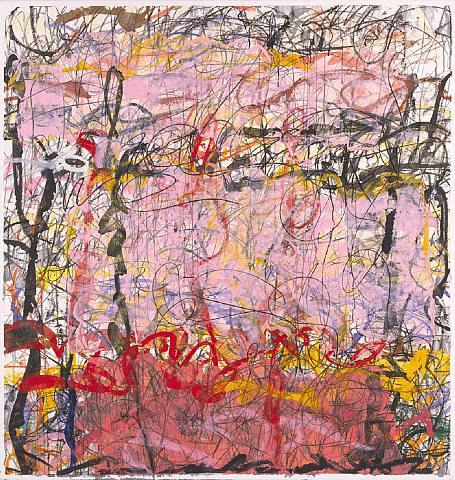
Thomas Ingmire
.
 It seems that whenever I come across an artist who just yanks my mind and makes me crave to see more of their work and study the methods of their oeuvre, that the trail runs cold too quick.
 It seems that whenever I come across an artist who just yanks my mind and makes me crave to see more of their work and study the methods of their oeuvre, that the trail runs cold too quick.
I came across some images of Thomas this afternoon and then this evening bumped into a few more. This image is from his Website where you'll find 11 images.. His site is nice enough, but I sure would like to see more and to learn about the story behind each one.
Just what is the thought process behind these fascinating works ?
When you go to his site, the index is spokes of a turning wheel. Double click on the menu item you want to see.
Here's another intriguing image from Friends of Calligraphy, but again not as much info as you'd like.
You also might want to go Here and snoop around.
Wednesday, November 28, 2007
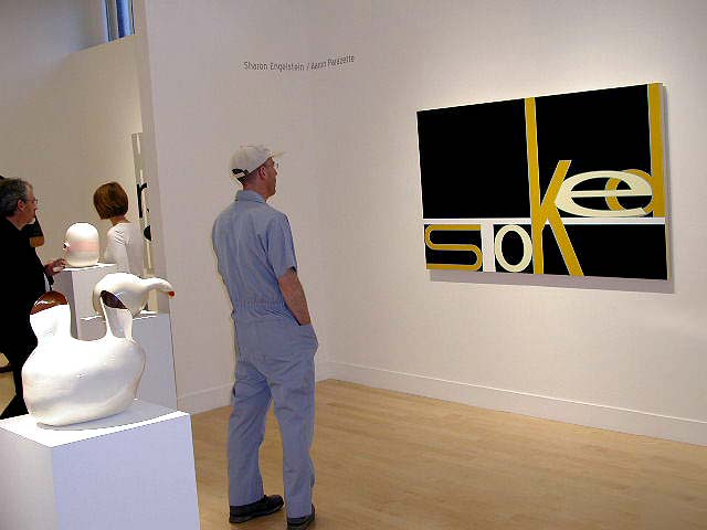
Aaron Parazette
.
 Here we have another artist who's interested in using words as the subject matter for his paintings. And he breaks them down into their smaller components, the letters, and allows us to just appreciate their existence by presenting them to us in a clean, light, bright colorful way.
Where would we be with out letters and words? But for a little while we can appreciate this visual song of praise for these humble, over used workhorses in our lives.
You can see more of his work by visiting his web site http://www.parazette.com/

Both images are from ArtBusiness.com. The top image is from one post and the bottom image from another post from their San Francisco Gallery Openings. I check their site daily to see what new shows have opened out there.
Please do visit their site. There's a trove of articles pertinent to you , the artist and much, much more. http://www.artbusiness.com/
He's currently showing at the Marlborough Chelsea until Dec. 8.
Check out the new paintings in the show HERE. SWEET !!
.
 Here we have another artist who's interested in using words as the subject matter for his paintings. And he breaks them down into their smaller components, the letters, and allows us to just appreciate their existence by presenting them to us in a clean, light, bright colorful way.
Where would we be with out letters and words? But for a little while we can appreciate this visual song of praise for these humble, over used workhorses in our lives.
You can see more of his work by visiting his web site http://www.parazette.com/
Both images are from ArtBusiness.com. The top image is from one post and the bottom image from another post from their San Francisco Gallery Openings. I check their site daily to see what new shows have opened out there.
Please do visit their site. There's a trove of articles pertinent to you , the artist and much, much more. http://www.artbusiness.com/
He's currently showing at the Marlborough Chelsea until Dec. 8.
Check out the new paintings in the show HERE. SWEET !!
.
Michael Goldberg
.
By now you ought to know how I feel about graffiti, calligraphy; all things writing-in-painting. Maybe I was one of those children who had the secret desire to color outside the lines or maybe just make lines and color that had no rhyme or reason. Either way, it's all about "gestural". How relaxing it is to look at these paintings and let your eyes follow the lines across the fields of color. There's no plot or politics. The mind always searches for identities, for clues and when the eyes see work like this I believe it relieves the mind.
James Kalm at YouTube has a new video titled "Cruising the Upper East Side" in which he visits 3 Galleries. In the middle segment of the tape he visits Knoedler & CO and the Michael Goldberg Exhibit.
both images are from Knoedler & Co's site at Artnet.
Monday, November 26, 2007
Stefan Annerel
.

Looks like tape? Just might be. Check him out . . . .


Looks like tape? Just might be. Check him out . . . .

Both images is from Galeries.NL
Lots of pics at Saatchi.
And thumbs with good enlargement at IBK.net
Saturday, November 24, 2007
Mira Schor
If you've visited before, you'll notice some changes. My favorite artist list is now a link list so that you can instantly check out an image by these artists that I admire. The last name on my list this evening was Mira Schor.

I'm still always amazed when I encounter images like this. Just the thought that words or a sentence could be the sole content of a painting really does it for me.
The background to that thought is that maybe you're doing a realistic piece and there's a particular thought that you want to get across. You would use visual props and hope that people "get it". A way harder situation is abstraction. You've got this important idea and yes you can pull it off with visual cues, but mostly you'll probably have to rely on the title to get your point across. Well, here, the title IS the painting; "We are all naturalized citizens of the simulacrum".
In my own personal experience, it was very hard to break away from realism and cubism. Those were the only styles I knew. Well, let me re say that. I would emulate my artistic heroes at the time; Picasso, DeKooning and a few others. As I got further into abstraction I tried to find my own voice. What did I have to say ? Well there's always room for another pretty picture in this world but it's even better when those paintings have meaning. And so that's how I came to write in my paintings. First I was including the title and date, then random thoughts . . . . Finally there's that wonderful freedom of just writing, just letting loose and letting the thoughts flow, whether it's words, lines, colors, shapes - doesn't really matter.
As for Miss Schor, it sure is hard finding images of her work. Got any ideas ?
image from upenn.edu
Yayoi Kusama

Tis the season to be dotty . . .
If you've never read the story of Yayoi Kusama and her dots, you are in for a very nice surprise. There are quite a few artists who have dabbled in pointillism for a while, either realistically or abstractly and it's usually an experiment to help them break their paintings down into basic elements; a tool to pick their artistic brains and come up with some solutions. But Yayoi really took it to another level and really didn't worry about it being called dots because they were, well, dots. At first some of her work comes off as cute or quirky. It's not until you've seen a lot of her work that you realize just how thoroughly she delved into so many possibilities, both in the exploration and the presentation. It really is quite stunning, as you see piece after piece and notice all the quality effort that went into each one. What an amazing mind. Sometimes I wonder if artists are just another category of scientists.
Definitely worth your while to search out some reading material on her and there's a wonderful amount of images of her work on the web.
A good start is this page at Artnet where they have 114 images, list of her galleries, reviews and magazine articles.
top image from Mocoloco
bottom image from Fadwebsite

Wednesday, November 21, 2007
Appreciating Art
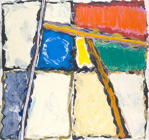
Remember back in high school you'd hear of a painting by a famous artist go for x amount of money(a lot) and your mind would calculate that it must be an important work of art. And higher prices meant more importance. In a way that's kinda sorta true. But imagine you have $20 million in a little "treat yourself to something nice" account or fund and imagine that you'll be buying some art with that money. If you did have that kind of money you'd probably live in a very nice home(mansion) and have important and influential friends. So yes, you could buy 1 very special painting or maybe several of whatever your little heart desires. But instead of buying that very expensive Elvis on velvet painting you've been craving you'd probably ask for advice and kinda hope that your painting is important or might even be an investment. And you'd certainly acknowledge your friends tastes. Are you catching my drift?
.JPG)
That's just 2 of countless sides to what we consider to be the art market and I for one am a sucker to read all about it hoping to further educate myself in the kinds of knowledge that are available. There is important art with good reasons why. There is also art that is a good investment. Imagine how ego-stroking it must be to own a new, important, contemporary art work that's a good investment and also in the art history books. The short of this is that money does make the market; but it doesn't necessarily mean that it's the best art.
I don't have millions nor do I currently have the kind of place where I could hang good paintings by other artists if I could afford them. But what's wonderful is to be able to appreciate art, or rather to let yourself appreciate art; to let something speak to you. Those are the wonderful kinds of moments in this life that we cherish. This is a favorite painting of mine that has to hang in a narrow hallway at the moment. A while back I took it to a friends gallery and it was such a treat to see it under spotlights from 20 or so feet away and be able to walk up to it and around it. In the proper setting it has a lot of depth and movement.
Titled; "A Rose Tulip/Conquest Of Titans" 1989
Friday, November 16, 2007
Dean Aldrich
 (that's me) aka Adeaner. But that's a whole 'nother story.
Back when Dale's garage was a studio and he was kind enough to share it. Lots of fond memories and lots of paintings. And the light was fantastic !
Thursday, November 15, 2007
Edward Evans


This is Edward Evans. You must check out his website. These paintings are acrylic on linen, 48" x 36".
Both images are from his site -
Mark Cameron Boyd

Visit the website of Mark Cameron Boyd and snoop around. You'll be surprised, informed and entertained.
Stimulate your intellect - visit his blog, Theory Now.
Wednesday, November 14, 2007
Lighthouses

For those of you who like lighthouses, check out "12 Stunning Lighthouses" , the Nov. 15th post at DeputyDog.
image from DeputyDog
Tuesday, November 13, 2007
Michael Goldberg
 A new record price was set for Michael Goldberg at auction last night at Christies. "Untitled" 1956 went for $205,000 (includes premium). image from Artnet.com. Click on the link to read the rest of their post about the auction.
 I've been a fan of Mr Goldberg ever since my first visual encounter back when I was Googling things like "cursive", "gestural" and "writing in their paintings". But this one really surprised me because it looks so DeKooningish. It's been a while, so I Googled him again and came across the painting below, titled "Still Life" 1955, oil, paper, masking tape on canvas.
The image is from Artnet,com where they have 36 images of his works that date from 1949 to 2007. You know that these are not by DeKooning and yet that's the artist who immediately comes to mind. I almost expect to see two eyes and a set of teeth as in the Woman paintings.
So thank you Artnet, it's a treat to see 36 works by this artist in one place and to see the different influences and changes.
Also, check out the Seraphin Gallery where they have 21 watercolors and an oil.
And go here to see 2 more of his paintings on flickr by Prizmetrix that are in a wonderful photo stream of other abstract artists. Very nice context of artists.
Monday, November 12, 2007


Saturday, November 10, 2007
 "Brownian Motion"
 "Woofey"
Kuno Gonschior

The All Mighty Dot
Well, maybe not a dot, technically, maybe a dollop or short brush stroke.
Anyway, paintings like this make me wonder if some of us artists are actually scientists; probing the universe at-large, looking for meaning instead of just facts.
Pointillism; wasn't that a science of sorts, breaking down a painting into it's smallest parts and yet keeping the whole?
It's always a bump in the road when you are with someone who has to ask "what is it?" when encountering an abstract or contemporary art work.
And what a pleasure to be with someone , on the other hand, who goes silent and studies the painting; open and willing to receive whatever message was intended by the artist.
In a way, aren't paintings like a message in a bottle cast upon the sea of life.
I believe that in the future they'll have equipment that'll be able to "read" paintings and decipher all kinds of information and meaning.
I am in awe of artist who can pursue a specific style/theme and make it their career, their oeuvre.
 both images are from Kuno Gonschior's website.
The Bending Road

There are two aspects to the title.
One thought is how things can twist and turn and what seems like a clear choice might turn into an adventure. The other thought is in relation to the old saying " may the road rise to meet you.
In a way this was a continuation of my dot (abstract pointillism) motif.
Sort of a magnification of the small dot unit to where you can see how unique each one is and yet they all make up a whole picture. Kinda like us and life.
There's a star character running towards us on the bridge. Is the man behind him just another person? Could it mean trouble ? Or maybe he's a guardian angel in disguise.
Another Newspaper Painting
.
. .
.
.
 .
.Just came across this image of "Uck Lucky", 2005. This is one of my "newspaper paintings" and it brought back fond memories. I took 2 full page ads and applied them to the canvas while the gesso was still moist; then colored them with pastels and colored pencils, fix with Krylon clear spray, apply matte medium, repeat, repeat . .
.
I've always enjoyed those little puzzles in the newspaper where you have two pictures and you're to find the 6 differences. As I look at this painting my eyes kept going back and forth looking for the differences.
.
.
Creighton Michael
 These images of "Impact 107" and "Impact 207" (respectively) are from the Robischon Gallery in Denver. Both are oil on panel, 36" x 60" x 2", and again it's nothing but the shear delight of the calligraphic movement.
Visit his web site creightonmichael.com

The Robischon Gallery has quite a lengthy and interesting stable of artists. Give them a visit.
Friday, November 09, 2007
Jacqueline Humphries

Context means so much; it puts things in perspective. It's wonderful to see images of paintings and then it's really great to see them in a context, like a home. Both images of a painting by Jacqueline Humphries are from newyorksocial dairies.com and this particular issue features the home of Brian McCarthy. (seated)
 Both images of a painting by Jacqueline Humphries are from newyorksocial dairies.com and this particular issue features the home of Brian McCarthy. (seated)
This is quite an interesting site. If you'd like to look inside the homes of some well-off New Yorkers, click on the link and then choose Archives and then choose NYSD House.
Thursday, November 08, 2007
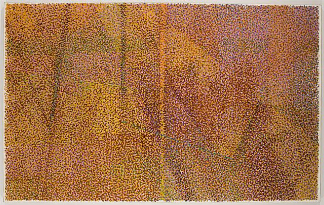
MY Abstract Pointillism

Top painting is "Looden", 2001
Second painting is "Big Round Rock State Park", 2003 which I especially enjoyed painting. So soothing and relaxing to paint each little dot. The process is rather intuitive and at a certain point you can "see the light at the end of the tunnel" and painting starts to feel like a visit with an old friend that must come to an end. (both images are thumbs, click for larger image)

As I said in the earlier post, you just don't hear about abstract pointillism and so it's hard to search for it. You mostly stumble across artists here and there. So I'm doing my part and collecting names. If you know of any others please contact me.
Abstract Pointillism
Andrew Forge
Most anyone, when asked about pointillism will immediately think of the time of the Impressionists. Hardly anyone even wonders if there was or is such a thing as abstract pointillism. Yes there is and it would be a wonderful thing if some Art Museum would do an informative show on it. Several years ago when I first started doing "research" on the net, this is the kind of art I was looking for and it's hard to find; mainly because they just don't describe it as abstract pointillism.
 will immediately think of the time of the Impressionists. Hardly anyone even wonders if there was or is such a thing as abstract pointillism. Yes there is and it would be a wonderful thing if some Art Museum would do an informative show on it. Several years ago when I first started doing "research" on the net, this is the kind of art I was looking for and it's hard to find; mainly because they just don't describe it as abstract pointillism.
This first image "September” (1995-1996). Oil on canvas. 60” x 48”, is from an informative and insightful article in the Brooklyn Rail .
The next two images; "October" 1993-1995, and "Heavy Hemlocks II", 2000 are from the Betty Cunningham Gallery as posted on Artnet.com - where you'll find additional images.
Please visit the Betty Cunningham Gallery where you can see 22 images of his work. My favorite is "Snow" and "Untitled". Check it out.

Monday, November 05, 2007
Anselm Reyle
.
where you'll find the interview with him. Among other things he talks about how and why he uses the PVC-foil in some works
Both of these images are from Artnet.com , where they have 14 examples of his


where you'll find the interview with him. Among other things he talks about how and why he uses the PVC-foil in some works
Both of these images are from Artnet.com
, where they have 14 examples of his work and auction results.
Collage & Calligraphy

Just thought I'd post a couple of my paintings.
On the right; "Floxxy", just a quick 1, 2, 3, badda - boom and it was done; nice and light. And it says - Hola, que tal. The T is the brim of her hat and her right cheek, the a is her left cheek and the L is her nose. And there's another T for good measure.
Below is "Evagween". Don't ask where the kitty came from or the square piece of collage. The word Evagween is squirted right out of the tube and has a nice calligraphic effect. To keep that thick paint from shriveling up you have to moisturize it more than a few times while it's drying by lightly brushing it with matte medium.
For quite a while I wondered why I named it Evagween until one day I passed a Chinese take away called Evergreen. Yes it was funny to picture them saying it that way. Isn't it funny how different we all are and all of our little foibles that amuse someone else.

Sunday, November 04, 2007
Abstract Pointillism Memories

Was going through some pics of my paintings and came across this and it brought back many fond memories of working on it.
Titled; "Daydream"
click on it for a larger view
Saturday, November 03, 2007
"Queen Tut & The Pouty Prince"
.
.
.

The long story is that I had two, full page ads saved from the NYTimes and once the canvas was gessoed, the above mentioned ads got affixed to it. The first one to get colored with Conti Pencils and pastel was the guy. Did pretty good if I do say so myself. Then started on the girl. Well I can only do realistic for so long . . . . . so I kinda let loose a little on her a little bit.
So I stood back and pondered, and yawned - bore ing. Then an idea struck, I started laughing and grabbed a tube of yellow paint and gave her a crown - right out of the tube. With more laughter I added his neck chain and heart and some more hearts, all straight from the tube. Till I got done doing the moustache and beard and glasses on her I was about doubled up laughing my heart out. That was really fun.
Exhibited it several times, but the reaction seemed to be some questions or negativity. People were trying to read too much into it. Well, our annual Palette Award Show was coming up at the Arnot Art Museum and I thought - if ever there was a place where maybe someone could appreciate this painting it would be there in the Museum, so I entered it in the Show. I got an Honorable mention and more than a few people had a good laugh. It's not the kind of thing that would ever sell in this 3-horse town, so after the show I just gave it away.
.
Thursday, November 01, 2007
Solar Eclipse

Deputy-Dog.com is back and has some astounding space pics.
This is a pic of what a solar eclipse looks like from space. The people in the shadow area are in darkness.
Please visit his site for other thought provoking pics.
image from Deputy-Dog.com
Subscribe to:
Posts (Atom)

