Saturday, December 31, 2011
Fluid Lines (with meaning)
.
Smash 137 - a fine contemporary Artist who's successfully transitioned his graffigraphy from the street to the gallery; deftly refocusing his abilities. This video from Graffuturism (and still images) gives a pretty good over view of the studio side of his oeuvre. Watching a b&w slideshow (complete with scintillating jazz) at Ruedione shows the strength of his compositions even without color.
I've had a "Smash File" for some time now; collecting links and wondering when I could properly present this artist's work. He is yet another example of how the many, familiar classic styles(schools) of modern and contemporary art are filtering through into street art today. His Diptych on concrete (below), with one panel empty is a familiar Andy Warhol trope. A short video of a Show at Speerstra has other examples that help make my point.
Justifiably proud of his work, his Website has 259 quality images. If that's too daunting for you, try skipping ahead by 3's or change the page number in your browser window. Besides traveling around the world, you'll soon notice that each piece (which is an iteration of his name) is titled and has it's own theme and color palette. The words "practice, practice, practice" come to mind and by-Jove, I think he's "got it". And yet, I much prefer his gallery pieces and hope this is just the beginning.
Thursday, October 20, 2011
A Bigger Hero
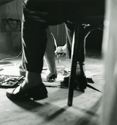
When Cy Twombly passed, I refrained from saying anything and just listened and looked as many, more-informed people expounded on his career and works. Last week I stumbled across a Blog called FOR PILAR that had photos of Cy Twombly at his home in Rome. So I thought I'd pass them along. Seeing his work in this context makes so much sense.
It was several years ago, that I discovered his work and was overwhelmed with feelings of admiration, awe, surprise, excitement, inspiration; the list goes on and I'm sure you get the picture. At the same time, I thought, "what gaul !"; to paint exactly as you please. This man became my hero.
Friday, October 14, 2011
Inspiration
One of my all-time favorite songs.
Instead of jogging, I used to go down to the track, find a spot, don my headphones, close my eyes and dance my butt off and I remember this song well.
And in this video, she's not a kid anymore - but it's her song and she sure owns it !
If you miss hearing the original sweet guitar solo after the rapping part, go here.
Monday, October 04, 2010
Graffiti Styled Calligraphy
.
.
.
This video of Raum constructing a painting using words, more than aptly depicts a new category called graffigraphy where the emphasis is on the lettering. For such a short vid, it brings to mind different art movements and main line artists past and present. I like the fact that his execution is so straight-up and straight forward; akin to a construction worker quickly finishing a project.
Be sure to notice the other artwork in the background (starting at 19seconds).
.
Unfortunately I could not find anything else about him on the Internet. If you have any leads, please let me know.
.
.
Thursday, February 18, 2010
Impasto People As Pointillism
.
.
The image is from m.publico.es and the video is from his Website.
.
Originally spotted this artist on Avery McCarthy's Blog.
Saturday, January 23, 2010
Previous Dots
There's a quip about "that nut didn't fall far from THAT tree" - meaning that they have characteristics much like their father.
Ross Bleckner is one of those artistic "trees"; a father of many of the styles you see today. Whether you're familiar with his work or not, you'll enjoy visiting his Website to revel in all the beautiful directions that he took his oeuvre. You'll also want to Google Image him to more fully appreciate an outstanding and prodigious career.
.
Top image from his Website.
Bottom image from his page at the Parrish Art Museum.
To make my point;
After looking at Damien Hirst's Blue Paintings at the Wallace Collection, go back to Bleckner's Website and look at the some of the paintings in the bottom three rows (which predate Hirst by 20 years) . . . .
.
Tuesday, November 10, 2009
Another Art Hero
.
Galerie Ernst Hilger has a 3 paragraph Bio that explains his oeuvre. As you look at the 19 images of his work, notice the dates and you'll more fully appreciate the influences in his career.
Galerie Gergersdorfer has 6 images Here, and 7 more Here.
You'll find another 8 images at the Judith Walker Galerie.
And for 4 totally huge enlargements of his work, Galerie Seidler has 3 0n This page and 1 at the bottom of This page
The top image is from jmcfaber.
The painting, from Galerie Gergersdorfer.
.
Sunday, August 09, 2009
Overpainting
.
The work of Arnulf Rainer is at the very least astonishing. Many more words will come to mind as you study his oeuvre, but you might want to do a bit of reading before you come to a final judgment. What amazed me most was his overwhelming, careening drive to make nontraditional art. That zeal took him down some very unusual paths. You'll come to understand the title of this Post as you see and read about his work. But the irony, for me, is that the word overpainting also becomes an adverb for his actions (as in someone going too far).
Before you go to the image links, please read this one paragraph from ArtInfo. It helps set the stage for all that follows.
I don't remember hearing the term overpainting before and it's the perfect description for most of his work. The more you study his oeuvre, the more newer, younger artists come to mind and again we're reminded of how artists ruminate and regurgitate what's been done before. It's almost like the retelling of a joke; it may change in the telling, but the punchline remains the same. Here we have the original in all it's flawed, inglorious rawness.
And with that I'll leave you to your own discoveries and opinions.
Artnet has 63 images and you'll find 31 images at madelcambre.
If you're still interested after seeing those, you might want to see the 37 images at oseculoprodigioso. And I must warn you that the music that starts to play will put you in a mood like no other and add a tremendous amount of psychological depth to what you're viewing.
Here's a concise timeline of his career.
This Biography and a very readable Review by the NY Times, round out the picture.
An enjoyable, candid Review of the Exhibit at the Arnul Rainer Museum in Chelsea, by Lilly Wei in Art In America.
You'll find a wider range of image results at Bing.
There's much to think about here and come September 27 of this year they'll be opening the Arnulf Rainer Museum, dedicated to his work, in Baden, Austria.
Top image from PBase.
.
Saturday, November 29, 2008
Philip Maltman
One could be forgiven for presuming, at first glance, that this was the work of Twombly. But in a minute one realizes that this is neither Twombly nor a look-a-like effort. Philip Maltman is his own man and in complete control of his very honest oeuvre. These beautiful gestures and colors are his alone. I was hard pressed to find one or two images to post that would best represent him. His oeuvre is definitely not formulaic and at times wide ranging. Upon finding Mr Maltman's work on the Web, I searched everywhere, trying to find more examples and information and when finally I was able to contact him, he generously responded. The question I pressed him with was - Just exactly how do you go about doing what you do ? He's well represented on the Web and I had already read several of his "Artist Statements", but I wanted to know what made him pick up a brush and go about painting the way he does in layman's terms.
Here was his straight forward response:
"Philip Maltman - Notes on Painting October 2008
It always begins with looking. A beach, a landscape, a garden, a table littered with natural objects, things which I regularly photograph. I print images and draw selected sections. These are pencil and watercolour sketches which are like a “loosening up” or training session. I do not deliberately use these as preliminary sketches. I will occasionally exhibit them but more often than not they remain in sketchbooks to be scanned from time to time as “aides memoire”.
In the studio I will look at the photographic images say, a group of stones, shells, seaweed with sunlight reflecting off interspersed pools of seawater.
I will choose a colour for the ground anything from white through greys to pinks and purples to black. This ground can be dependent on the colour of sand in the original, or maybe sampled from the original digital photograph with Photoshop which can throw up interesting surprises.
Occasionally as in a recent landscape based picture, the whole ground was painted pink because a couple of patches of light in a distant field were pink. Preparing grounds, which are always one colour, is an ongoing activity. Experiments in colour are also made without reference to source material.
Back to the beach then, I will paint the stones, shells, seaweed, and light in broad strokes, not descriptive detail, using oil paint. While it is still wet I will very quickly work into each area of paint with my fingers aiming to destroy the figurative element of the image and create an abstract “equivalent”. This has to work first time so there is a bit of the Zen Calligrapher’s practice in psyching oneself up ready to pounce. But of course if it doesn’t work I will modify with washes of white spirit, sometimes bitumen is introduced with some diluted oil to colour it. Usually I allow the liquid paint to run vertically to further destroy illusions of pictorial space.
I am aiming at a flat surface with coloured marks which might evoke a feeling of the original image although not in a figurative sense.
Next, using amongst other drawing materials, pencil, oil pastel and wax crayon I will improvise a sort of skating across the surface of the work highlighting, circling, scribbling and generally drawing into and around the paint. Words, letters, and numbers are always a temptation at this stage but I find it difficult to compose and position areas of text.
I will often acquire maps/charts of the areas that I am working on so numbers and letters can be “legitimately” incorporated. I feel that I need an overpowering non-sentimental reason to introduce what I feel is essentially an entirely separate art form (writing) and the reason is rarely there.
Single letters are more abstract, signs and symbols which usually refer to objects from the original image are used along with the letters and numbers from the charts.
These devices are used to make the surface of the painting reflect an existence which has innumerable layers of invisible waves, rays, signals, gases and creatures; imperceptible causes and effects; constant changes in light, sound, air pressure, weather - Life!
Everything is buzzing with atomic vibration therefore painting can never be still. That said, I can be persuaded by the work in progress to slow down and add/subtract marks, washes words and colour.
I participate with paint and I love its movement. I feel a strong relationship with all my materials and whilst they do not always co-operate they definitely participate like a group of dancers (Contemporary Ballet).
When a painting is finished or stops it is as if the dancers are exhausted, what’s done is done and can never be repeated exactly. But we will, of course, try to do it all again tomorrow! "
He may be on the other side of the planet, but it feels like a discussion over tea. I was already a fan, but after reading this I saw his work in a better light; it made more sense and had more depth, more meaning.
You'll want to visit all the links below because all the works are different and you can see just how he leans in different directions.
Escape Bar & Art (scroll to the bottom of page)
And here's a real treasure trove; Maybole.org - 10, Paintings 1, Paintings 2 & Paintings 3
Friday, November 28, 2008
Contemporary Post Modern Abstract
So it was a real treat to come across the slide show of his current exhibit titled "White Earth" at Almine Rech Gallery.
I started this post thinking I could explain or at least introduce his work to you. But in lining up some links and seeing his expanded oeuvre, I'll let the work speak for itself.
He's represented by Gagosian Gallery with 16 great images and was also in the group show; Yayoi Kusama, Steven Perrino, Anselm Reyle (wow, 3 of my favorites) in Mar/April 08. And he was part of another fantastic group show in Sept/Oct 07; Grotjahn, Hirst, Parrino, Reyle, Richter. (Be sure to click on the View Work on the LEFT side of the page.)
Here's an interview with Reyle and here's an article about his work going to six figures.
The image is from and article about Reyle in ARKEN.
You'll want to visit their site and read their articles on other artists.
Tuesday, September 23, 2008
Indecipherable
I've had several discussions with other artists about freedom of speech as one of the components or facets of language based painting. And although it sounds a bit nutty, I feel that the ultimate level of free speech comes when no one can understand what you are saying. Suppose there is something quite personal that you wish you could get out, but actually it's nobodies business. Well, there's a wonderful release in being able to express yourself without the fear of recrimination, by just simply making those written thoughts unreadable.
.
This would be a good time to revisit the work of Alexander Echo. And by the way, he doesn't subscribe to this train of thought at all. But seeing his work again, reminded me of how the written word, so powerful and meaningful, can also be presented in ways where only the beauty of the designs of the letters, or the gestures themselves become the focus and there is nothing for us to do but to appreciate the act and the marks of writing.
I'll let you do your own homework on Alexander Echo; he's got quite an interesting oeuvre and his Web Site will answer your questions about his fascinating work.
And he's also one of my Art Heroes.
Both images are from his web site.
.
Monday, May 12, 2008
Ingo Meller
But I digress.
Ingo's oeuvre is totally about 3 simple things; the canvas (linen), paint straight from the tube, and simple brush strokes. His unstretched and unframed canvases are cut about the size of a pillowcase and primed with transparent acrylic medium. (And eventually Velcroed to the walls.) He then loads his brush, which is about a fifth as wide as the canvas, with dollops of oil paint straight from the tube and proceeds to make his simple strokes, which are usually spare. The names of the paints become the titles of the paintings.
Personally, I've always had this "thing" for the names of paint. I'd much prefer to pick a paint (to buy or apply) solely on the merits of it's name and how it sounded or affected my emotions. There's many a painting where each of the colors used, were chosen because of the description or name on the tube. So for this particular aspect of his oeuvre, he's my hero. Actually I admire his whole train of thought; the way he's completely separated and respected the three basic components of painting. It's like he's giving equal respect to these elements by keeping it all to a very factual minimum.
.
The two images are from Galerie Nordenhake, where you'll find more images and info.
.
For seven other images of his work, go to Cheim & Read.
.
And for a lovely automatic slide show of a few of his works and a shot of his studio with the paints all lined up, go here.
Saturday, March 29, 2008
Kuno Gonschior
Click thumbs for largr image.
There are many artists who fit into this category, but it just so happens that I was looking at Kuno Gonschior's work today and was struck by the absolute consistency of his work through the years.
The painting on the left "Untitled", seems to be less about pointillism than it is about attaching bits of paint to the canvas. Done in 1959/60, it's the earliest example of his work on his website, which is all in German. This is about as straight forward as you can get; attach bits of paint (just one color, using a palette knife, probably) to what looks like raw linen. But it's well done and it works. Fast forward to 2006 and the painting on your right, titled "Landscape (Magenta)". He's absolutely made a lot of progress; the colors are enough to make you swoon. But he's still completely true to that first concept of attaching paint to canvas and gives us so much more than just 2 dimensions.
Some of us need to try this and that, searching for answers to questions we don't even know. It's just a real pleasure to see someone who found an answer and so eloquently reiterated it through the years.
Both images are from from his website Here's the link to his "Works" page.
You'll absolutely want to go here and take the beautiful virtual tour of his show at Galerie Frank Schlag & CIE.
Then go here to see another great virtual tour of his exhibit at Museum für Konkrete Kunst.
And you'll want to see the powerful new paintings (some from 2007) from his show that just ended March 8th at the Stux Gallery, New York.
Saturday, December 29, 2007
Hans Staudacher
Don't ask me why, but soon after finding works by Hans Staudacher I found myself rocking with laughter and deciding that he was the Picasso of abstract calligraphy. The image above, really does it for me. The first impression is that the painting is translucent - until you study it. Quite an effect; this image is iconic and memorable.
Brash, Bold, Gusto, Fervor are but a few adjectives that come to mind when viewing his work. This 1991 - oil and collage on canvas is at Artnet, along with 5 other works. It's very interesting, that they list 565 auction results for him, (that you can view if you're a subscriber).
You can also view 9 works here and 5 works here.
Hans describes his work thusly; quote "My painting is handwriting, color, dance, play, sign, inspiration, chance, speaking, word, movement, speed, superabundance. It is unbearable, impossible to understand for many, mischievous." unquote(H.Staudacher) Quote is from Lentos Museum of Modern Art, Linz.