Showcasing abstract paintings with writing or dots. Abstract calligraphy, postmodern pointillism, marks, gestures & scribbles, text and language based works.
The Artists you're looking for, are listed in the categories below.
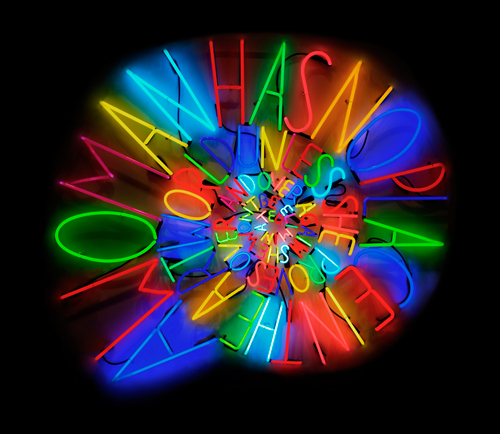
Deborah Kass likes to be seen and heard; through her art work. She's not shouting, but she does get your attention and many of the paintings are constructed with words or phrases.
This image is from her Website, where you'll find a good sampling of her work. But please go HERE and watch the video, studio visit. It's entertaining and you'll come to understand the art-historical influences that precipitate her different series.
A lot , correction, an awful lot has been said about Damien Hirst's Global Exhibition of Spot Paintings which made me decide to refrain from commenting. It seemed like one more review and we'd all blow up from information/opinion overload.
Fortunately for mankind, here is the man himself, sanely explaining what, hows come and why. Very nice.
Damien Hirst: On the Spotfrom Matt Black on Nowness.com. .
- If you're seeing a white screen where the vidoe should be, just click on the first link (Damien Hirst . . ) to access the video.
AND, you'll find an eighteen-plus, minute video of an interview with Charlie Rose HERE.
By now, you're quite aware that this Blog is about pointillism and paintings with dots. To my knowledge, Hirst is the only artist who calls his marks, spots. In my opinion spots are bigger than dots, so the thought occurred that maybe we should have a new category called Spot Paintings into which I would place artists who make larger dots - which qualify as spots. For example: Thomas Downing.
This video is quite a dramatic introduction to the amazing work of EVOL. He works hard at the realism and juxtaposes it with the casualness of cardboard, which magically adds even more authenticity to the work.
Hungry for more images?
Wilde Gallery has a pdf with an interview and many images.
The concept by artist Yayoi Kusama was simple; provide a stark, white space and turn kids loose with colored stickers. Queensland Art Gallery of Modern Art supplied the average-home type space and the dots: the results are delightful. What better way to introduce the young to modern pointillism, than by the master herself.
When is a painting not a painting ? In the case of Sarah Steinwachs, you'll forget that question as you're swept up in her luminous and sometimes glorious hand-cut paper and mixed media works. Please enlarge this image, from her Website and you'll understand completely. Then visit her Site for more palette-cleansing works.
Smash 137 - a fine contemporary Artist who's successfully transitioned his graffigraphy from the street to the gallery; deftly refocusing his abilities. This video from Graffuturism(and still images) gives a pretty good over view of the studio side of his oeuvre. Watching a b&w slideshow (complete with scintillating jazz) at Ruedione shows the strength of his compositions even without color.
I've had a "Smash File" for some time now; collecting links and wondering when I could properly present this artist's work. He is yet another example of how the many, familiar classic styles(schools) of modern and contemporary art are filtering through into street art today. His Diptych on concrete (below), with one panel empty is a familiar Andy Warhol trope. A short video of a Show at Speerstra has other examples that help make my point.
Justifiably proud of his work, his Website has 259 quality images. If that's too daunting for you, try skipping ahead by 3's or change the page number in your browser window. Besides traveling around the world, you'll soon notice that each piece (which is an iteration of his name) is titled and has it's own theme and color palette. The words "practice, practice, practice" come to mind and by-Jove, I think he's "got it". And yet, I much prefer his gallery pieces and hope this is just the beginning.
If you'll enlarge and study this painting ('Dream of Pollock' (for Kirk Varnedoe), 2007) by Martin Kline for just a minute, you'll get past the ho-hum feeling that he's emulating Pollock: he's not. The center area of this work is just a clue to the magnificent and colorful/textural paintings you'll find on his WEBSITE. (3 pages of paintings) I especially appreciate how he uses the color and grain of the panel supports to compliment his handiwork. It's unfortunate that the site's images don't enlarge, so I'm showing you this picture from a set of nineteen from his Show at Gowen Contemporary Gallery which includes installation shots and examples of other facets of his oeuvre.


