Monday, December 31, 2007

Thoughtful Endings / Hopeful Beginnings

.
There's bright and glittery, and then there's Jack Reilly. I've been saving this site in a folder now for several months, wondering, when would be a good time to use it. So on this, the very last night of 2007 I thought it would be a good time to see something that glows.


This guy is not "normal" and you'll be glad he's not. It's always good to be challenged and perceive the ruts we've gotten ourselves into. Be creative as we might, there's always someone else with a totally different take on things and it might not necessarily be something specific that we can use in our own oeuvre, but it certainly helps to shake things up a bit in the old noggin and notice the little bit of tiredness that's crept into our work.

Visit Jack Reilly's website, you'll be surprised by his paint application and shaped canvases.


Thank you for visiting my blog. Any comments or views you might want to express are welcome.I do hope that there are good memories and feelings in your heart of this past year and that the New Year will be a pleasure for you.

images from Jackreilly.com


Sunday, December 30, 2007

Scientific, Calligraphy

.

It just keeps getting better and better.

All those years of blindly searching for artists and work like we've seen here. What would you type into a search engine to find work like this ? But somehow the dam broke and there seems to be a small flood of the kind of art that I like, coming my way.

This image, "Untitled Color" 1998, by the artist LEÓN FERRARI is from his Exhibition at Cecilia De Torres.com. Their site has 5 installation shots and 32 images of his work. (Which is outrageously exceptional that a Gallery would post so many images of an exhibit - Thank You)They have an exhibition of his work at their Gallery on 140 Greene St. NY, NY, now thru Feb, 2008.

As you read the accompanying text, you'll see that much of the work was approached in a scientific manner.

Saturday, December 29, 2007

Hans Staudacher

.


Don't ask me why, but soon after finding works by Hans Staudacher I found myself rocking with laughter and deciding that he was the Picasso of abstract calligraphy. The image above, really does it for me. The first impression is that the painting is translucent - until you study it. Quite an effect; this image is iconic and memorable.


Brash, Bold, Gusto, Fervor are but a few adjectives that come to mind when viewing his work. This 1991 - oil and collage on canvas is at Artnet, along with 5 other works. It's very interesting, that they list 565 auction results for him, (that you can view if you're a subscriber).
You can also view 9 works here and 5 works here.

There are plenty of images out there for you on Google Images and Clusty Images. (Yahoo; not so much.)

Hans describes his work thusly; quote "My painting is handwriting, color, dance, play, sign, inspiration, chance, speaking, word, movement, speed, superabundance. It is unbearable, impossible to understand for many, mischievous." unquote(H.Staudacher) Quote is from Lentos Museum of Modern Art, Linz.

Friday, December 28, 2007

Achille Perilli

.


It was very interesting watching this particular Italian's oeuvre come into being and then mature and change and morph and become quite modern. You can read 2, one page biographies here and here. Born in 1945 in Rome, he began to attend courses in literature and art history at the Rome university and graduated under Lionello Venturi, with a thesis on Giorgio De Chirico’s metaphysical paintings. At some point in these biographies, the Russian Avant-garde style of Structuralism and Constructivism are mentioned and bears noting. And then you have this quote from Caroun.com which makes you realize there's been a whole lot of other discussion about his work that we're not privy to. quote"Achille looks to the tradition of abstract modern art, ending up questioning or even rejecting it with his "geometric non-shapes" and his theory of the "geometrically incongruous". Color parts of his paintings refer to the fundamental idea of the removal of the represented."unquote. I didn't go to college, so I won't try to expound on things that are not my forte. What we see in his work, though, strengthens the point I've been trying to make about the importance and pervasiveness of calligraphy in art everywhere.


Take the time to follow some of these links and you can see how he progresses from a simple calligraphic idea to something quite bright, modern and simply complex.


This image, "Il Palazzo delle Delizie" 1982, is from openart.it


You'll find 11 images Galleria Verrengia where


Left, "Composition In Black and Sepia" 1957,
image from baruch.cuny.edu


The middle, Right image "La nota libertina" 1964, is from Beni Culturali, they have 4 images.

Notice the dates on these paintings. In the 1957 composition there's just some simple gestural lines and drips going on. In the scratchy looking 1960 piece these lines have jelled into what could be mistaken for writing. Then in "La Nota Libertina" from 1964 he absolutely IS writing and creating positive and negative spaces by using the closed areas of the cursive letters. Something so simple as writing a few words and then filling in the closed spaces of the f's and y's etc, now generates a composition. The bright modern works from 1982 and 1992 make it seem that he's abandoned all this for geometry. I don't think so. Look closely at the last work here from 2003(or 05). Couldn't this also be a word or phrase that's morphed into a simple construction of color ? How sweet.
You'll find 19 works here, five from 1956 and the rest from '92 to '04.

Top image, "Amour - Belle oisiau" 1992 one of 4 images from Artantide.

.

Cy Twombly

.

Seeing the work by all the Italian Artists that I've posted about brings so much more sense to the work of Cy Twombly.

He fits in, they fit into an artistic moment in time. It's hard to believe that there was a time when abstract art was first "invented". That up to that point there had only been realism and designs. How exciting it must have been for all of them to "join hands" and step off that cliff together.

Image from New York Magazine.

.

More Italians

.
I had every intention of doing my last post on the Italians, this morning. But fortunately I did one last check on the Internet and found yet more material on Achille Perilli and even a short biography in English. And as seems the case lately, I came across even more artists who seemed to share in this whole expanded train of thought concerning calligraphy.


The image above, titled "FELICULA" is by Enrico Bertelli, from barganews. The writing in the painting reminds me so much of a Cy Twombly work. Enrico was born in 1959, the same year Cy Twombly permanently moved to Rome. In studying the Italian artists who were born in the early 20's, as was Cy, I wonder what, if any interaction they had. What little Art History we know is just the highlights and it's enlightening to encounter all these additional artists who worked in the same vein.

Take a quick trip to Italy and visit barga news.com.

You'll want to check out "barga artists", on the left side of the blog and check out their "categories" (on the right side).

Thursday, December 27, 2007

Studio Envy

.
.

There is absolutely nothing that can compare to having a studio - any studio. But what a wonderful thing it must be to have a well lit and roomy area in which to create and then step WAY back to ponder the results.

image from http://www.garanjoud.com/
.

Abstracted Divisionism

.
The dictionary responses for pointillism are quite simple; separating the applied colors into separate dots or strokes and letting the eye mix the colors. But back at that point in time we hadn't made it to Abstraction yet, so the paintings were of realistic, recognizable scenes. Some would say that Division ism and pointillism are one and the same, but I think there is another side to all of this besides the visual mixing of the colors and recognizing of shapes. As we came into abstraction and then the modern era, the reasons for individually separating dots or brush strokes of color changed radically; there were new options, new paths to pursue. In the painting above, "Autumn Leaves Fluttering In The Breeze" 1973, the colors don't visually mix to present a realistic picture, rather they undulate and glow; this is a mental, emotionally charged, romantic picture; a scene from our mind.


As I look at Alma Thomas' paintings it's hard to know what to say about them. Obviously she was following a course, experimenting, searching. But from what I've read, no light was shed on the actual mental process that brought about these works; the stimulation, the where for, or the why. There is a progression though, from purely abstract painting, into color field and then the mosaic-like "pats" of color on an abstract or single tone ground; all the while experimenting with both the colors and the shape compositions. But if you'll notice the dates on these works you'll see that she jumps around a bit here and there. So I'll let you do your own research and come to your own conclusions. One thing is perfectly clear - she achieved an undulating joy in some of her paintings.

The most comprehensive site is the Smithsonian American Art Museum with 29 images of her works and a short biography. Additional images HERE and here. (At the last site, go to pages 4, 5 and 6 and you'll see some lovely abstracts of hers from the 60's.)

Both images are from the Smithsonian American Art Museum.
.

Sunday, December 23, 2007

More Creativity

.


This is Max King Cap and the images are from atspacegallery.


Friday, December 21, 2007

Jon Thompson


Although it's not a very common oeuvre, the artists who do pursue it, seem to do so with relish, adding their own "two cents". The premise of pointillism has always been viable and pertinent, and each new generation finds new angles and new formulas for the equation.
The abstract pointillist image on the right, from the Anthony Reynolds Gallery, really caught my eye. What simplicity; dots and two colors. The choice of those colors actually make it an make it Op Art piece.

You'll find 16 images of the artist's work at the Anthony Reynolds Gallery (click on Artists and then choose Jon Thompson). The first 3 images are the most recent (2007, and not pointillism) and reminded me of some of the geometric work by the Italian artists of roughly the same age. A clue to that might be that he was born in 1936 and attended British Schools in Rome in 1960 - 1962. At the end of the slide show are B&W photographs that are anything BUT what is in your mind right now. Those are from '97 & '98 and provoke quite a few questions, none of which are answered on that site. His biography only lists a date chronology and a few Selected Publications. So there's quite a jump in the mentality here; black and white photography, pointillism and then geometrical line work. It'd be interesting to know what he's looking for or what he's trying to say through these very different oeuvres.


Of the 16 works you can view on his page, 7 of them are the dot paintings done in 2004 and 2005 and the color choices are new and fresh. In two of those paintings there are strange objects that have invaded the picture plain and have so cordially taken their proper places within the format. The paintings now become a sly joke and it makes us reconsider what pointillism is, anyway. The images only enlarge so far, but I swear I see bits of food here.
Yes, this is quite postmodern and a far cry from the pointillism of yore.


Oughtomanic

.


Separate the one word title into the 3 words it's made of and think about it and then you'll understand why a couple just loved this and laughed and gave it to their daughter in college.

Canary Opera


.


This certainly is no masterpiece, but it is good to look at it now and then and see all the wonderful possibilities. Isn't it amazing how with just a little color and a few lines our mind takes the ball and runs with it; make a story ? And of course the title has everything to do with that. Titles are way important. They guide the mind towards a conclusion.

Adeaner

.


Trial By Error / Error by Trail


.

Thursday, December 20, 2007

Script as Content

.
I was completely bowled over upon finding this work by Francois Bonjour.
Dynamic and intriguing, it's composed of writing and mark-making with red swipes in the center that make it sing. This artist has a fascinating and compelling oeuvre.


Navigation at his Website is a bit tricky, but well worth it. A click on Galleria brings up the chronological gallery icons. Once you open a Gallery move your mouse around on the left side of the page to reveal the clickable titles of the works for that year.

Additional images can be found at lacolomba and Here.

MaCelleria dArte has fascinating pics from his vernissage..

Image from lacolomba.
.

Agostino Ferrari


We're nearing the end of our foray into Italian artists who were born in the first half of the 20th century and who incorporated some form of calligraphic gestures into their paintings. By far the best biography yet, on any of these guys (that's in English), makes Agostino sound very much like a scientist working towards a specific goal. If you thought that I might have been stretching things by describing the other artists' works as calligraphic, I think you'll have to totally agree that this man's work is completely, all about the act of writing (or calligraphy) without any props or apologies.


Caldarelli. it is a wonderful site for seeing how his work developed through the years. In the early 60's there's the slightest glimmer of the writing aspect, but then he goes into geometric and minimal and, well, you need to see for yourself. It would be another 20 years until he discovers the oeuvre that would take him into this next century. Go to the site, click on the 1st painting and to advance, click prosegui. To go backwards, click torna. The whole set takes you up through 1998. Clicking on any painting will take you back to the picture index, where you originated.

Go HERE and you can see 7 other wonderful images that help to give a fuller picture.

And then artantide.com, the site that started all this. The red image (2006) at top is from their site and you'll enjoy the 11 images that range from '64 to '93. Read his biography HERE.

Lacolomba.ch has 6 images from the late '90's and then 2 very special, strange, beautiful images (must be way older) that have just the smallest evidence, it seems, of the thoughts about writing that would later bloom and flourish.

If you'll click on the image to your left (again, from artantide) for a larger view, you'll see that the background is completely covered with a gesture that could be a cursive e, l or maybe it's and on going u. What ever it is, this painting is totally all about script and writing, as verb and noun.

Please treat yourself to visiting these sites. There seems to be a very clear focus on what his oeuvre was once he caught his stride.


Today graffiti artists are all the rage. Galleries are spotlighting their work and blogs are singing their praises. This is just wonderful to look back into recent Art History and see how things developed and who the artists were who set us on our way. We always take the art we have for granted. We tend to forget that there used to be tighter parameters.

.
And he's still painting. What he discovered for himself and us is still quite viable and fresh.

A site with 37 images of his work is centrosteccata.

.

Piero Ruggeri

.
.


Both top images are from galeriebeukers.nl, and although they have 10 images that enlarge, there's absolutely no text or imformation.

Artantide.com has the briefest of biographies and 2 wonderful images; 1 from 1972 and the other from 2003.

Piero seems to have stayed pretty true to his oeuvre through the years. Using a combination of abstractions and abstracted calligraphical gestures, even his monochromes retain the same flavor, the same gusto and bravado. In some paintings he generously slathers the paint on and then continues to mark it and make it thoroughly his own. eartegalllery.com has two great, early images from 1930 that you'll want to check out and you'll see what I mean about staying true.

If you'd like to see more of his monochromes, go to Galerieprotee where they have six images, all from 2005 and 2006. There's a whole pile of wild abstracts by other artists on this site. You'll need to scroll down almost to the bottom to see the 6 images .
.

"Sponge, & The Neon Solo"

.


.

Wednesday, December 19, 2007

Be Amazed & Entertained

this is definately art, too.


and turn up the music - great song !

. . . and the very last thing you see is a wonderful and funny way to end.

Mario Deluigi

.
Born in 1901, he's the oldest of the artists we've been discussing so far. He joined the cubist movement with relish, went into abstracts and then started doing what he called grattages in the early '50s; of which these images are examples. He continued in this oeuvre until his death in 1978 in Venice. The image on the right is from his site, mariodeluigi.it where you can read the biography and see the images of paintings from different periods in his development.
.
His biography doesn't elaborate much on this last technique but they do offer this, - quote " Deluigi continued his deliberation on connections between space, light and colour that would become a dominant theme in his work - where light is conceived as a structural device not simply painted but created within the canvas by means of strokes cut into the surface. This technique of ‘grattage’, which already appeared well - defined at the Biennale di Venice of 1954 in work entitled Motivi sui Vuoti (Motifs on Voids), characterises the whole of his subsequent output." unquote.
There are 22 images of the grattages on his site and although there were a few other images elsewhere, I didn't list the sites because the pics were so bad. Mario's work needs special photographic attention to properly record what is there. It's very easy for the reflective light to hide the details. Even of those 22 images, not all of them "come acrost". But yes, do visit his site.
As for that quote in the previous Mark Tobey Post, about Mario and Tancredi copying Tobey - I guess we'll never know. What with all the sites being in Italian, maybe they know. What we do know for sure is that for several decades there were quite a few artists pursuing this oeuvre of abstract, calligraphic mark making, and we can see the influence they had on each other's work.

.

Left image is from fondazionebrunozevi.it

Bottom image from centrosteccata.com
.

Tuesday, December 18, 2007

Mark Tobey

.


Mark Tobey was an American Artist and quite influential if you believe the following quote from the book, MARK TOBEY – Light Space New edition in English language. quote - "Italians Tancredi and Mario Deluigi openly yet superficially imitated Tobey. In the degree of abstraction, the compositional schemes, and the all-over notion of Tobey’s paintings, Jackson Pollock recognized an opportunity to move beyond the discourse surrounding the Surrealists who had emigrated from Europe to North America — a step that would lead him to his action paintings. Without the impulse provided by Tobey’s moving focus and all-over concept, works by Richard Pousette-Dart and Lee Krasner, and the early works of Sam Francis and Piero Dorazio would have been inconceivable. " - unquote
That's quite a statement and makes me want to do further research, and was the reason for my doing the post yesterday on Tancredi Parmeggiani. The next post will be of Mario Deluigi.
The above quote and the top image, "Night Celebration II" 1971, is from hachmeister-galerie.de.
.

It's really hard to chose just one or two images of Tobey's paintings, they're all so mysterious and fascinating. This second image, "white Flames" 1970 is from Artnet (they have 40 images).
What I'm starting to see here is the convergence of calligraphy and pointillism. I was trying to find a special painting of Tobey's that would make my point, but I think I'll just press on with what we see here.
My understanding is that pointillism (or division ism) is about breaking painting down into it's most basic parts. And those parts are the individual brush applications of color; paint. And maybe, in a way, it applies to mark-making. At the same time you'll notice that a lot of the marks or applications of paint also look a whole lot like letters, proto letters; calligraphy.
For me it's pretty obvious that the influences of pointillism and calligraphy have collided here and in the work of Antonio Sanfilippo, for example. Although occasionally, references are made, it seems that in general people don't identify the works of some of these artists (in many cases contemporaries) as a hybrid of both abstract calligraphy and abstract pointillism.
.

Antonio Sanfilippo

.
There's not a whole lot I can tell you about Antonio Sanfilippo other than he was born in Partanna on 1923 and died in Roma on 1980.


This image, "Untitled" 1962, mixed media on paper on canvas, is from Artantide.com. What a cavalcade of Italian artists ! We've become so familiar with whatever Art History we know and this will jog your mind a little to see these other artists. The site is in Italian but in the upper right corner you'll see that you can switch to en (English). What you'll also find is that when you switch to English some of the biographies become very pared down or nonexistent altogether. Some searching on the web might shed more light. Most other sites where you'll find their work are also non English sites. I usually do image searches on Google, Yahoo and Clusty and then follow up with a Clusty web search.


This first image speaks to me of letters and calligraphy. That may not have been the intention, but that's how it comes across. It's a large vague shape with the different colors and densities and so abstract that our mind really can't settle on a solution. So we just enjoy the visual sonata before us.
The second image, from equilibriarte.org, looks like a cherry blossom alphabet soup of happiness; carefree and childish.

Having just pursued all things ABMB the first part of December, it really is wonderful to see this work and look at the dates, when it was painted and to realize how all this came before and how it shaped each succeeding generation of artists. And again, it reminds us that there is so much going on all the time and how little we know of the whole process.
.

Monday, December 17, 2007

Georges Noel

.


.image from music.pronceton.edu


For a bigger view, go to the link above, scroll down till you see Noel's Garden and click on the words, noisy work (link).


Paulo Consentino

.


There's snow on the ground, the wind is cold and the happiness and pressures of the Holidays and the coming Year's End are upon us. So right about now you could use some happy music and a fast moving artist to chase the blues away.

I posted the link to this before, but thought you might like watching it again.
Enjoy!

Tancredi Parmeggiani

.


Tancredi Parmeggiani was born in Italy in 1927, so right off you can group him in with certain artists and movements. He's also one of those, who in the end, decide when to end their life. You can read his bio here.

What attracts me to the first work is the loose, openness of the abstract which is framed, but that frame is certainly a part of the painting. Sweet! The line-work looks to me as if he was thinking and it's just open ended calligraphy. Image is from emilarte.it

.
The second work is certainly more formal; a peacock's tail comes to mind, or fluttering banners and ribbons. But here, too, I think he was muttering to himself.
The bottom work is a 1949 tempera. Image is from clpon-line.it


Although the Art History we read is filled with many personalities and nationalities, it's almost like picking the cherry off the top of a cake; you get a little icing too, but you really don't get much of the cake - the bottom, the basis for the whole thing. I've had a very small immersion in Artists-Italian, for a couple of days and the view I get is that the art word is a vast sea of movement. There are stimulating forces that cause change and movement and there are far reaching ripples, there are undercurrents . . . . What catches our eye are the dramatics on top the waves, the things bobbing up and down on this sea of change. These star players are usually credited with making the changes happen. I'm starting to wonder if maybe they are just the stars and we need to reconsider the "bit players" and the supporting actors. Maybe they were the ones whose momentum brought about the changes. So many artists out there don't get seen by everyone, but they're a vital part of the process.

.

.

Saturday, December 15, 2007

Kees Goudzwaard

.
.
With a name like that, you can pretty much tell he's not Italian. And most of the sites where you'll find images of his work are not in English either. I've been collecting info on him for a while and thought this would be as good a time as any to do this post so as to concentrate on the up coming project.

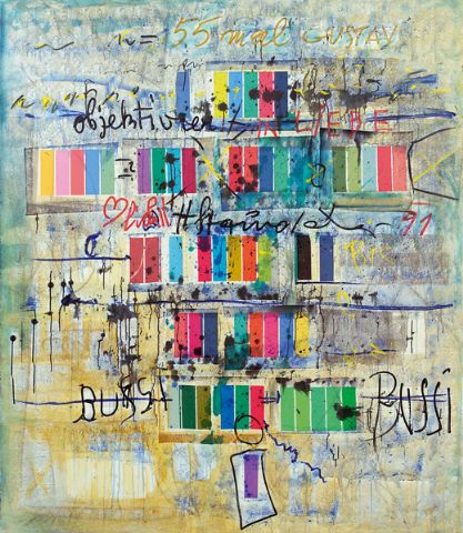
A while back, over the course of several posts, I presented the work of Stefan Anneral who used various kinds of tapes and paint in his very colorful work. (He's listed in the links on the right side of the blog under ABSTRACT LINKS) Further searching produced more information on his oeuvre, revealing that there is much more than what first meets the eye. At some point a more informed post about him will be forthcoming.Technically, this type work would be categorized as collage and it challenges us the way he uses common materials and turns them into glowing gems. Once again we reconsider what "artistic" materials are and can be.

And that brings us to Kees Goudzwaard. Here we have another artist interested in using tape, but it looks like he's intent on exploring the possibilities of using only masking tape on a solid colored background. Or so I thought.

After seeing Stefan's work with the tape and then finding Kees, I thought it was more of the same; slightly different, but tape and paint on a support none the less. Come to find out, these are not collage but in fact oil paintings and only oil paintings. Kees makes a model on canvas using sheets of colored paper and strips, bits and pieces of masking tape and then replaces what he's constructed with oil paint. He also does it in a smooth finish so there are no traces of the artist.

So on the one hand we're looking at such a simple, almost minimal work that looks as though the artist just took pieces of tape and affixed them to the canvas, as in fact he did, but what we're really viewing is a hyper realistic oil painting OF what we thought we saw. In other words this is really good trompe l’oeil, not collage.


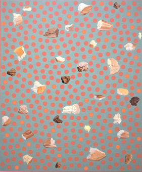
The first piece I ever encountered on the Internet by Kees Goudzwaard had a soft blue ground and the immediate "reading" was that it was some sort of blueprint. Both colors were in the right range and reminded me of how certain blueprints come across more as a work of art than a functional document. For lack of a better way, lets say the red work falls into the "blueprint" category. It really is something to view these as though they were simply what they look like - an artist putting bits of masking tape to canvas. The whole idea of what makes art and what are artistic materials, comes to mind. Then upon coming to terms with the fact that these are skilled oil paintings, so much more is added to the equation.


To read more about him go HERE and HERE .


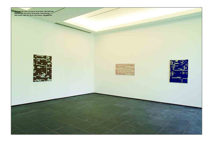
He's represented by the Zeno X Gallery and when you go to THIS page, not only can you see his work and enlargements, you can also see each work in a "view" inside the gallery, which also enlarges. VERY nice concept. Check it out.


Red image is from S.M.A.K.

Top and bottom images are from Zeno-x.com

Other images can be found Here, Here, Here, Here, Here and Here.
.
.

Friday, December 14, 2007

Alessandro Algardi

.
.
There are some evenings when I should have stopped searching the Web and gone to bed, when suddenly I'll come across a spectacular find. And this was so worth staying up for. I have no idea what to try and tell you about this guy, because what few sites have his work are in Italian(?). He was born in Milano in 1945; there's lots of words and dates after that, but it ain't in English. And it's unfortunate that he shares the same name with a famous old master sculptor.


To me this was a severely stupendous find. How rich and luxurious and mysterious. There's so many levels to comprehend in these quiet works. I'm not sure if there are actual words and sentences involved, or if this is just mark-making. Either way, it's still powerful yet soft and subtle.


These images are from the best site for seeing his work - artantide.com, where they have 6 images.
.

Visiting Gallery Joe

.
The really great thing about digital photography is that you can have pics without ever printing or paying for printing AND you can also delete, delete, delete. But the bad thing is that we're never organized from the start, and so a year or two later things are pretty much lost and need to be found. So the last hour was spent going through some picture Cd's that I had burned over the years that overlap here and there and are a total mess. BUT, they are correctly labeled now and I was able to find a wonderful picture that brings back fond memories.


It's been long enough now that I don't remember when, but Dale and I went to see all the art galleries in Old City, Philadelphia, PA. What a cool experience. So there's Gallery Joe across the street. we walk over and go into this tiny establishment that specializes in drawing. There's a small front gallery and then we walked 'round into what used to be an old vault and there were three watercolor panel just hanging there. As we stood in that small, quiet room and looked at the monochrome scene before us, we were transported out into the cold silent woods. You could almost hear the snow falling and maybe a Chickadee nearby. Talk about your virtual experiences . . .

You can visit Gallery Joe online. (Looks like they spiffed up the vault.)
.

Thursday, December 13, 2007

A Dotty Christmas ?

.
Sorry, just couldn't resist looking at the work of Gastone Biggi some more. What a name. Imagine what it must have been like for him in grade school. Anyway, this painting seems pretty straight forward, for me. Abstract background, green orbs on top. Maybe this is the equivalent of artistic light humor.
.

.

But actually I think he was exploring, experimenting. Maybe artists are scientists and these are our notes. This image, "Costellazione irlandese quinta" 1993, 11.8x11.8 in is from Artfacts.net.

Our last image is more mysterious. Titled "giorno d'acqua" 2003, 27.6x27.6 in and also from Artfacts. Sure would like to know the story behind this one. What a difference 10 years makes.

.

Italian Pointillism

.
.
For the longest time my searches on the Internet for all things abstract pointillism and abstract calligraphy seemed next to futile. This last year has seen a dramatic change. There are roughly 30 art news and blog sites that I visit daily. Somewhere along the line there will be something worth Googling or pursuing further and amazingly a trail begins and I end up a very happy camper. New artists, new oeuvres, new intellects; sometimes it almost seems quantum the way it works out.

I don't have the slightest clue as to what prompted me to do dots on my paintings years ago, but you can't imagine how encouraging it is to keep coming across artists who experiment with dots and pointillism. Somehow each artist has something new to add. So it was with great delight to come across a lot of images by the Italian artist, Gastone Biggi. It's hard to decide which images to temp you with. Really, you'll just have to go HERE and see more for yourself. Some of his paintings bring to mind Ross Bleckner's work when he was painting cell like objects.
Artfacts.net has 10 images and the top image is one of 22 images at Galleria Centro Steccata. (This is their main artist page, just scroll down and you can't miss the dot paintings.) Kinda neat to leave the USA for a minute and consider other cultures and visual values. Also, note the dates. It'll help you frame the works within the 20th and 21st Century artistic timeline . . .
.

Wednesday, December 12, 2007

Real, Outsider Art

.
.

I always cringe when I hear the term self-taught, because it implies that the artist was not educated. The artist may not have gone to college, but they might be educated in other ways that could actually work to their advantage and it certainly does not preclude them from making great art. That's a whole 'nother story that I don't want to veer into right now. But I really cringe whenever I hear the term art brut or outsider art because I'm almost always disappointed at the work I'll see. Do all these artists who produce outsider art go to an outsider school to learn the dozen or even fewer oeuvres that are so pat, so rote? I don't even bother to pick up publications with those titles anymore - they contain nothing new or different or exciting.

The point of saying all that was to introduce Dan Miller. Dan is autistic, which makes him even more of an outsider. Most of us don't know all that much about it. We've probably briefly encountered someone who was and that experience was our only education on the subject. There's certainly much more to know. If this subject had never been mentioned we'd view his abstract calligraphy like any other. I got so excited when I saw his work and wanted to see and know more. What was the thought process ? And after reading about and thinking about his thought process it makes you question your own.

Go to Creative Growth to read his story and see some of his work. (their image quality is terrible)
A better site to see some images of his work is White Columns. It's unfortunate that none of the sites have large views of his work.


The top image is from Artnet (they only have one), bottom image is from Rena Bransten Gallery (they also only have one image of his work in a group show).
.