
.
It's hard to believe that the first decade of the new millennium, which is now being called the Aughties, is over and done and a new section of time begins. As each year passes away we take time to reflect and redouble our effort to do better in the new year. This process is even more special when we mark the passing/beginning of a ten year period. I hope you've enjoyed the Holidays and wish you a wonderful New Year. Thank You for your support.
This tilt/shift, time-lapse video of Mardi Gras by Keith Loutit seems quite apropos.
Turn up the volume and enjoy !
.
.
Thursday, December 31, 2009
Wednesday, December 30, 2009
Flights of Fancy
.
I've got plenty of great artists to post about, but what with the Holidays and all, it's been hard to focus on the regular posting routine. Hopefully with the coming of the new year and the return to normality I can resume sharing some great art with you that's more in line with what this blog is all about. But I did want to share this image with you; for me it's just a simple reminder of how easily an artist can take the simplest things and craft something to jog our mind and make us momentarily reconsider life and the world we live in.

This is by Marcus Bunyan and you'll find more on his Website.
.
about ABMB
.
Each year when Art Basel Miami Beach happens, I scour the blogesphere trying to find pics, vids and whatever coverage I can about the fair. As usual it was a little disappointing to have to go here, there and everywhere to find enough images to get a fair idea of what was going on. Joanne Mattera did a good job with 24 posts about the fairs, which in their totality gives you a flavor of what it was all about. You can start with her post - The Wrap-Up Awards - which also has links to all the other ABMB Posts.

Thanks Joanne.
.
Each year when Art Basel Miami Beach happens, I scour the blogesphere trying to find pics, vids and whatever coverage I can about the fair. As usual it was a little disappointing to have to go here, there and everywhere to find enough images to get a fair idea of what was going on. Joanne Mattera did a good job with 24 posts about the fairs, which in their totality gives you a flavor of what it was all about. You can start with her post - The Wrap-Up Awards - which also has links to all the other ABMB Posts.
Thanks Joanne.
.
Sunday, December 27, 2009
Speaking of Newspaper . . .
.


Artist Gordan Cheung uses the Financial Times stock listings as the ground for all his mixed media works. You can find out why, in an interview at myartspace. When you visit Gordan's Website, there's a nice video from one of his shows. His site provides plenty of images of his work, but it's nice to see the works in-context.
.
Saturday, December 26, 2009
First Masterpiece
.
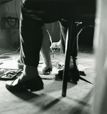
It's a pretty neat story, actually; I had moved to Georgia, gotten a job and after staying with friends for a while, got my own place. Hopped on the old bicycle to check out my new neighborhood and around the corner was this dumpy ole shop/warehouse. That's how I met Dieter and believe me, there are plenty of other great stories to tell too. I popped in - introductions - and then he got back to work and I suddenly felt creative.

I found this piece of paper and started rummaging through a huge stack of magazines to find these pieces of collage and just threw this thing together. Where the silver and gold came from, I have no idea.
Titled "Torn Between The Sun and The Moon", it doesn't take a PHD to see the psychology here. The background is a graphite rubbing of his worktable and the blue circle and lines are tracings of rough events that happened on/to that table. I would say with out a doubt that this was my finest work - completely thrown together with no preconceived idea; a spur-of-the-moment masterpiece of great import.
click to enlarge
.
Thursday, December 17, 2009
Wrapping-up Christmas
.
Here's a short, funny Christmas story for you;
When I was in my teens it was all about gourmet this and genuine that and I was enthralled with the life of high society and everything hoiti-toiti. And my very special Christmas presents had to be fitfully wrapped; everything was very high class. Fast forward 40 years and now I try to get gifts that are fun and are Christmas-morning-memorable for under $20; which makes the shopping fun for me. I then wrap these treasures in newspaper, choosing pics(ads) that bring a smile or contain a sly joke and then simply write their name and apply a bow.

(Click pic to enlarge)
The gift in the front that says LIFE, is for Carol, my brother's wife and in the bottom right corner is a picture of a many layered cake. I wrapped it so the other section of the paper with the recipe is on the back and easily saved. Instead of the usual "oh isn't that pretty" about the gift wrap, the conversations go in other fun directions. So once I hand them their gifts and they have a little chuckle, it's rip & tear time with no compunction.
.
Monday, December 14, 2009
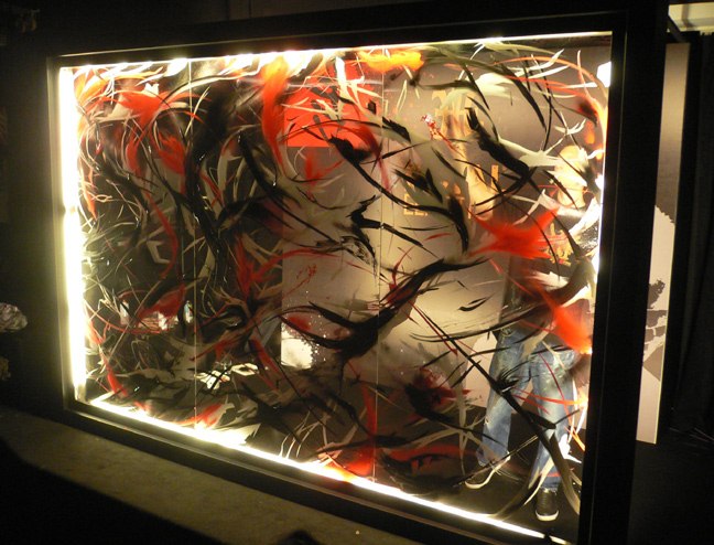
Hit & Run Painting
Sunday, December 13, 2009
Floral Inspirations
.
There's still a bouquet of cut flowers, flanked by two half-burned candles on the dining room table. They're now faded and wilted and they remind me of the story behind a series of paintings by Fereydoun Ave, titled Lal Dahlias. I can't seem to find the original story which paints the picture of a depressed artist who's mother passes and he fills his apartment with dahlias and suddenly finds inspiration and begins a manic whirlwind of artistic activity focused on the now wilted and dying dahlias.

This image is from a review of that Show, in the DubaiLime. You'll find 6 more images from that Show Here and a picture of the artist with several of the works Here. It takes quite a bit of searching several search engines to come across any more images from that Exhibit, which then gives you a better feel for the variety of styles and materials he used.
.
You might also want to check out his Persian Miniatures.
.
There's still a bouquet of cut flowers, flanked by two half-burned candles on the dining room table. They're now faded and wilted and they remind me of the story behind a series of paintings by Fereydoun Ave, titled Lal Dahlias. I can't seem to find the original story which paints the picture of a depressed artist who's mother passes and he fills his apartment with dahlias and suddenly finds inspiration and begins a manic whirlwind of artistic activity focused on the now wilted and dying dahlias.
This image is from a review of that Show, in the DubaiLime. You'll find 6 more images from that Show Here and a picture of the artist with several of the works Here. It takes quite a bit of searching several search engines to come across any more images from that Exhibit, which then gives you a better feel for the variety of styles and materials he used.
.
You might also want to check out his Persian Miniatures.
.
Saturday, December 12, 2009
Mark Making and Erasure
.
The work of Christopher Wool certainly falls into the Category of Marks, Gestures & Scribbles and I've wanted to do a post about him for quite some time now. Famous and notable, others have waxed eloquent about his oeuvre and there's little I could add to what's already been said. But some of you may not be familiar with his work and this is probably the best way to introduce it to you.
(There's no sound until the annoying, little commercial ends)
.
Wool is also known for his text works which you can see in a very fascinating video over at CastYouArt that covers the Warhol, Newman, Wool “Barney is now at another party.“ Exhibition at Kunsthaus Graz. This is an interesting juxtaposition of work by these three titans.
.
Tip: If you don't have High Speed Internet - click the arrow to start your video and then click the appropriate button to stop it. It will continue to load so that later you can again click the arrow and play it without interuptions. You probably have tabbed browsing, so just use your other tabs to surf the Internet while you're waiting for the video to load.
.
Friday, December 11, 2009
Brush Strokes and a Color
.

Regardless of what style of painting you like, please take the time to read this interview with Alan Ebnother. Aside from explaining his oeuvre, it's amazing to read how this artist came to his career. He's interested in texture and color and couldn't be more serious in his pursuit. Another interview has pictures of works from his blue series and you must scroll to the bottom and see his studio in New Mexico.
.
.
He's represented by the George Lawson Gallery where you'll find a sampling of his paintings in different colors and you'll find more images at Galerie Gisele Linder. You'll definately want to go through his photos at MySpace.
.
.
Thursday, December 10, 2009
Blooming Sansevieria
.
Snake Plant, Sword Plant and Mother-In-Law's Tongue are all common monikers for the Sansevieria but few people know it blooms; much less smell like an Easter Flower.


This hardy little plant-that-could will sometimes take such abuse and just keep on going. It can go unwatered and in bad lighting and hold it's own. It's striking presence fits any decor and to see one bloom is quite a treat.
Snake Plant, Sword Plant and Mother-In-Law's Tongue are all common monikers for the Sansevieria but few people know it blooms; much less smell like an Easter Flower.

(The flower stalk is just left of center - click images to enlarge.)
I was going through many of my photo albums this evening, looking for images of recent paintings that I could exhibit and came across these pictures of my sword plant. Deciding it would make for an interesting addition to the landscaping, I planted it outside for the summer. Later that summer a closer look revealed that it was blooming. The buds remind you of little bananas and there are small droplets of sap or nectar on the stems. When the blossoms pop open they look like tiny fireworks and have the loveliest smell. Each of the Easter Flowers that we love have a distinct and sweet smell and this is just one more. It soon starts fading though and you catch yourself burying your nose in the blooms for any last whiff of that intoxicating perfume.

This hardy little plant-that-could will sometimes take such abuse and just keep on going. It can go unwatered and in bad lighting and hold it's own. It's striking presence fits any decor and to see one bloom is quite a treat.
.
.
Wednesday, December 09, 2009
Lines, Dots, Flowers & Stripes
.

.
 You need to experience the ever evolving oeuvre of Thierry Feuz for yourself. Just one or two images doesn't do him justice nor does it begin to relate how he feels about color and form. In the top image from his interview at DE51GN, we're not sure if what we're seeing is micro or macro. There's plenty of line, gesture, color and contrast in this lacquer and acrylic on canvas from his Gulfstream Series and it reels us in and causes us to ponder. Although it makes so much sense, you'll be surprised by the different directions he chooses to explore. Visit his Website where he's divided his work into 6 categories or Series. And reading the interview/reviews at these 3 Links from his site gives insight into his personality and work.
He's represented by Limn Art Gallery, with images from his exhibition.
Six images at Une Gallery.
And Kashyahildebrand New York has some installation shots of his stripe paintings.
Top image from DE51GN.
Bottom image from Limn Art Gallery.
.
.
You need to experience the ever evolving oeuvre of Thierry Feuz for yourself. Just one or two images doesn't do him justice nor does it begin to relate how he feels about color and form. In the top image from his interview at DE51GN, we're not sure if what we're seeing is micro or macro. There's plenty of line, gesture, color and contrast in this lacquer and acrylic on canvas from his Gulfstream Series and it reels us in and causes us to ponder. Although it makes so much sense, you'll be surprised by the different directions he chooses to explore. Visit his Website where he's divided his work into 6 categories or Series. And reading the interview/reviews at these 3 Links from his site gives insight into his personality and work.He's represented by Limn Art Gallery, with images from his exhibition.
Six images at Une Gallery.
And Kashyahildebrand New York has some installation shots of his stripe paintings.
Top image from DE51GN.
Bottom image from Limn Art Gallery.
.
Monday, December 07, 2009
Collage Dots
.
.

.
I'm having a hard time understanding the oeuvre of Patrick Michael Fitzgerald. For the most part, for me, it's like an unfinished dish with the wrong seasonings. And then I come across this work that just blows me away. How do you combine ugly and charming with a dash of depth and perspective ? There's something hauntingly seductive about this drawing/collage that makes me want to rethink my own work.
.
Image is from his Blog.
.
Blond Dots
.
.

.
Julie Nelson's Statement is very closed and personal and sheds no light on the process of making these lovely, intriguing works. Visit her Website to see more.
.
.
Sunday, December 06, 2009
Dots & Patterns
.
.
 .
.

.
Both images are from the Holly Johnson Gallery.
.
.
. Christopher French discovered braille paper one day and it opened up a whole new territory of ideas for him. You'll find that story and more images at the Marsha Mateyka Gallery.
He's represented by the Holly Johnson Gallery where you can again read about the braille papers' influence in his Bio and see his more of his work , including the patterned pieces. The installation shots show the range of sizes in the work.
.
Both images are from the Holly Johnson Gallery.
.
Tuesday, December 01, 2009
Lines In The Sand
.


Additional images can be found on Google Images and others still, on Yahoo Images.
.
.
It's been a wonderful Thanksgiving and Scrubs is about to come on, so I won't try, nor do I need to wax eloquent about the fascinating ephemeral work of Jim Denevan. Quite simply he draws in the sand at low tide. The works are simple, huge and usually geometrical.
Both images are from, and please do visit his Website to see more.
Additional images can be found on Google Images and others still, on Yahoo Images.
.
.
Tuesday, November 24, 2009
A Season of Thanks
.

Twas the day before Thanksgiving
and oh so much yet to do . . . . . .
Wishing you and yours a very happy holiday.
The image is from pbnmopo.
.
Monday, November 23, 2009
Verbal Visuals
.
If you follow what's going on in the contemporary art world, then you're familiar with the work of Ed Ruscha.
Rather than try to say anything important about him or his work, I'll let you read this very scholarly dissertation about his painting "Mean As Hell". Although it's specifically about the painting, it really "nails it down" in explaining Ed's oeuvre.
What attracted me to this video and the main reason I'm sharing it is the simple honesty with which he speaks about his career and the reasons for becoming an artist. It just doesn't get any simpler than this; and that's why it's so inspiring.
.
Saturday, November 21, 2009
Cut, Drawn Lines
.

Seeing this image of Adam Fowler in no way prepares you for encountering his work.
Surprising and honest they are at once obvious and mysterious. Each piece starts as a gestural drawing using either pencil, graphite stick or graphite crayon. After the lines are made he removes the negative spaces in the drawings with an x-acto knife. Some works will have as few as 4 layers or individual sheets while others have as many as 74 layers in the finished piece. The lines differ in width and tone, relative to the drawing tool he used in the beginning.
He's represented by Margaret Thatcher Projects and several of the 13 images of his work are photographed from different angles to give you a better idea of the work involved.
Click the thumbnails on his Website for a generous enlargement; click again for a ginormous pdf version.
d.e.n. Contemporary has 3 images of framed work and here's a review from NYArtBeat.
.
Images are from artist's website.
.
Friday, November 20, 2009
Thursday, November 19, 2009
Neo-Geo w/Dots
.

 .
.
Top image from Artnet.
Artists minds are amazing things and it's so fascinating to find out why they do the things they do; what inspired them to pursue their particular course. W.C. Richardson's oil & alkyds or mixed media works are sure enough amazing and entertaining; some are Geo-Minimal, some are more complex. You'll enjoy reading the interview, and viewing the nice large images at Geoforms. There is a short statement and 8 images that concentrate on the dots, Here. Another 8 images here rounds out the examples of his work.
.Top image from Artnet.
.
Wednesday, November 18, 2009
Northern Perspective
.
From studying architecture, to working for a gold exploration project in the Arctic, to designing postage stamps for Greenland, Ina Rosing certainly has an interesting life to inform her oeuvre. Her mixed technique includes bursts of color and writing in the paintings. Although she uses crayons and spray paint, her passion is to - " . . . make the oil paint work in different ways and talk in different voices. My main concern when I paint is the paint itself. The colour and texture is more important to me than the subject matter." This partial quote is from her BIO at GV Art London. You can view installation shots of her Show, The Importance of Beauty and also view many more images of the work in the catalogue (pdf).

When you visit her Website, you'll need to other click and then choose "open link" to enlarge the thumbnails.
Image is from Amelia's Magazine.
.
From studying architecture, to working for a gold exploration project in the Arctic, to designing postage stamps for Greenland, Ina Rosing certainly has an interesting life to inform her oeuvre. Her mixed technique includes bursts of color and writing in the paintings. Although she uses crayons and spray paint, her passion is to - " . . . make the oil paint work in different ways and talk in different voices. My main concern when I paint is the paint itself. The colour and texture is more important to me than the subject matter." This partial quote is from her BIO at GV Art London. You can view installation shots of her Show, The Importance of Beauty and also view many more images of the work in the catalogue (pdf).
When you visit her Website, you'll need to other click and then choose "open link" to enlarge the thumbnails.
Image is from Amelia's Magazine.
.
Tuesday, November 17, 2009
Writing In Paintings
.
It doesn't matter whether it's readable or not, paintings with writing in them or on them attract me like a high voltage magnet. For me there's just something amazing about written words as content and composition.
.
It doesn't matter whether it's readable or not, paintings with writing in them or on them attract me like a high voltage magnet. For me there's just something amazing about written words as content and composition.

Ludmila Pawlowska's oeuvre is at once masculine and yet there's no mistaking the feminine side. Maybe that comes from the feeling that her paintings are constructions rather than just brushwork. You'll find a beautiful blue painting and she describes her work Here.
She's represented by Galeri Elise Toft where you'll find 10 images.
Ludmila is also represented by the Tapper-Popermajer Art Gallery where you'll find 14 other images of her work.
You'll get a better picture of this interesting woman by wandering around her studio.
Top image from Galeri Elise Toft.
.
Sunday, November 15, 2009
The Scribbler
.
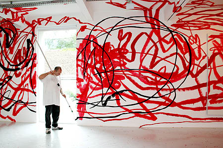
I would imagine that if you showed the top image to a child, they might be convinced that it's a picture of what Heaven will be like; one of the activities that they would be able to participate in - forever.

I would imagine that if you showed the top image to a child, they might be convinced that it's a picture of what Heaven will be like; one of the activities that they would be able to participate in - forever.
Otto Zitko is a unique artist indeed, but I think many of us want to not like him simply because he scribbles so much. Looking at his work makes us revisit our feelings about modern art, contemporary art. Just what exactly is important or meaningful ? Is his work just too simple to be important ? There are many times that I'll be viewing new work by young artists and while I'm scratching my head wondering "what were they thinking", I mentally take myself back to deKooning's Woman series - how crazy were those things ?
I'm not asking you to like his work - just to look and consider the feelings they evoke.
Saturday, November 14, 2009
Colorful Scribbles
.
 .
.
It's been a great privilege to watch several artists that I follow, change direction in their oeuvres. Just amazing to see the little morphs at first and then the full blossoming as their style grows and matures.
 I'll have to admit that the early works of Gunther Forg are not my cup of tea; but these later pieces practically make me giggle with delight. There's something simple and childish and honest that makes you want to say "hey, look" to someone who's only into realistic art. Even though his new works seem very different(mush prettier and open), as you get an overview of his work, you can see that these are still connected to what he's always been about.
.
.It's been a great privilege to watch several artists that I follow, change direction in their oeuvres. Just amazing to see the little morphs at first and then the full blossoming as their style grows and matures.
I'll have to admit that the early works of Gunther Forg are not my cup of tea; but these later pieces practically make me giggle with delight. There's something simple and childish and honest that makes you want to say "hey, look" to someone who's only into realistic art. Even though his new works seem very different(mush prettier and open), as you get an overview of his work, you can see that these are still connected to what he's always been about.The above images are from Galerie Graesslin where they have so many images of all facets of his work that it's just incredible. Even though it's in German, you'll quickly figure it out and the information for each image is at the top. For a quicker overview of his work go to Galerie Filomena Soares where you can quickly scroll through 25 images - enlarging an image gives you the information. And 19 other and different images can be seen on one page at Contemporary Art Daily's coverage of his show at Galerie LeLong where you can see even more images and a pic of the artist.
I'll leave you with a video of the Vernissage for his Show at Zane Bennett Contemporary Art. They have 16 works from 2008 and some are different yet from the other sites.
.
Nude Fruit
.

Take a few moments to contemplate this still life. What fruits do you recognize? And the longer you look, doesn't it seem as though some are in their underwear ? This image conjures very strange thoughts, indeed. Maybe it should be included in psychological testing along with the rorschachs.
You'll find this and another thought provoking image by photographar Holger Niehaus at photoq.nl.
.
.
Friday, November 13, 2009
Op/Dots
.

These dot paintings by Amanda Reeves take the words shy and subtle to a whole new place. But spend some time with them and you really start to like their personalities. There's an atmospheric glow to her minimal, color field backgrounds where different size dots of color hover like fairytale traffic signals guiding us through a fog. Read what she says about her work at the in2art gallery and it confirms your suspicions that this is, in fact op-art. When you visit her Website, click on Paintings to choose works from 2006, through '09. There are precious few works here, but they're all gems. Her latest works are going in a new direction and I hope she rekindles the magic as she goes forward.
.
.
.
Thursday, November 12, 2009
the really truth
.
 My latest painting titled "the really truth" is at once a triumph and joy to look at, but also a lesson-learned.
.
 My latest painting titled "the really truth" is at once a triumph and joy to look at, but also a lesson-learned.
This image isn't the best, the frame is borrowed from another painting and the background doesn't help; but that doesn't dampen my soaring spirit and I just wanted to share it. After making simple arbitrary decisions involving color and composition and then following my intuitions, what a pleasant surprise it was to see the end result. Click image for larger view.
The fascinating thing about including metallic paints in a work is that they have an uncanny way of mimicking and blending in with their surroundings until you change the angle of view. Then, when the light hits them they pop out from the background to reveal surprise patterns. From this angle you can't see that a large proportion of the dots are Iridescent Bronze. But seen in a different light, I found them to be a little annoying. - Next time, not so much Bronze.
As for the title - if you listen you'll notice how emphatic and persuasive we can be about portraying the truth. Shouldn't the truth be just a simple explanation of reality without the need to quantify or qualify our version of it ?
..
Wednesday, November 11, 2009
Same Old New
.

This image is intellectually stimulating and rib-tickling on so many levels
This image is intellectually stimulating and rib-tickling on so many levels
The artist, David Lyle finds his inspiration for these oil paintings on panel from lost snapshots garnered from thrift shops, flea markets, etc. I don't know if he "doctored" this particular painting or not. In general his oeuvre seems to be an honest re presenting of these old photographic memories. Visit his Website.
Tuesday, November 10, 2009
Another Art Hero
.
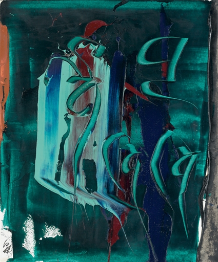
.
 Calligraphy and graffiti can be very ordered forms of gesture and writing. If we travel a little further afield, where mark-making, scribbling and writing converge, that's where we'll find Hans Staudacher. If you're unfamiliar with the man's work I've included plenty of links that will wet your appetite for more from this important artist.
Galerie Ernst Hilger has a 3 paragraph Bio that explains his oeuvre. As you look at the 19 images of his work, notice the dates and you'll more fully appreciate the influences in his career.
Galerie Gergersdorfer has 6 images Here, and 7 more Here.
You'll find another 8 images at the Judith Walker Galerie.
And for 4 totally huge enlargements of his work, Galerie Seidler has 3 0n This page and 1 at the bottom of This page
.
Calligraphy and graffiti can be very ordered forms of gesture and writing. If we travel a little further afield, where mark-making, scribbling and writing converge, that's where we'll find Hans Staudacher. If you're unfamiliar with the man's work I've included plenty of links that will wet your appetite for more from this important artist.Galerie Ernst Hilger has a 3 paragraph Bio that explains his oeuvre. As you look at the 19 images of his work, notice the dates and you'll more fully appreciate the influences in his career.
Galerie Gergersdorfer has 6 images Here, and 7 more Here.
You'll find another 8 images at the Judith Walker Galerie.
And for 4 totally huge enlargements of his work, Galerie Seidler has 3 0n This page and 1 at the bottom of This page
 .
.
The top image is from jmcfaber.
The painting, from Galerie Gergersdorfer.
.
Sunday, November 08, 2009
Intense Painting
.
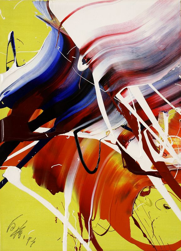
Kazuo Shiraga gets pretty physical with his paint. He'll even swing from a rope so he can paint with his feet.
The top image is from Artnet's coverage of the June, Modern & Contemporary Mallet Japan Auction and it sold for $11,218.
He's represented by, and you'll find some interesting images of his work at Annely Juda Fine Art. Just click on Gallery Artists and then his name.
.
This sweet little number by Kazuo will be coming up at auction; Christie's Rome: Tuesday, November 24, 2009 [Lot 140]Contemporary and Modern Art.
I make a habit of keeping up with the art auctions on Artnet - whether I'm perusing the catelogues of Upcoming Auctions or checking out what sold for what on their Recent Auction Results. It's quite an education !
.
.
Saturday, November 07, 2009
Abstract Graffigraphy.
.
After making the case that graffiti is just another form of calligraphy, which we'll call graffigraphy, it stands to reason then, that there would also be artists making Abstract, Graffigraphy.
A good case in point would be the work of West One.

I came across his work at the Galerie Magda Danysz quite a while back, but couldn't find out much else about him and wondered if he had just dropped out of the scene. This time 'round though, I came across this short piece in HypeBeast and he's doing just fine. Like many other graffiti artists these days he's learned how to join the system and turn a pretty penny.

You'll find a great slideshow of his work, including installation shots, Here.
When you visit his Website, check out Walls and Trains.
Top image from westonefc.com.
Bottom image from Hypebeast.
.
After making the case that graffiti is just another form of calligraphy, which we'll call graffigraphy, it stands to reason then, that there would also be artists making Abstract, Graffigraphy.
A good case in point would be the work of West One.
I came across his work at the Galerie Magda Danysz quite a while back, but couldn't find out much else about him and wondered if he had just dropped out of the scene. This time 'round though, I came across this short piece in HypeBeast and he's doing just fine. Like many other graffiti artists these days he's learned how to join the system and turn a pretty penny.
You'll find a great slideshow of his work, including installation shots, Here.
When you visit his Website, check out Walls and Trains.
Top image from westonefc.com.
Bottom image from Hypebeast.
.
Thursday, November 05, 2009
Lovely Musical Interlude
.
This tilt shift - time lapse video starts out tame enough with some still shots and then really breaks loose at 1 min, 28 seconds.
I especially like the last 40-some seconds; it makes us reflect on "all-in-a-days-work" in a different way.
.
This tilt shift - time lapse video starts out tame enough with some still shots and then really breaks loose at 1 min, 28 seconds.
I especially like the last 40-some seconds; it makes us reflect on "all-in-a-days-work" in a different way.
.
Graffigraphy
.
To resume our train of thought about calligraphy and graffiti, I'd like to reiterate that technically, there's no difference between the two. At the moment, and in general, you might say that calligraphy is done by a paid professional indoors using pen and ink or watercolors and that graffiti is done by a non professional, outdoors with spray paint and markers. And, as we all know, that is starting to change. The term Graffiti includes cartooning, wheat pasted images, tagging, lowbrow art and simple defacement, so I'd like to officially introduce the word graffigraphy to identify graffiti that is just writing. The easiest way to make my point is to give you the link to HandSelecta, where you can watch 30 different, short (most are under a minute) videos of graffiti artists writing a word or two - showing their style. Here are two examples from that site.
Even though you're watching graffiti being made, you instantly recognize that this is calligraphy.
So - lets call it Graffigraphy.
Now our conversations on this topic can be clearer and more intelligent since we've identified this part of the genre more precisely
.
Wednesday, November 04, 2009
Sonic Poof
.
Have you ever wondered what a sonic boom looks like ? Probably not. Well, this is what one looks like - it's actually a physical event.
.
Have you ever wondered what a sonic boom looks like ? Probably not. Well, this is what one looks like - it's actually a physical event.

The image is from evil live and the caption reads quote A U.S. Navy sonar technician Roald Dejarnett captured an Air Force F-22 Raptor executes a supersonic flyby over the flight deck of the aircraft carrier USS John C. Stennis (CVN 74).
pic: Navy News unquote.
This is a meaningful picture for me because I worked for a furniture moving contractor for Lockheed Martin in Marietta, GA a while back. Our work took us to almost every building in the plant. I've got more stories than you've got time to listen. What an experience it was to help with the set up, and then watch the big presentation and roll out of the F-22.
.
Sunday, November 01, 2009
Ab/Graff
 A first look at the canvases of Howard Sherman and we immediately think of Graffiti. His heady mixture of brash strokes, muscular paint-handling and crass titles, sucks us in and then spits us out laughing. Knowing that he was a cartoonist adds some sort of equilibrium to this mix.
I've long suggested that Ab/Ex (abstract expressionism) needs paring down to better identify the many disparate oeuvres within it's shadow; names that would more precisely steer our minds in the right direction. Ab/Graff might also end up being a huge umbrella type label, but it certainly gives a better clue as to the content we'll be experiencing.
The top image is from his Website where you can see many more images of his work from "06 through 2009.
A great review in Art Lies gives us more information on the cartooning aspect in his career.
You'll enjoy the candid studio visit, video above, from chron.com; it really helps to see these large canvases in context.
He's also represented by the McMurtrey Gallery.
A great review in Art Lies gives us more information on the cartooning aspect in his career.
You'll enjoy the candid studio visit, video above, from chron.com; it really helps to see these large canvases in context.
He's also represented by the McMurtrey Gallery.
.
Saturday, October 31, 2009
AvantGraffiti
.
So I decided to carry this idea of calligraphy/graffiti further by Googling abstract graffiti and was pleasantly surprised at what I found. The artist here, is James Choules aka SheOne.
The image is from a live painting segment from his Show in Hong Kong as posted in HongKongHustle.
.
So I decided to carry this idea of calligraphy/graffiti further by Googling abstract graffiti and was pleasantly surprised at what I found. The artist here, is James Choules aka SheOne.
The image is from a live painting segment from his Show in Hong Kong as posted in HongKongHustle.
Whether this type of thing wets your whistle or not, it'd do you good to take a peak at this other culture for a minute; not every artist comes out of art school. And regardless of whether it's done in a studio, gallery or under a bridge, there's a lot of good avantgarde art being made today. What's most fascinating is noticing how historical, academic art influences these artists works
You can visit his Website and there's a short Bio Here.
This first video includes segments of interview that help fill in the blanks about his career..
.
The one below from Vimeo, where you'll find 5 more vids of his work, is much brighter and lighter
.
Thursday, October 29, 2009
Graffiti IS Calligraphy
.


.Top image is by A1one from Blind Angle.
.
Even though we tend to associate graffiti with vandalism, the truth is that it's just an avantgarde and usually outdoor form of calligraphy. One dictionary describes calligraphy as "fancy penmanship, esp. highly decorative handwriting, . . . " So you could say that using the term CALLIGRAFFITI is really just a bit redundant. I think that there are those who want to take the familiar formalism of what we recognize as calligraphy and give it some street-cred by including drips and brashness. At least that's how I felt about the work of "Shoe" from the last post. There are others though, who might be trying to define a sub-genre. . .
Of all the results from my Image Searches, my favorite work was that of Merrill Shatzman, below(titled Calligraffiti#2 - a woodcut on paper). You'll find this and a dozen other images of her work at Adam Cave Fine Art.

This new term certainly has it's supporters.
This new term certainly has it's supporters.
The image below is from a Post on Brushsong about the Calligraffiti: Writing in Contemporary Chinese and Latino Art, Show at the Pacific Asia Museum in Pasadena.
Others still, are convinced that their work straddles both worlds and regardless of our opinions, these artists have embraced this description for their oeuvre and consequently any argument becomes a mute point.
The image below from Madny Al Bakry's Website, rounds out our little sampling which I hope has piqued your interest to investigate further.
.
.
Tuesday, October 27, 2009
More Dots Than Dashes
.
This Blog was originally birthed out of my searches for artists who wrote in their paintings. As I was browsing through my many categorized Favorites Folders to do a post this evening, I noticed a tremendously larger amount of artists in the Dot categories than in the Writing and Word categories. This could mean any number of things, but I immediately set out to correct this imbalance by Googling the word calligraffiti. The results are interesting, but the real kicker came when I visited a good descriptive article about the different styles of graffiti at WebUrbanist. Half way down the page was the word Calligraffiti and a paragraph that states - quote Calligraffiti is a combination of calligraphy and graffiti invented by Amsterdam graffiti artist Shoe (also known as Niels Meulman). It’s a somewhat stylized but still easy-to-read lettering style. It brings together the best parts of calligraphy and graffiti by putting beautiful and artful letters into an urban setting. unquote.

I really do beg to differ: there are just way too many artists who have already used that word and cast it aside because it's just too unwieldy. Be that as it may, here is a pic of him - Niels 'Shoe' Meulman - painting his calligraffiti on a coffin. Yes, and you can read about it Here.
Personally, I'd like to see someone pursue GRAFFIGRAPHY.
.
Image from Mediamatic.
.
This Blog was originally birthed out of my searches for artists who wrote in their paintings. As I was browsing through my many categorized Favorites Folders to do a post this evening, I noticed a tremendously larger amount of artists in the Dot categories than in the Writing and Word categories. This could mean any number of things, but I immediately set out to correct this imbalance by Googling the word calligraffiti. The results are interesting, but the real kicker came when I visited a good descriptive article about the different styles of graffiti at WebUrbanist. Half way down the page was the word Calligraffiti and a paragraph that states - quote Calligraffiti is a combination of calligraphy and graffiti invented by Amsterdam graffiti artist Shoe (also known as Niels Meulman). It’s a somewhat stylized but still easy-to-read lettering style. It brings together the best parts of calligraphy and graffiti by putting beautiful and artful letters into an urban setting. unquote.
I really do beg to differ: there are just way too many artists who have already used that word and cast it aside because it's just too unwieldy. Be that as it may, here is a pic of him - Niels 'Shoe' Meulman - painting his calligraffiti on a coffin. Yes, and you can read about it Here.
Personally, I'd like to see someone pursue GRAFFIGRAPHY.
.
Image from Mediamatic.
.
Monday, October 26, 2009
Sunday, October 25, 2009
Graphic Paintings
.

 .
.
M. Muhraddin's oeuvre has writing, collage, texture and lots of drama. Each work feels like a complete, light meal with a different flavor. You'll really enjoy visiting his Website where he's done us a tremendous favor by presenting his work in such a way that we can see the progression through his career. You can read a brief biography Here. Another important tidbit of information can be found Here.
.
.
.Both images are from his website.
.
Subscribe to:
Posts (Atom)
