
.
Elliott Puckette is a fan of calligraphy, which is very obvious when you see her work. Aside from the beautiful abstract, calligraphic gestures; what's unusual about some of her "paintings" is that she builds up generous layers of gesso on panel to which she applies an ink wash and then carves into this with a razor to produce the sensuous lines.
.
.
This silent video is a walk-through of her show in January at Paul Kasmin, where you'll find a very good sampling of her work.
She's also represented by the Earl McGrath Gallery where all the images are from 2006 or older.
For more insight into her oeuvre you can read a very short piece Here or read articles about her Here.
.
Sunday, May 31, 2009
Thursday, May 28, 2009
Pixel Pointillism
.
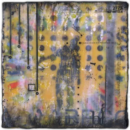
The image below, is a detail of a painting by William Betts. And rather than showing more examples of his work and commenting, I'll just tell you 2 things, provide some links and hope that you're intrigued enough to do a little research. You'll be glad you did.

The image below, is a detail of a painting by William Betts. And rather than showing more examples of his work and commenting, I'll just tell you 2 things, provide some links and hope that you're intrigued enough to do a little research. You'll be glad you did.
~William decided to become an artist after having careers in gas, real estate and soft ware.
.
~He uses robots to make his paintings.
.
He's represented by many galleries, but if you go to the Richard Levy Gallery and click on Press, all your questions will be answered.
.
The Holly Johnson Gallery has the best sampling of the different variations of his oeuvre.
.
Most definately you'll want to visit his Website.
.
To see what the artist looks like, go Here.
.
Image is from Jennifer Kostuik Gallery.
.
Wednesday, May 27, 2009
Why Be An Artist?
.
We all have some preconceived notions of what an artist is; certain paradigms that are so powerful that we even try to fit ourselves into these assumptions. These are most likely ideas that have come from a limited reading of art history, in which one encounters famous tales of the starving artist who gave his all for true art. The big problem with all of that, is that there are as many different stories as there are artists. Making art, after all, is just another job. There are times of insight and inspiration and other times of work and calculation. Seeing this video interview of Dan Colen really drove that point home for me.
Some artists are intense, others are casual. Like they say, it takes all kinds. I'm the kind of person who likes to be really inspired, psyched, "on" in order to paint. For the longest time I was convinced that only then could I produce anything of worth. But really, it's just a matter of doing a good job well. You use whatever talents you have. Usually, the biggest problem is lack of direction and questioning oneself too much.
.
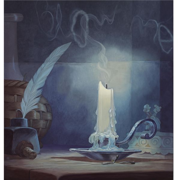
This candle painting, which is discussed in the interview, just sold at auction for $386,500~ at Sotheby's New York Contemporary Art Evening Sale Tuesday, May 12, 2009.
.
We all have some preconceived notions of what an artist is; certain paradigms that are so powerful that we even try to fit ourselves into these assumptions. These are most likely ideas that have come from a limited reading of art history, in which one encounters famous tales of the starving artist who gave his all for true art. The big problem with all of that, is that there are as many different stories as there are artists. Making art, after all, is just another job. There are times of insight and inspiration and other times of work and calculation. Seeing this video interview of Dan Colen really drove that point home for me.
Some artists are intense, others are casual. Like they say, it takes all kinds. I'm the kind of person who likes to be really inspired, psyched, "on" in order to paint. For the longest time I was convinced that only then could I produce anything of worth. But really, it's just a matter of doing a good job well. You use whatever talents you have. Usually, the biggest problem is lack of direction and questioning oneself too much.
.
This candle painting, which is discussed in the interview, just sold at auction for $386,500~ at Sotheby's New York Contemporary Art Evening Sale Tuesday, May 12, 2009.
.
Monday, May 25, 2009
An Artist's Mind
.
For all the explanations and Artists Statements, what really drives an artist to do what they do? How do you go from making the fascinating image below, from 2004, to cutting out words and hanging them on a wall ? Somehow there's a mechanism that prompts artists to craft an oeuvre to express themselves; to say something in particular. And then many go on to say other things in other ways.

For all the explanations and Artists Statements, what really drives an artist to do what they do? How do you go from making the fascinating image below, from 2004, to cutting out words and hanging them on a wall ? Somehow there's a mechanism that prompts artists to craft an oeuvre to express themselves; to say something in particular. And then many go on to say other things in other ways.
Annie Vought has decided to write and then carefully cut out the letters and/or phrases with an exacto knife. Some works are large and continuous, others consist of seemingly random words scattered on the wall; others she frames. You can see her work by visiting her Website.

Sunday, May 24, 2009
Everyday Life In Oil.
.
I just spent the last hour or so going back through all the posts of re-title features, when I came across this wonderful work by Kate Waters from her show at Galerie Voss back in October/November of '08. Normal Realism is a rare thing indeed in this day and age. If it's torn, broken, dirty, shabby, messed-up, unfinished; in other words, if it's anything other than a good clean realistic painting, they'll sing it's praises. In general, it seems that straight-up realism is snubbed in the contemporary art scene. And that's a shame.

In my mind this painting works just as well as anything done by the old masters. The composition draws you in, there's a story here, you've got your drama and great contrasts and even though in shadow, you can see exactly where the man's eyes are focused.
I just spent the last hour or so going back through all the posts of re-title features, when I came across this wonderful work by Kate Waters from her show at Galerie Voss back in October/November of '08. Normal Realism is a rare thing indeed in this day and age. If it's torn, broken, dirty, shabby, messed-up, unfinished; in other words, if it's anything other than a good clean realistic painting, they'll sing it's praises. In general, it seems that straight-up realism is snubbed in the contemporary art scene. And that's a shame.
In my mind this painting works just as well as anything done by the old masters. The composition draws you in, there's a story here, you've got your drama and great contrasts and even though in shadow, you can see exactly where the man's eyes are focused.
I think that in everything there is a certain amount of evolution and painting too has evolved through the many "schools" or periods. But it is so refreshing to know that there are still many artists who faithfully paint the real world we live in and do their craft so well.
When you visit her page at Galerie Voss, you'll notice she has three sets of paintings. The painting above, is from set 1. In set 2 you'll find a very interesting variation of this same composition. What's great fun is her paintings of people in museums standing in front of great, huge, historical paintings. Here and here. So not only is she painting what looks like a photograph, but she's also repainting the historical paintings. I don't know if that's ironic or just plain humorous.
Either way, it's refreshing to see everyday life captured honestly in paint.
.
Wednesday, May 20, 2009
A Beautiful Mess
.
Busy, complex abstracts fascinate me. Simpler subject matter and bigger graphics usually make it pretty obvious how to balance the composition. But, more complex paintings present the challenge of not becoming redundant; keeping everything interesting throughout the painting while staying focused on the whole piece.

.jpg)
Busy, complex abstracts fascinate me. Simpler subject matter and bigger graphics usually make it pretty obvious how to balance the composition. But, more complex paintings present the challenge of not becoming redundant; keeping everything interesting throughout the painting while staying focused on the whole piece.
Naomie Kremer seems to have a handle on it though and her works are thoroughly entertaining, whether viewed from a distance or close up.
If there's such a thing as studio envy, I've got it. You can see more of her cavernous studio Here
You'll enjoy visiting her WEBSITE. Check out the video section too. She makes "Hybred Paintings" onto which she projects video; examples of which can be seen Here. For more information on that, go Here and Here.
You'll enjoy visiting her WEBSITE. Check out the video section too. She makes "Hybred Paintings" onto which she projects video; examples of which can be seen Here. For more information on that, go Here and Here.
.
She's represented by Modernism Inc, where you'll find more examples of her work.
.
Two pictures by Art Business give you a good sense of the scale and colors in a gallery setting.
.
Crayon Pointillism
.

A physicist by training and computer technologist by profession would seem like an odd direction to come from. A short piece by the Newark Advocate helps fill in a few blanks. He's quite an artist though, as you'll see when you visit his Website. There are the Oil paintings that are quite somber in mood, works in fabric and fiber and conceptual work which includes a color alphabet. But what really got me fired up were his encaustic works (above) and the wax crayon pieces, below. I won't waste your time with descriptions; you really must see these works made from hand-crafted wax crayons, for yourself. These pointillist crayon works are much more than a pleasant novelty.
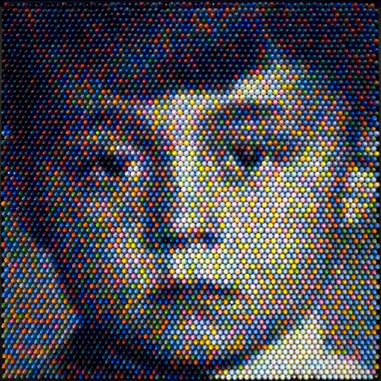
I tend to read between the lines when reading Artists Statements. It's a shame that so many artists try to impress us with the worth of their work by filling their Statements with intellibabble and hyperbole. But regardless of all that, you can still tell a lot about their personality, depth of intelligence and style of commitment. It's a minority of artists who concisely and honestly explain the what and why of their oeuvre.
All of that was said to explain why I was just blown away when I visited the Website of Christian Faur.
A physicist by training and computer technologist by profession would seem like an odd direction to come from. A short piece by the Newark Advocate helps fill in a few blanks. He's quite an artist though, as you'll see when you visit his Website. There are the Oil paintings that are quite somber in mood, works in fabric and fiber and conceptual work which includes a color alphabet. But what really got me fired up were his encaustic works (above) and the wax crayon pieces, below. I won't waste your time with descriptions; you really must see these works made from hand-crafted wax crayons, for yourself. These pointillist crayon works are much more than a pleasant novelty.
.
You'll want to give yourself plenty of time to peruse all his work. There are some truly great concepts here and it takes a while to fully comprehend the level of intelligence and commitment that he's brought to his oeuvre.
He's also represented by the Sherrie Gallerie.
Top Image from blog Makezine
Sunday, May 17, 2009
Large Format Calligraphy
.
Abol Atighetchi definitely went in the right direction when he decided to pursue large format calligraphy. This image is from Art Space, where you can see more of his work and read the short blurb that explains that statement.

You can see his older work by going to Kargah. I think you'll agree with me that this was the better direction for his oeuvre.
.
You'll also want to visit his Website.
.
Abol Atighetchi definitely went in the right direction when he decided to pursue large format calligraphy. This image is from Art Space, where you can see more of his work and read the short blurb that explains that statement.
You can see his older work by going to Kargah. I think you'll agree with me that this was the better direction for his oeuvre.
.
You'll also want to visit his Website.
.
Friday, May 15, 2009
Surreal Perspectives
.
The music beautifully sets a mood for the changing scenarios in this video. Yes, it's all real. Or rather, I should say it's surreal to see ourselves as little toys. And this particular perspective allows us to see how large amounts of water act the same as smaller amounts.
You can check out Keith Loutit's Website for more.
.
.
Wednesday, May 13, 2009
Egg Shaped Dots
.
In the course of a week I see a lot of art and read a considerable amount of Statements and Bios. There are Bios and then there are wonderfully concise, information-packed and enjoyably readable Biographies like the one at Gallery Naga about Bryan McFarland.

In the course of a week I see a lot of art and read a considerable amount of Statements and Bios. There are Bios and then there are wonderfully concise, information-packed and enjoyably readable Biographies like the one at Gallery Naga about Bryan McFarland.
Brian had a good career with a well known oeuvre and then decided to take a different tack. He painted the "Egg Series". This image, "Egg Fountain" 2006, oil on linen 58x52", is from Gallery Naga.
.
To see older examples of his work from the late '90's, go Here.
.
Additional images can be seen at the College of Visual & Performing Arts.
.
Monday, May 11, 2009
From Calligraphy To Architecture
.
Calligraphy has always been an integral part of Art in the old world; and by that I mean the REAL old world, which is the eastern side of this planet. It's a pleasure to see these artists who've been so influenced by that Art History, adapt and make new contemporary works. You don't need to be able to read the script to enjoy this abstract calligraphy painting by Siah Armajani. Titled, "Sealed Letter", 1964 (acrylic, ink, string and sealing wax) it's in the Grey Art Gallery Collection, where you'll find his bio.

Calligraphy has always been an integral part of Art in the old world; and by that I mean the REAL old world, which is the eastern side of this planet. It's a pleasure to see these artists who've been so influenced by that Art History, adapt and make new contemporary works. You don't need to be able to read the script to enjoy this abstract calligraphy painting by Siah Armajani. Titled, "Sealed Letter", 1964 (acrylic, ink, string and sealing wax) it's in the Grey Art Gallery Collection, where you'll find his bio.
What's especially fascinating about Siah is that he turned to architecture. He also now makes what could be described as archisculpture. It's a shocking juxtaposition to see his 2D visual works from the late fifties and the current archisculptures; both at Max Protech. Very fascinating.
Any image search will give you plenty of visual results for his architecture and sculptural endeavours, but little text to explain the change. The link for his Bio at the Grey Art Collection does provide a few clues.
.
Tuesday, May 05, 2009
Took A Little Trip
.
to my hometown of Williamsport, Pa for a couple days. A change of scenery is always good for the mind; stale ideas are suddenly seen as such and new ideas start to take their place.
to my hometown of Williamsport, Pa for a couple days. A change of scenery is always good for the mind; stale ideas are suddenly seen as such and new ideas start to take their place.
When I started this blog, it was to share the findings from my searches for artists who incorporated dots or writing into their paintings. In a way it almost seems boring now; like I'm still trying to make the same point in every post. I thoroughly enjoy the search for and discovery of these artists and their work, but feel that my presentation is becoming stale - at least to me. So I hope you'll bear with me as I get my wits together.
In the mean time, Thanks for your patronage and please help yourself to the Artist's Links in the far right column.
Image is from tryharder.
Friday, May 01, 2009
Dottillism
.
For the longest time I've been cramming all paintings that had dots, into the categories of Postmodern Pointillism or Paintings with Dots. Those two categories serve their purpose, but it might be time to expand things further to accommodate what I felt could be called Dottillism; which applies nicely to the paintings below.
For the longest time I've been cramming all paintings that had dots, into the categories of Postmodern Pointillism or Paintings with Dots. Those two categories serve their purpose, but it might be time to expand things further to accommodate what I felt could be called Dottillism; which applies nicely to the paintings below.

The image is from Super Touch. They have quite a few images from Damien Hirst's current show "Requiem" in Kiev.
I was quite surprised and bewildered by several Francis Bacon style triptychs in the show that I had never before. Check it out.
.
Subscribe to:
Posts (Atom)
