Wednesday, April 29, 2009

Teasers & Pleasers


If you're going to be in Belgium this next month, you'll want to see Stefan Anneral's works in a Group Show at the Kusseneers Galerie.
The Opening is Thursday, May 7th at 6pm.
The Show runs till June 27.

We've featured the work of Stefan before in posts in January of this year and April of '08.

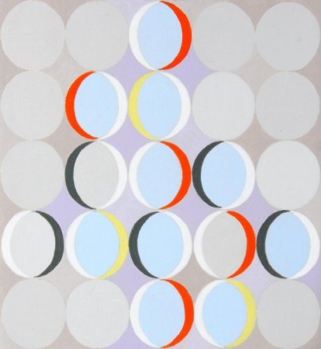
You'll absolutely want to visit his Web Site and view all the luscious jewels he creates. His paintings are wonderful to look at, and into.

Galerie Kusseneers
De Burburestraat 11
2000 AntwerpBelgium

Ph. + 32 (0)3 257 24 00


Looks like a great Exhibit with plenty of viewing room.

Friday, April 24, 2009

When Artists Change

.
Calligraphic gesture is important to Eric Johnson and carries through from his early work in 2004, clear through to paintings for his current show at Heskin Contemporary. But as you can see, there's been a bit of a change in his oeuvre. My first encounter with his work was the painting on your right,( Windershift 2004, acrylic on canvas 30" x 30")* and I never thought of the word calligraphy in studying these early pieces; but definitely get the connection in his latest efforts. What a change four years can make. It's always fascinating and encouraging to watch artists who have headed in one direction, make a grand turn to head in yet another. He's quite focused in this new, somewhat scientific project, using a calligraphic parallelogram whose iterations imply movement and change. Visit his Website to see all the beautiful variations.


. The painting top left is from his '04 Artist-In-Residence, in which he's described as " . . a New York based abstract painter whose current work “investigates the versatility of the calligraphic gesture as a carrier of compound meaning, simultaneously referencing natural and psychological phenomena, . . . " **

Below are examples of his lastest works
.


*Image from Artists Space.

**Image and quote are from St Mary's College of Maryland Artist In Residence Page.
.

Wednesday, April 22, 2009

. . . To The Music

.


Isn't it fascinating to see the difference between the top piece from 2001 and her current work, below, from 2007 ? Both images are from the Golden Foundation.
Most of Theresa Chong's current work is black or white dots on a reverse background and a first encounter might convince the viewer that they're looking at star charts. Closer inspection reveals that there is more going on here and in the lighter pieces it's easier to get a handle on what she's doing. Rhythm and staccato permeate her work, which reflects the learning and playing of music.

.
She's represented by several galleries and you really should see her darker works, of which Art Projects International has some very good examples.
Danese Gallery has a small selection of light and dark work and Exhibition Views from 2003.
You can visit her Website to see a full range of her work from 1999 to 2008.
.

Monday, April 20, 2009

Mixed Medium w/Dots

.
Many an artist uses the lowly dot to convey a feeling or meaning and the reasons and mediums are as diverse as the artists themselves. Some make it a life long career while others experiment, dabble and move on. Rarely using dots in her oeuvre and restricting herself to black and red (the colors of bookkeeping), these dots have an important role in her mixed medium pieces that also incorporate collage and thread.

Tsilli Pines' series, titled The Figures, "is about the topography of money in human consciousness, the constant parade of numbers in everyday life".* Quite apropos for our current situation. A review at ArtLtd expands a bit more on this theme.

There are many, varied artistic endeavors exhibited on her Website, but this series is by far the most cohesive and promising. Simple, elegant and meaningful; I hope she produces more work like this.
.
Top image; "Missing Assets", 10" X 17"

Bottom Image; "Compounding", 21" X 17"


* Quote from her Artist's Statement.
Both images are from her Web Site.
.

Friday, April 17, 2009

Lines and Circles

.
.
Here's yet another artist who found a niche and dedicated himself to making beautiful works within self imposed limitations. You'll want to read this very short and informative biography of Carlo Nangeroni to understand his work. Like all good art, it stands on it's own; but a little back-story helps us understand the oeuvre.
Top image is from GlobArt Gallery. He's represented by Esso Gallery. .AskArt has 5 images.
.
This image from Artantide.com
.

Wednesday, April 15, 2009

Memory & Myth

.
Derrick Hickman's paintings draw you right in because you perceive that you can read them. So you start to read a word here and there and then it becomes obvious that you're not supposed to know the whole story. There are times that I too want to tell a story in paint, but don't necessarily want the viewer to be completely informed.
These abstracts are about myth and memory and the best way to explain that is to let you read this quote from an email.
"I began using text in my pieces a couple of years ago and the process always made me feel slightly exposed and vulnerable. My abstractions of text, line and color grew out of this discomfort of being so open. As I found myself trying to blur the line between public statement and privacy, I began to see the potential in this sort of coy expression. The process of painting each piece can be very cathartic. Going over each story, repeating blocks of color, sometimes for days. The stories (sometimes of great personal importance and sometimes trivial) begin to take on new meanings, depending on when I'm working on them and other outside influence. Much like our verbal story telling and how we try to frame it in some type of context that is permanent. We return to these stories later and find that we have to adjust them according to our new perspectives."
.
It's quite thought provoking to think that some of our memories border on myth and may become adjusted as we revisit them.

You'll want to visit his Web Site for more examples of his work.
.

Monday, April 13, 2009

Name That Plant

.
.

.
.

This is a pretty unusual plant that I've had for some years now. The leaves are so thick, they remind you of beaver tails. The leaf in the pic on the left is roughly 8" long and 4 and a half inches wide. My plant has bloomed three times now and it takes at least 4 or 5 months from the time the buds first appear, until they open. The buds remind you of jingle bells and when they finally do open, (and this is the widest they open) the flower falls off in the next day or two. Each of the four petals is very fleshy and thick; much thicker than the leaves. There were three buds; the first flower took over 4 months to open and it may be another month till the others open.

Can't remember where I got it and several times I've tried to search the Internet to no avail. The leaves make me wonder if it's a succulent and the buds are so slow to open; could it be in the orchid family ?
If you know what this plant is please leave a comment. And it'd be interesting to know why the flowers fall off so quickly after having taken months and months to open.
.

Wednesday, April 08, 2009

Painting FAST

.
Once upon a time, there were no car seats for children. It was a wonderful time when your parents would let you lie down in the back window. You could play with some toys, but usually you would just be quiet and relax on your back. I have many a fond memory of looking up at the sky and enjoying the ride as the trees sped by.
Peter Berndt has a rather unique style of painting that taps into some of those memories. In a few of his works he quite beautifully captures that blurred feeling of speeding along the road. In others, we're shown the vibrant shapes and colors like you would you see when you're not focusing on anything in particular. His paintings are quite mood inducing and rekindle the kind of magic that we used to sense as children.

The bottom image is from and he's represented by the Verein Berliner Kunstler. He's in a group exhibition at the Berlinische Galerie till the end of August. They've used a very iconic Image to advertise the show.

The small image is from Zeit meines Lebens.


.

Friday, April 03, 2009

Glass/Mirror Effect in Art

.
Christian Dotremont presents us with unreadable calligraphy that we appreciate and enjoy visually; then balances the composition by adding legible French at the bottom, which when read, would redirect us mentally.
If you did some homework by pursuing the links in the last post, you'll understand my comments about trends and styles from the past being reiterated and re presented in the oeuvres of younger artists. The more art you see, the more obvious these genealogies become. Many an artist, through the ages, has experimented with writing/calligraphy and even today we're still looking for new ways to decoratively express our opinions through words, even when we decide to hide the meaning. Consider a piece of glass; if it's clear we see through it, but if it's mirrored our vision is redirected. I'm not exactly sure which way to make the best analogy here, but being able (or not) to read calligraphic marks taht we're viewing determines how our vision and thoughts are directed. The work above is a great example of the glass/mirror effect.
.
In the works below, we're convinced that these marks have meaning and we try to find the answer. So rather than viewing a landscape and "walking through it", were interacting with these works in a different way; searching for clues of a different sort.


.
.
.
.
.
.On your left is work by Desai Manohar Vitthal, from the wonderfully absorbing site, Museum of Calligraphy.
.
On you right, a work by Bridgitte Radecki from Centre For Contemporary Canadian Art.
.
Top image is from Galerie Birch. They have a good bio about his work, with links to other artists in the COBRA Movement.
.

Wednesday, April 01, 2009

Wild-style Calligraphy

.
I was ruminating about how unfamiliar we Westerners are with the very long, total History of Art and how Writing and Calligraphy have played such a major role in that story. For some back-story to those thoughts, you'll enjoy reading a nice little bit of history and explainations Here. A more concise read on the developement of the styles can be found Here. There are five major scripts of Chinese calligraphy. The most expressionistic is Kuang Cao, or wild cursive calligraphy style, an important achievement of the Tang Dynasty. The two most notable examples of this style were Zhang Xu and Huai Su.* No doubt, these images and the text you'll find in the links, will confirm your suspicions that these very old calligraphic works might in fact be the beginnings of abstract expressionism. I've often thought of the saying, "the acorn didn't fall far from that tree" when viewing contemporary art. What we see and take for granted today is simply the iterations and reincarnations of previous styles and genres.


This image by Huai-su is from earlab where you'll find an entertaining story. Go Here for a short bio. This is just a portion of the original, long scroll.
.
Top image by Zhang Xu is from China The Beautiful. A short bit of info about him Here.
.
*This information was found on pages 1 & 2 at China Culture Information Net. Or go here and click on the calligraphy icon for the full menu.

.