Monday, December 31, 2012

Welcoming A New Year


Wishing all of us a wonderful, Happy New Year !

Enjoy the peaceful fireworks in my painting titled "The Really Truth".
(click to enlarge)


Thursday, December 27, 2012

Curing A Painting


Something amazing happens to paintings over time; they actually seem to cure. At least it would seem that way and I'm not completely convinced that it's all mental.  While sorting through the images of all my paintings, I came across this picture of  "Dream Canon" (the painting above),  done in Georgia  in the late 80's. Newly created works are always more harshly critiqued by the artist. But let a good bit of time go by and the emotional connection with it changes and it becomes easier to see and appreciate it in a new way.

The original under-painting was some sort of landscape with collage that I had circled areas of particular interest and then turned on it's right side and proceeded to cover with dots. I put the effort into building and painting a frame for it and remember thoroughly enjoying what I had accomplished. But seeing it now in this new context - well, I'm rather amazed by my own style and content.


Wednesday, December 26, 2012

Cacophonous Collage


Does this look like "yelling' to you? This sure is some loud painting and collage by Despina Stokou and it gets your attention. Yet another example of words being the sole subject matter in a contemporary composition.

Image from Elemeno P Blog.


Monday, December 24, 2012

Merry Christmas 2012


The end of the year goes so quickly; so many things that need to be done. The title of this painting is "Donny Bonn Donny Johnny" and the look on his face closely portrays my current attitude of trying to stay focused in the final surge in the year.

Wishing each of you a wonderful Christmas.


Friday, November 30, 2012

Connecting The Dots


Presenting us with thoughts, topics, names, etc and their connections is not new, but it's one more way that Paule Hammer gets his point across. Visit his page at the Galerie Jette Rudolph to see his word painting, paintings with words, installations and some just plain weird stuff too.


Image is from Galerie Jette Rudolph.

Tuesday, November 20, 2012

Beautiful Graffiti


JonOne is another graffiti artist who's came in from the cold to work on canvas and exhibit in galleries.  It's been a real pleasure to follow him; watching as his oeuvre matures. The current Show at Fabien Castanier Gallery is an example of just how beautiful graffiti can be. He still produces pieces with writing and writing gestures and the new abstracts are truly sweet.

This image is from Graffuturism, where you'll find more images of the A Beautiful Madness Exhibition.

Arrested Motion has an even more thorough visual coverage of the show.


Thursday, October 25, 2012

Painting Math


If you're like me, the name Bernar Venet brings to mind some fantastic sculpture (including a recent show at Versailles). So it was interesting to find out that he did these paintings of mathematical equations. This image is from LuxArtAsia where you'll find more images and an interview.

Visit his Website and you'll be well rewarded for snooping around.


Tuesday, October 16, 2012

Aboriginal Infinity Nets


There's an interesting Post over at Hyperallergic about Aboriginal abstract art not being Modernistic. It's a very good read and might also help to expand your visual vocabulary. Visit Gallery Savah to see more Aboriginal Art and you'll also notice that a couple of the Pwerle girls use a technique similar to Yayoi Kusama's Infinity Nets. At any rate, isn't there such a thing as intellectual representation and wouldn't that void the thought that Modernist Art and Aboriginal Art are different ?

Image is from Gallery Savah.


Tuesday, October 09, 2012

Good Ride


I've seen my share of "trick" skateboard videos and they're all nice enough, but this particular film really caught my eye. It's what you might call a "slow" burner. If you'll just relax for a minute (actually a bit over 5 minutes) and let this video take you, it won't be long till you're really appreciating this young man's skills. This has a very authentic feel to it.

Found this on Freunde von Freunden.


Wednesday, October 03, 2012

Scribbled Paintings


James Hoff is not the first and certainly not the last artist to scribble "like a child", with oil paint on canvas. There's a grand tradition of "letting loose", all in the pursuit of abstraction. Whether you like or appreciate this genre or not, this is something that a lot of artists try their hand at on the journey towards their own personal style.

Image is from VI, VII.


Thursday, September 20, 2012

New Painting Techniques


This short Video of Shepard Fairey doing his thing, is a wonderful "how to" of an urban art process that is simple, complicated and really cool. From the early collage layer through the negative and positive stenciling, it's a pretty neat style that he's developed into a sophisticated look, all his own.


Sunday, September 16, 2012

Homage To Writing


Writing and Painting are both vehicles for expressing ourselves and telling stories. Or not! Friederike Feldmann makes a point of writing in a certain way so we'll never understand it. His paintings become a stage where we see calligraphy as a player and not as an informant. Our only choice is to see the designs that lettering makes in these works: to appreciate the gestures only. Most, are simple exclamations of nothing and yet we're drawn to them because they seem to have meaning.

The image is from his Website.


Sunday, September 09, 2012

Dots Or Spots


I suppose when a dot gets to be a certain size it's called a spot. Either way, they're great compositional tools. Roman Palau uses bold spots to anchor and accentuate the subject matter in his paintings to great effect.

This image is from his Website.

He's also represented by the Timothy Tew Gallery.


Thursday, September 06, 2012

Painting Masterpiece


For the longest time I thought I was the only one who knew about Yayoi Kusama. But in the last couple of years she seems to be everywhere. The Show at the Whitney was disappointing because it just didn't do her justice. But there's been enough shows in prestigious places that more than picked up the pieces. And they just keep coming.

This image is from D'Amelio Gallery where they're showing works from the 50's. Is this painting just too amazing or what ? I'm absolutely dumbfounded.! It's been wonderful to see more and more and more of her work. She's been prolific and if she's ever stumbled here or there, she's more than made up for it with gorgeous masterpieces like this one.


Wednesday, August 29, 2012

From Graffiti To Gallery


If the only thing you know about graffiti is what you see scrawled on walls and trains, you need to hit the Internet and get introduced to this parallel universe in the art world. Many an urban artist has made the cross-over to the gallery and for many, that transition has matured their style and sharpened their skills. HENSE is a young writer from Atlanta and his story is an easy one. Visit his Website, click on Video and get to know him.

And you're sure to enjoy this interview (with studio pics) at PURGE.

This image is from KNOWN Gallery.


Tuesday, August 21, 2012

New Interpretations of Pointillism


You'll notice two things, right off, about Mellissa Read-Devine's paintings. The brush strokes tend to be big and she's not a slave to the pointillism; painting whatever area needs to be painted in whatever way necessary. The results are refreshing and her views tend to be intimate, quiet and simple.

This image is from her Blog and you can also visit her Website.


Thursday, August 16, 2012

Gettin' Jiggy


There's no doubt that Karl Hyde pretty much lets loose when he paints using calligraphic gestures and graffiti stylings. Sometimes he uses normal supports, like this piece on watercolor paper, but he's been known to just grab pieces of cardboard or whatever else catches his fancy. As for mediums, he stretches things a bit and shows us the possibilities of unusual products and procedures.

This image (and more) is from an interview at abstract critical.

You'll see some interesting works on his page at Bernard Jacobson Gallery and installation shots from his Exhibition. (be sure to click on the e-catalogue at the top of the page)

You'll find a very interesting work at White Hot Magazine.

But the best overview of his oeuvre is his Flickr stream with 84 pics.


Monday, August 13, 2012

Visual Maestro


This picture pretty much sums up Allen C. Smith conducting business; the business of making art. His brush strokes are very fluid and I'm sure that like me, you too are reminded of calligraphy. Even though his work could fall into several categories, Allen's paintings are all about gesture and action; but with control. Graphite, watercolor, acrylic and oil are mediums that he easily turns into visual delicacies. And even though they're "easily read", if you'll take just a moment, they will pull you into a beautiful and surprising world of relaxing rhythm. Actually his paintings work in several ways - soothing and calming or refreshing and exhilarating. "The joy of painting" seems to permeate his work.

This image is from his Blog and you'll certainly want to visit his Website.

Saturday, August 11, 2012

Electric Pointillism


Isn't it great that just when you think you've seen and understand it all, something new comes along; an artist decides to question the status quo.  Leo Villareal presents us with a very entertaining iteration of electricity and light and does it beautifully. In fact, he's another one of those thoughtful artists who takes his craft seriously; working studiously to make beautiful works that provoke us to think/not think.

You can visit his Website, but like me, you may experience technical difficulties. Another choice would be an Google Image Search or Video Search where you'll find the twenty eight minute video of his Show at the San Jose Museum Of Art.


Saturday, August 04, 2012

Paint Balls


When does a dot become a spot; when does a spot become a ball? Monika Steiner paints balls and spots, or however you want to categorize these orbs and sets them in an atmospheric haze, complete with drips.

Visit her Website for more images and information.


Saturday, July 28, 2012

Holes & Circles


I've been following Kelly Walker for some time now and found his Exhibition at Galerie Catherine Bastide to be especially thoughtful and intelligent. The concept is simple enough and has been explored before, but these pieces are relaxing and enjoyable. As with pointillism, we're dealing with parts and pieces of the picture  plane; but in a whole new way.

This image is from Contemporary Art Daily.


Friday, July 27, 2012

Pieces Of Painting (Pointillism)


When you first encounter the work of Douglas Melini, the terms reductive, minimal, and op-art immediately come to mind. And you'd be right on all accounts. But what gets my attention most are the paintings that contain these tiny particles of paint that make up the bulk of the composition. They bring to mind Kusama's Infinity Nets (but more organized and working with a grid). Not all of his paintings contain these wonderful dots of faint color; he's mostly about pattern. For me, these are precious example of how intricate and intimate an artist can get with his subject matter. On top of that, his frames are hand painted with patterns that both beautifully end and extend the picture plane.

Visit his Website to view his full oeuvre.

Image is from Minus Space.


Friday, July 20, 2012

Stunning Abstract Paintings


I remember quite vividly that I had gone to Barnes & Nobles to look at the Art Magazines and had grabbed a handful of interiors Magazines in the hopes of seeing some great art; and there it was, a photo of a lovely interior with a couch and behind that hung a huge Cleve Gray painting that just astounded me. Balance in a painting is very important to me and here this artist just ignored any sense of symmetry and the results were glorious. I've told the story before about trying, as a youngster, to understand what made a painting, any painting, a good work of art. And the best I could figure is that somehow, at some point, a painting comes to find it's own internal balance. I realize how little sense that makes, but for me it totally explains the difference between bad and great art. Be that as it may, it was just amazing to see how Cleve composed his paintings. If his works fascinate you too, then you also will be rewarded by any research you do into his life and oeuvre.

Be sure to visit his Website.


Monday, July 16, 2012

Contemporary Persian Calligraphy


Most of Feredoun Omidi's work is very formal; his repetitious style giving them an almost geometric balance. So I was a bit surprised in finding some pieces where he gets a little jiggy. They are a relief from, and a compliment to, each other.

This image is from the Payvand Website, where you can see and enjoy both styles.

XVA Gallery has a nice slideshow of his work.  


Sunday, July 15, 2012

Mirrored Words


Robert Barry abandoned painting in the late 60's and dedicated himself to expressing himself in other ways; most often with words. A fascinating concept, really; this whole thing with "a picture is worth a thousand words" versus reading actual words which work quite well in conjuring images. Either way, I quite like his diptychs where he frosts the glass - leaving the words clear and on the other half the words are frosted. So, for all their prettiness and simple charm, Barry's works are loaded with intellectualism and thought provoking ideas.

His page at Gallerie Greeta Meert has a concise blurb that lets you know where he's coming from and good links (with pics) to his many exhibitions there, along with selected works from each show. The Brooklyn Rail has a nice piece that sheds more light. You also might want to see his "Silver" Exhibition.

In his Show titled "Words And Music", with giant silver words splayed across walls and ceilings; the whole concept of graffiti comes to mind and yet you can't bring yourself to call it that because it's so formal and restrained. Avery strange effect, indeed.


Monday, July 09, 2012

Graphics and Calligraphy


As you can see, the adults are enjoying this painting by Nils Erik Gjerdevik; as for the youngster, it's getting close to either lunch time or play time. I wouldn't mind visiting this exhibit myself. Neil's oeuvre seems to wander around in a fantasy area somewhere between graphics and calligraphy; and mostly with a light touch. His sometimes, spare use of the surface fascinates me as well as how he places and spaces his compositions. He's taken calligraphy and abstracted it down to the essence of the gesture so that the lines now describe shapes instead of words.You'll see what I mean when you visit his Website which is very organized and has plenty of images.


Image is from Kopenhagen Magasin.


Wednesday, July 04, 2012

Verification


The work on the left is by Farzad Kohan and I'm not sure if the positive elements are collage or what's left of an underpainting after he applied the green ground. Either way, it reminded me of my painting on the right, titled "Moron". There is an underpainting that I "washed out" wih an off-white glaze. The next step was tracing out the letters of the phrase and then painting the bluish ground for contrast. It's always a pleasure to exhibit this painting and watch people try to figure out the phrase. A few get it instantly, but most take several minutes and a few never do get it. (the answer is at the bottom)  I'm convinced it has more to do with your current mental state than any amount of smarts you have.

The image of Farzad's work is from his Blog which you'll want to visit because this particular piece is a one-off and not representative of his oeuvre. His Website showcases his abstract paintings.
  

EVRYBOdy is Just Exacty Where They're Sposed to BE


2-Dimensional Sculpture


click to enlarge


It just takes a second or two of looking at Michael Zelehoski's unique wall pieces to be msytified and mesmerized. Something about the textures and angles makes them feel unresolved. Having worked in a woodworking shop, I immediatley fell in love with his process and was amazed by the simplicity of the idea which induces very complex mental reactions. It's very fitting to call these sculptures, once you understand how they're made; and even then it's hard to believe they're 2-dimensional.

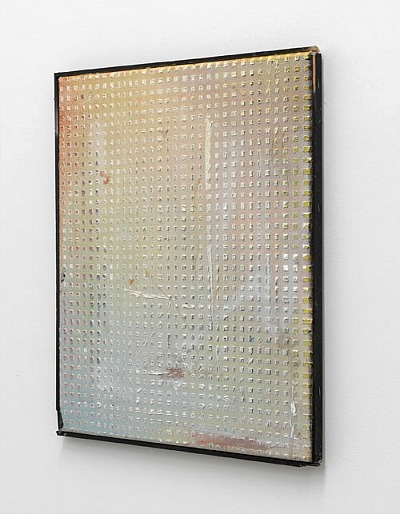
The above image, was the first encounter I had with his work and it's a sly and gentle teaser. You're not real sure what you're looking at, but there does seem to be some realness and craft involved.

Visit his Website and be blown away!
.
 His work plays with perspective, his compositions are simple and subtle and the more you see, the more amazed and appreciative you become. Be sure to watch the video (on his Website) to get a sense of the realitiy of the making of these incredible mind-teasers.


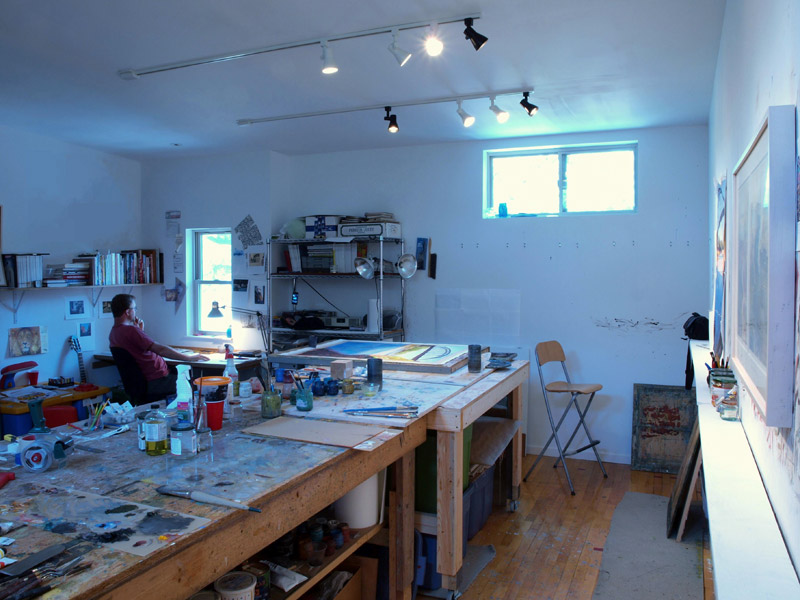
This is the back-side of a piece titled "Picnic Table" and gives you a bit of a clue as to what's going on.

An interview at Glasschord helps you understand his train of thought and a visual and verbal visit to his studio at ArtSake rounds out the picture.

Picnic Table image is from onartetc.


Monday, July 02, 2012

Ah Oeuvre


If you're a fan of Dan Miller, you're in for a real treat. I was visiting Lorraine Glessner's Blog, this morning and her Post had 3 examples of Dan's drawings and a link to what I would describe as a momograph of his work. For anyone interested in Dan Miller, you know how frustrating it is to find examples of his work. Well, this should hold you for a while. Enjoy.

Image is from stoppingoffplace.


Saturday, June 23, 2012

Crashing Gestures


That's exactly the feeling I had upon seeing this inspiring piece by Georges Noel. And even though it was done in 1984, it looks fresh and classical at the same time. Visit his Website to see more by this talented Frenchman.

Caroline Dimnik Contemporary Fine Art has some surprising images.
(click on Artists and then Georges Noel)
And if you're like me and still haven't gotten your fill, there's always good old Google Images.


Painting In The Studio


Please enlarge to Full Screen

Eddie Martinez is one of several young artists I've been watching to see where they go and what they'll do. His work reminds me (to a certain degree) of Basquiat's street-art-into-fine art, oeuvre. So I'm anxious to see how he does commercially and critically and does he have what it takes for a long successful career.

I'm sharing this with you because there are several special moments, both visually and vocally that ring true and apply to all artists. A second viewing will bring home even more simple truths.

You'll find fifteen images of his work at Peres Projects and you can visit his Website.


Monday, June 11, 2012

Words and Mark Making


Have you ever noticed or thought about just how little it takes for our minds to perceive an image. With only a few brush strokes or marks, our brain will leap to conclusions and "paint a picture", so to speak.

This particular work has plenty of effort put forth, but it still reminded me of  the ease with which we can evoke meaningful visuals and conjure moods. Adding words, a more advanced form of mark making, complicates things and slows us down while we search for concrete clues and meaning.

The artist is Gunter Ludwig and the image is from a really great Blog called just another masterpiece.

You'll find a nice slide show of his work HERE.


Sunday, June 10, 2012

Redacted Paintings


Jenny Holzer's show of new work immediately brings to mind the work of Kazimir Malevich, which is oh so refreshing in this day and age. These seem quite a shocking turn in a whole different direction from her usual language based oeuvre, but closer inspection reveals bold and thought provoking content..

The image is from Contemporary Art Daily. You'll find more images and text explaining the show at Art Observed and of course, many more images at Spruth Magers Gallery.


Friday, June 08, 2012

ReWriting Graffiti


You've probably heard me say it before; in watching the street art/urban art and graffiti movements, you see all of what's come before in the fine art world, percolating down through and into these Kids works. It's almost as if they're taking classes at night, learning about all the "schools of art" that have shaped our modern-art world. The four works in the above image from his Show at Doze Collective, are by Dale VN Marshall aka "Vermin". If this fascinates you, follow the links to see the three different styles of his work and read about his very fascinating story.

You can start by visiting his Blog. Please take the time to go back though his Blog - there are some amazing works, but they were just too big to put in this post.

 Here's more from Doze and a flickr photostream.

Image from Doze.com.


Wednesday, May 30, 2012

Words and Images


Brigitte Waldach works in red and combines words with images of people. The compositions are spare and powerful. I've always appreciated Eastern Drawings with their calligraphy, but here we can actually read the text. So we have a bit of a different spin on a very old eastern tradition of combining images with words.

Visit her Website for more images.

Image is from Archblog.


Thursday, May 24, 2012

Good Spot, Bad Dot


If you weren't aware of  Damien Hirst's Spot Paintings extravaganza this spring, then you really need to get out more (on the Internet). There was so much ink spilled over those simultaneous shows that I'll not rehash it. At any rate, it was very refreshing to hear that he now has a show of works that are representational, with dots that he actually painted himself. I really was anxious to see these new works, but try as I might, just can't bring myself to like them. And it has everything to do with composition and balance. A few are nice enough, but so many of the paintings just seem to be off balance and feel uncomfortable.
See for yourself.

This image is from his current show at the While Cube Gallery.

You'll see some great installation shots  HERE, which gives you a better feel for the show.


Tuesday, May 22, 2012

The Importance Of Dots


Using dots as a compositional tool; that's exactly the thought that struck me upon seeing "Butterfly (La Primavera)" by Tat Ito. This painting so easily does it's job and makes it crystal clear that something as simple as a dot(s) can accomplish what's necessary when making a work of art.

This image is from his current show at the Joshua Liner Gallery.


Sunday, May 20, 2012

Crossing The Line


I hope you can bear with me for just a moment as I dig up a very old and what might seem like a totally irrelevant and useless word; Pointillism. Lets start by saying that the prefix "point" in pointillism brings to mind something small, like the tip of a small brush, when in fact, Pointillism (the movement) was all about individual brush-strokes. So if we could broaden our vision just a bit to include larger brush-strokes and then allow abstraction as well as realism or representation, you'll find that we're in a new place.
And this is what I'd like you to consider as you look at the paintings of Judith Murray. Pointillism was/is a very good idea (way to think about painting) and through the years many an artist has proudly picked up this banner to carry it forward. But what goes unnoticed are all the artists who have joined the ranks and don't fly the colors. If you read any text about Judith's work, no one it talking about her breaking down the picture into brush-strokes (which would be pointillism). Instead they're using all the current verbiage that one uses to promote a female painter. And she deserves any and all the praise and promotion they can give her. But I'm just hoping that now, what you'll see in her lovely paintings is the fresh, reincarnation of Pointillism; a wonderful old tool that still works well.

Be sure to visit her Website.

Enjoy the video.

Sunday, May 13, 2012

A Show of Text Paintings


There's a show up, at the RH Gallery called Text In Progress and it's my kind of show. They have  a couple of the usual suspects like Leon Farrari and Fiona Banner who bring some familiarity to what might be a whole new experience for some gallery-goers. I can't tell you how excited I get when I encounter a painting that you can read. For me there's just something magical about that.

Other than Leon's work, I was most intrigued by Joe Hardesty. The image is from his Website.

The sticky question for me is whether this is word-text paintings or language-based art. . . . .


Tuesday, May 08, 2012

Beautiful Scribbles

or should I say elegant tangled lines ?


detail of Bon Chance 2


I've had the distinct pleasure of making the acquaintance of Allen C. Smith aka Denny Smith and watching his oeuvre expand and mature. It wasn't that many years ago that he was working plein-air on a 15ft "painting" of sailboats at the Keuka Lake Art Fair in Hammonds Port, NY. and a friendship was born. Back then he was using wax crayons and both the subject matter and the medium seemed meant for each other. Later he began a series of geo-minimal compositions using graphite; these were amazingly elegant and luxurious and a quantum leap in seriousness. But alas, these too had inherent problems which lead him to experiment with yet, other mediums.  He's currently working in water color and his Bon Chance Series is particularly interesting because he's using both rules and chance to determine the colors, lines and layers in these grid-oriented compositions. Once, during a studio visit he explained how that when he sets his mind free and gets into his "zone", that the motions of his painting are akin to scribbling - unplanned gestures that are free of intellectual guidance; and the enjoyment he fells when the physical supersedes the mental. Obviously it's all under control, and it was special to be privy to this artist's inner guidance system.

Visit his Website to view his Portfolio.

You'll find studio and installation shots on his Blog.


Image is a detail of a painting and from his Website.


Wednesday, May 02, 2012

Hybrid Painting


Paintings by Wendy White are at first confusing; like you've stumbled into a nether world where urban art, studio practice and signage have all collided. But it doesn't take long to feel comfortable with these surprisingly sane and sensible works where language is front and center.

Her Website is straight-forward and easy to navigate.

Image is from a pieces about her in The L Magazine.


Sunday, April 22, 2012

Night Flight


Time for a short mental break.

How wonderful for us to have visuals like this so we can reconsider our political, social, religious and personal positions; it's always good to see the bigger picture.


Spotted on Billionaire Boys Club Blog.

Wednesday, April 11, 2012

E for effort


Justin Quinn's compositions, using only the capital letter E, are amusing and relaxing. Researching was frustrating because his "madness" is never fully explained - there are teaser words and phrases, but nothing to help you fully understand what and why. His work is particularly fascinating for me because it crosses into that shady area where the mind tries to read the picture because it recognizes letters.

View his work at Cain Schulte Gallery  and  Conduit Gallery.

Image from Art & Bob.


Saturday, April 07, 2012

Pop-Urban


Michael Bevilacqua has it "goin-on" when it comes to capturing the pop-ness of today's urban art. For me, this painting is just a newer version, Rosenquist. Mike can surely paint and some of his very early compositions are even tender, (as evidence Here and Here) but he really hits his stride in this first decade by giving us a clean and clear vision of what main street-urban is, in it's relationship to mainstream fine art.

He's represented by the Gering & Lopez Gallery where you'll find a nice overview of his work.


More images.


Thursday, April 05, 2012

Just A Few Words


There seems to be some bumping going on within the walls of certain galleries these days, between works by fine artists and urban artists and you'd be hard pressed to tell the difference. It's almost a melding of the minds in this visual pursuit, and yet the different camps retain their own dogmas; proud to carry their banner of words into this brave new world of fashionable expression.

Read about Zavier Ellis' work Here or visit his Website.

In the end it's really nothing more that school-taughts and self-taughts trying to cross some "line".


Image from ichinichiichinin.blog45.fc2.com/blog-entry-475.html


Sunday, April 01, 2012

The Frame's The Thing


When seeing the Andrew Wyeth Show at the Philadelphia Museum of Art several years ago, not only was I enraptured with the paintings, but completely overwhelmed with the effect that each unbelievably special custom frame had on the work; elevating it to a more magical level.

In my own practice I've been through several episodes of how to more perfectly frame a new painting and I can tell you that framing from scratch is pretty tricky and yet oh so rewarding. There's noting like a "artist's frame" to compliment a work.

And so it was a smile-smearing moment to come across this french art collective named KOLKOZ who, for this particular project make the frames (themselves) the work of art. How DID they do it so well ? haha

You'll find more examples Here.

Saturday, March 31, 2012

Chapel of Art


As you study art, artists and their paintings, inevitably you have a desire to visit their studios; the environment in which those works came into being. It's a chance to see the bigger personality between the person and the picture (painting).

This evening I came across a site called TENWORDSANDONESHOT - it's exactly that; one shot of the artist's studio, their answers to ten, one-word questions and a link to their site. It's quite addicting to be able to peek into all these diverse personalities and oeuvres. Of all the possibilities for an image to share, I chose this one of Christopher St.Leger (from page 40) because he's looking out the window (?) and it just struck a chord with me.

Enjoy. 

Thursday, March 29, 2012

Shiny Square Dots


Amazing how some things just grab you: I would really like to have this. Somehow it hovers between object and painting; medallion and rough sketch. This feels homemade and elegant at the same time and it looks like the raised squares are reflective, which adds yet another layer of intrigue and interaction.

 But alas, this beauty by Michiel Ceulers is a one-off. Don't even bother to Google him; it's a tremendous disappointment. To add insult to injury, his Website only has b&w images of his work . . . . .

This image is from the white hotel, where you can get lost perusing all the amazing artwork from different artists,  genres and time periods.


Monday, March 26, 2012

The Language Of Painting


Language-based painting can mean different things and there are many trains of thought about how one could incorporate words/language into a painting. I've always found it fascinating that lines can bring to mind an image (of a person or thing) and just as easily cause us to try to read (when we perceive words). Either way it's wonderful to see how differently artists build their compositions.

Anne-Marie Cosgrove chooses to use language itself as the basis for her abstractions. The effect is tantalizing as we try to read the work. She speaks about her style in this video and you'll find more paintings at her Website.

Image is from Center On Contemporary Art Blog.


Saturday, March 24, 2012

Postmodernizing, Pointillism


This may not be the most beautiful example of Jennifer Bartlett's work, but it gives you a good introduction to how she thinks. We have an image broken down into individual dots and then it's then further reduced with a negative grid. Jennifer takes the whole notion of pointillism and turns it inside out and then revisits it from several different angles; even using short lines to the same effect. If this is not making any sense, simply click on this Google Image Search link and as you slowly scroll down you'll see how she goes from realism to pointillist strokes to dots, dots with words and beyond; the variations are a bit mind numbing and she has my utmost respect for pursuing these trains of thought.

Locks Gallery has a nice overview of her work.

Image is from bombsite.


Monday, March 19, 2012

Intellectual Scribbles


Jonathan Lasker in his studio in New York from Lars Bohman Gallery on Vimeo.


   I won't say that the paintings of Jonathan Lasker are an acquired taste, it's just that they seem so simple, even cute at first.  It takes a little while to fully appreciate what's happening on the canvas and in his head. If you'll watch the video, it's time well spent and you'll come to understand and appreciate his interesting and thoughtful oeuvre. Notice how even his small sketches are thoroughly well done and could be immediately framed for show.

He's well represented by several galleries and some Google Image Searching will show you the breadth of his career.

Please click on the Lars Bohman Link under the video to see works from the 80's which will just blow your mind.


Wednesday, March 14, 2012

Autism Speaks


Reporting on the Art Fairs in NYC this week is finally winding down and I came across this gem by Dan Miller. To be sure, there was a lot of great art to be seen, and an even greater amount of ridiculous junk with high price tags. But knowing that this particular piece was made by someone with Autism makes you rethink a whole lot of  things. He's "represented" by Creative Growth, where you'll find some answers to your questions.

Much more of his work HERE.


Image from Art Critical.


Wednesday, March 07, 2012

Artchitectural Drawing


Lebbeus Woods loves to draw and his drawings are real works of art that focus on architecture. This statement seems rather inane until you see his body of work and feel the power of the stories they tell. This piece is my favorite because it not only has the architectural flavor, but brings to mind crop circles and modern art.

This image is from a good Post about him (with images) at Hyperallergic.

To see the show and more images, go Here.


Wednesday, February 29, 2012

Drawing Your Dreams


There are people who can draw and then there are people who make amazing things. When Julian Kreimer paints realistically, he calls them "Observations". So when you see his abstract paintings and drawings, at first it's hard to reconcile the two, quite different styles. In this thoroughly enjoyable studio visit-Video by Gorky's Granddaughter, the answers are funny, thought-provoking and inspiring. Enjoy !

This image is from his Website.


Thursday, February 23, 2012

Much More Than Dots


Peter Schuyff uses dots, circles and combinations thereof (and other shapes) to hijack his compositions. These pretty little disruptors have a charm all their own, coaxing us to reconsider how things work in the picture plane.  This image is from the Self Portraits, at his Website and he also does the same kind of thing in the Drawings On Drawings Series. But then he wanders off in other directions; or so it seems. My impression is that he's just teasing us with simple complexities: plumbing any deeper meaning is up to us.

You really should do a little research before coming to any conclusions. There's some very beautiful work out there, not shown on his site.

If you were wondering what makes him tick, watch this video for an unusual bit of entertainment.

Wednesday, February 15, 2012

Blob-Dots


Charlotte Smith goes beautifully batty when doing her dots. Some paintings are restrained and serene; others are full-on assults to the senses. I won't even try to explain the works with stacked dots of paint; you can see that and others, Here (keep clicking right)

She's represented by, and this image is from Cris Worley Gallery where you'll find more paintings. To see her more traditional works, go Here.