Sunday, October 26, 2008

Photographic Pointillism

.
If there is such a thing, Michael Zacharias seems to be exploring it. Visit his Website and you can read about the concept, which sure sounds like pointillism to me.
.


The image, "Bulldozer" 2006, Lambda print mounted on aluminium, 125 x 125 cm, is from his page at Artreview.com where you can see 10 examples of his work.

It's great to see these younger artists revisiting pointillism and bringing fresh input to an important genre. Suddenly, pointillism seems postmodern.

What is a lambda print ? - Go here and here.

Tuesday, October 21, 2008

Big Fancy Dots

.
It's always great to "meet the artist", or in this case see who he is. And this is a great first impression. Meet Donald Traver. .


This image is from the First Thursday Gallery Openings in San Francisco,May '05 by Art Business.com. There are 4 installation shots of the show. This is a site I check frequently to see what's happening, Gallery Exhibition-wise in San Fran. Check out their main site and read all the great, helpful, encouraging articles.

To see images of work by Traver, you'll want to go to the Gregory Lind Gallery. Incredibly, they only have 4 examples of his work on His Page, so make sure you click on the two links to his previous Exhibitions at the bottom of the short Bio to see a wider range of his oeuvre.

.

Monday, October 20, 2008

Colour Cards & Phrases

.

This is such a simple concept and so straight forward that it boggles the mind. You have one of those "I coulda done that" moments - but you're really glad she did it cause she did it so well.
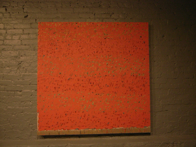
This is the work of E A Byrne and the above image and detail is one of her Art Phrase Colour Cards; a fantastic series that you really should check out. The top image and detail is from her page at Re-Title. Page one has 8 images from this series and page 2 has 8 images of other work. And incredibly, there's no information at all about the work there.

To read about her concept you'll need to go to either her page at Saatchi Online. where they also have the images of the work in this series, or to her Website where you can also view her other series and projects.
In general, when reading Artist's Statements and writings about their concepts, one needs to wear a pretty tall pair of boots. But this really is just fun and simple and good looking.

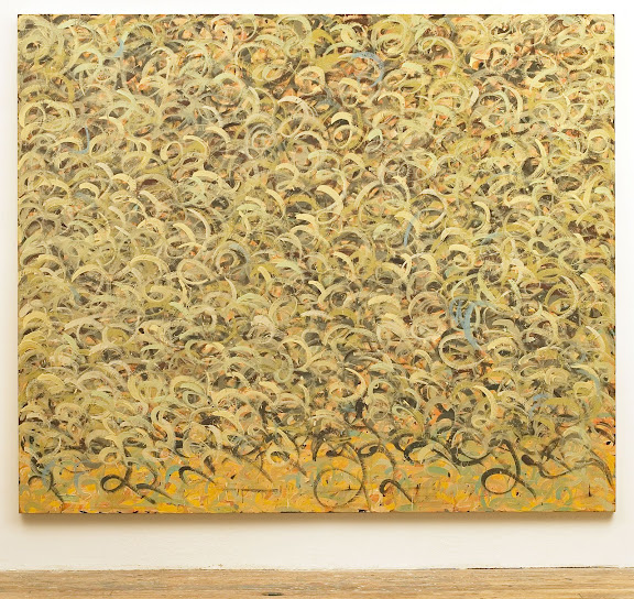
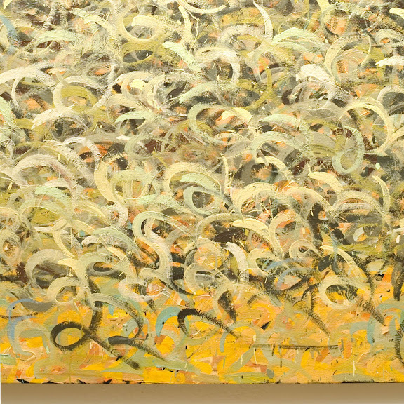
Both the middle and bottom images are from her page at Saatchi Online.


.

Sunday, October 05, 2008

Painting By The Numbers

Or rather, painting with numbers.

Joseph Woolridge.


At least a year or so ago I came across the work of Joseph Woolridge on re-title. Did a post about his work and was happy to hear from him. Since then it seems he's dropped from the radar. So it was a pleasant surprise to come across a review of an exhibition of his work at the Five Myles Gallery in Brooklyn in May/June o 08. The image is from Shift. Great article, good review.

Joseph makes his paintings with numbers. He paints numbers.
Really. Usually with the number 2.


This is one of several images he sent me and is my favorite. Below is a close-up.


Pointillism, Divisionism, DOTS

.
Seems like there's a missing link here. We're all familiar with the first two terms, but when you enter the realm of just Dots, it's wide open; there are no parameters.


Came across this lovely image of "For Bernard Jacobson", 1979 by Howard Hodgkin at the Government Art Collection, UK. Aside from his loud simple abstracts, he's know for painting his compositions with the support in the frame so that his painting encompasses the entire thing. I hadn't really thought about his doing dots before.

Pointillism and Divisionism were very focused genres that delt with realism and it's abstraction using dots. When it comes to doing abstract pointillism or abstracts with dots, there's no cohesive approach among artists. It's completely wide open and each artist brings their own craft and mentallity to this area of expression.

.

Saturday, October 04, 2008

A Painting of Words

.

Even though this is what I search for all the time, there are still moments when I sit back and am just a little amazed that we're to the place, artistically, where we can do a painting with just words. Instead of realism or abstraction, the composition and content is completely and all about words/letters..
The works shown here are by Thierry Alet.
Can't tell you a thing about him; it's all in French. But I did want to show you a couple of images of his work - because, unfortunately you can't find these images on the site that hosts them. Go figure.
It's fantastic how these paintings draw you in. They're like a mystery that must be solved. We see recognizable letters and what seem to be words and so we try to get meaning from it. I'm sure these are French. But he does do English, as in the Dream Series.

Images are from the H. Heather Edelman Gallery.

Impasto Pointillism


How do you pick just one ? All his paintings are bright and pretty.
The image is of "Landscape(Blue)", by Kuno Gonschior from his Web site.
.

Friday, October 03, 2008

OK !


Now I'm "feelin it" and am ready for bed. Yee Haw !
Yup, I can live with this now.
I really don't know what I'm doing with this html thing. So far the changes have taken and nothings blown up or disappeared. I'm happy with the look, so it's time to move on and get to bed before 3 in the morning.
There's a very long version of how I worked in this furniture warehouse down in Georgia. It was an absolute mess - the kind of mess where you need to take "before" pics. Anyway, I transformed the place into an actual functioning, clean, organized warehouse - no mean feat !!! And here I am standing in the very last section that needed attention.
This is the kind of feeling I have right now - of accomplishing something against all odds. Perseverance is a really cool thing.

Thursday, October 02, 2008

Just Not Feelin' It Yet


This is Sam Reveles and both images are from the CRG Gallery. Although they put a much better spin on it, to me he's just a big happy scribbler. And I see it as just that - somebody having a good time and making something pretty. Sometimes I'm really glad I didn't go to college and get my head filled with all that other stuff; glad that I can see it just like the average working man and appreciate the shear physicality of it.

This last year I've really come to appreciate that annoying question that common folk tend to ask when encountering an abstract or contemporary work of art - "What does it mean ?" I've tended to take for granted all my reading and studying and how it's helped me to understand the why of it all and forget that without that information some paintings can look downright silly, even preposterous. And even though it always boils down to weather or not you personally enjoy the work, I've come to understand that it's an honest question that deserves an honest simple answer. Yes there are reasons for paintings being important and it's helpful to have that information so that one can appreciate an artist's work on different levels.


Sam is also represented by Dunn and Brown Contemporary where they have installation shots from his exhibits.

.

Wednesday, October 01, 2008

It Ain't Over Till . . . .

.
This has been quite an experience ! Who knew ??
And this is how my mind looks now. . .


A while back I came across a wonderful Blog called Beta Blogger For Dummies which is a tremendous resource for anyone interested in blogging! There have been many ideas on the back burner and finally I decided to take the plunge. After following the instructions on his blog to change to a three column template I set about tweaking all the variables I could; and wouldn't have been able to do it without out some extensive reading of his different posts over the course of a couple days. But here we are !

The main purpose was to bring more organization and sense to my side columns. So now, everything about the blog and blogging is on the right and all the artists whose work you can view by clicking on their names, are on the left. When starting this blog, everything was abstract calligraphy to me. You'll notice some new headings now in the left column - these will fill out as I move artists into the appropriate category.

Image is from Cheimread, where you'll find more wonderful pics and installation shots of work by Otto Zitko.

.

New Beginnings For A Better Blog

Five hundred and some posts later I feel like it time to bump things up a notch. The goal is to add a third column and make this blog a better research tool. I've been questioning several things about this blog for a while now and wondering when and how to make some adjustments. Without boring you with the details, lets just say that I'd like to take this in two or three directions at once. So I hope you'll bear with me, cause this is what my brain feels like right now.


Looks like we've got a Cy Twombly Jr on our hands here. This is Philip Maltman and the image is from NuMasters.com. You can rest assured I'll be doing a thorough post on him in the near future and work out a compairison between HIM, Kikuo Saito and Cy Twombly.