Saturday, November 29, 2008

Philip Maltman

It's been about 5 or 6 years now since I first came across the work of Cy Twombly. I remember the amazement; the disbelief that someone could have that sort of freedom and be such an Art Star. I guess that I was so used to the regular completely color filled canvases of AB EX that this sort of thing seemed so new(to me) and radical. For a month or so I would stay up nights searching for any image or info about him. I was totally enamoured with and mesmerized by this free, wild style of gobs and smudges and writing and drips and gesture; which brings us to a discussion about the work of one very talented, Philip Maltman.


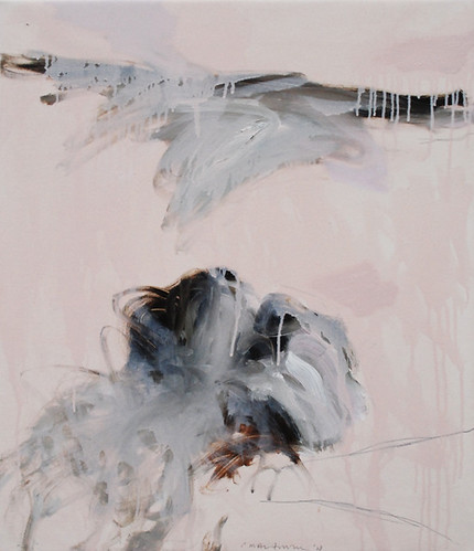
One could be forgiven for presuming, at first glance, that this was the work of Twombly. But in a minute one realizes that this is neither Twombly nor a look-a-like effort. Philip Maltman is his own man and in complete control of his very honest oeuvre. These beautiful gestures and colors are his alone. I was hard pressed to find one or two images to post that would best represent him. His oeuvre is definitely not formulaic and at times wide ranging. Upon finding Mr Maltman's work on the Web, I searched everywhere, trying to find more examples and information and when finally I was able to contact him, he generously responded. The question I pressed him with was - Just exactly how do you go about doing what you do ? He's well represented on the Web and I had already read several of his "Artist Statements", but I wanted to know what made him pick up a brush and go about painting the way he does in layman's terms.


Here was his straight forward response:
"Philip Maltman - Notes on Painting October 2008
It always begins with looking. A beach, a landscape, a garden, a table littered with natural objects, things which I regularly photograph. I print images and draw selected sections. These are pencil and watercolour sketches which are like a “loosening up” or training session. I do not deliberately use these as preliminary sketches. I will occasionally exhibit them but more often than not they remain in sketchbooks to be scanned from time to time as “aides memoire”.
In the studio I will look at the photographic images say, a group of stones, shells, seaweed with sunlight reflecting off interspersed pools of seawater.
I will choose a colour for the ground anything from white through greys to pinks and purples to black. This ground can be dependent on the colour of sand in the original, or maybe sampled from the original digital photograph with Photoshop which can throw up interesting surprises.
Occasionally as in a recent landscape based picture, the whole ground was painted pink because a couple of patches of light in a distant field were pink. Preparing grounds, which are always one colour, is an ongoing activity. Experiments in colour are also made without reference to source material.
Back to the beach then, I will paint the stones, shells, seaweed, and light in broad strokes, not descriptive detail, using oil paint. While it is still wet I will very quickly work into each area of paint with my fingers aiming to destroy the figurative element of the image and create an abstract “equivalent”. This has to work first time so there is a bit of the Zen Calligrapher’s practice in psyching oneself up ready to pounce. But of course if it doesn’t work I will modify with washes of white spirit, sometimes bitumen is introduced with some diluted oil to colour it. Usually I allow the liquid paint to run vertically to further destroy illusions of pictorial space.
I am aiming at a flat surface with coloured marks which might evoke a feeling of the original image although not in a figurative sense.
Next, using amongst other drawing materials, pencil, oil pastel and wax crayon I will improvise a sort of skating across the surface of the work highlighting, circling, scribbling and generally drawing into and around the paint. Words, letters, and numbers are always a temptation at this stage but I find it difficult to compose and position areas of text.
I will often acquire maps/charts of the areas that I am working on so numbers and letters can be “legitimately” incorporated. I feel that I need an overpowering non-sentimental reason to introduce what I feel is essentially an entirely separate art form (writing) and the reason is rarely there.
Single letters are more abstract, signs and symbols which usually refer to objects from the original image are used along with the letters and numbers from the charts.
These devices are used to make the surface of the painting reflect an existence which has innumerable layers of invisible waves, rays, signals, gases and creatures; imperceptible causes and effects; constant changes in light, sound, air pressure, weather - Life!
Everything is buzzing with atomic vibration therefore painting can never be still. That said, I can be persuaded by the work in progress to slow down and add/subtract marks, washes words and colour.
I participate with paint and I love its movement. I feel a strong relationship with all my materials and whilst they do not always co-operate they definitely participate like a group of dancers (Contemporary Ballet).
When a painting is finished or stops it is as if the dancers are exhausted, what’s done is done and can never be repeated exactly. But we will, of course, try to do it all again tomorrow!
"

.

He may be on the other side of the planet, but it feels like a discussion over tea. I was already a fan, but after reading this I saw his work in a better light; it made more sense and had more depth, more meaning.

You'll want to visit all the links below because all the works are different and you can see just how he leans in different directions.

Axisweb

Rowley Gallery

Piersfeetham Gallery

NuMasters

Escape Bar & Art (scroll to the bottom of page)

Flickr

And here's a real treasure trove; Maybole.org - 10, Paintings 1, Paintings 2 & Paintings 3

Friday, November 28, 2008

Contemporary Post Modern Abstract

.
It wasn't all that long ago that I discovered the captivating work of Anselm Reyle. To be sure, he made an impression on me and I've kept an ear and eye out to see where he was going, ever since. Seems he's doing real good lately; what with pieces coming up at auction and fetching six figures and now he's on the cover of Art Review for December.
So it was a real treat to come across the slide show of his current exhibit titled "White Earth" at Almine Rech Gallery.

I started this post thinking I could explain or at least introduce his work to you. But in lining up some links and seeing his expanded oeuvre, I'll let the work speak for itself.

He's represented by Gagosian Gallery with 16 great images and was also in the group show; Yayoi Kusama, Steven Perrino, Anselm Reyle (wow, 3 of my favorites) in Mar/April 08. And he was part of another fantastic group show in Sept/Oct 07; Grotjahn, Hirst, Parrino, Reyle, Richter. (Be sure to click on the View Work on the LEFT side of the page.)
Here's an interview with Reyle and here's an article about his work going to six figures.

The image is from and article about Reyle in ARKEN.
You'll want to visit their site and read their articles on other artists.

Wednesday, November 26, 2008

Contemporary Eastern Calligraphy

.
Calligraphy as art has a long, beautiful history on the other side of this planet. To us, that word usually means wedding invitations or business cards and not much more. But over there . . .
A little research on the web will open your eyes to a whole different appreciation of Eastern calligraphy.
.


This untitled work by Reza Mafi (Iranian, 1943-1982), sold for $134,500 at Christies international modern and contemporary art October 30, 2008 at the Jumeirah Emirates Towers Hotel. Browse through the catalogue and get the art flavor of another part of the world and you'll also see how importantly calligraphy figures into things. Christies Lot Note is tremendously concise and informative and for me, inspiring. And what I found surprising was the prices for works by artists we've never heard of. It rather puts things into perspective.
You can see other wonderful and different works my Reza Mafi at AskArt.
.

Thursday, November 20, 2008

What Makes Art !?

.
This is a bit unusual for artwork on my blog. As I search the Internet, my interests are focused on works with writing or pointillism. But I just couldn't pass up on posting this image.
It reminded me once again that ART happens. And when it does it is wonderful and special and well, it just makes life better. I'm convinced that you can't teach art. You can show people how to do this or that or copy a style, but real art comes into existence by itself. Yes we can plan for it and work in that direction, but I'm still convinced that real art somehow just comes together.
.


This piece just bowls me over. It's hilarious ! But it really does work somehow and is strangely beautiful and poetic. Just a few simple lines and some color and you have this transfixing personality that captivates you. The image, "Blossom" 1996 by MARGOT BERGMAN is from her page at Corbett vs. Dempsey. She has some other great pieces and you'll want to read about how she works, but this really is a masterpiece.
.

Tuesday, November 18, 2008

Strange Lookin Dots

.
If you've been following the fall auctions in NYC you're aware that the painting, "No. 2" by Yayoi Kusama went for $5,794,500 at Christies PostWar & Contemporary Evening Sale Wednesday night. (I'm not showing it here because the pics just don't do it justice.)
Always a fan, it stirred me to Google her again.


She is THE original Dot Woman and any research you do will keep you entertained. I was pleasantly surprised by the works they have at MOMA . One piece in particular, titled "Accumulation of Stamps, 63." 1962 (one of sixteen they have in their collection), really caught my eye. Most are quite different from any I've seen before.

The Roslyn Oxley9 Gallery has some exellant images of her infinity nets and you'll want to check out the pics from her Exhibits there.

Image is from Artinthepicture.

.

Monday, November 17, 2008

Dots - PERIOD !

.
The human imagination is a funny and fascinating thing. There never is an end to all the surprises in store from our compatriots on this planet, especially when it comes to creativity.


Here we have a work by Alexandra Dipple; a collage actually, of dots and full stops from discarded newspapers. The image, a detail from "Dots and Full Stops, no.2", is from re-title. You'll want to visit them to see the other images of her work and read the explanations that go with them. It's all very fascinating. Another place to find her work is at the Axisweb site.
.
.

Friday, November 14, 2008

Drawing Dots

.
Why would anyone draw a dot ? I guess someone who was taking their time and considering simple things.
Alan Green wanted to make "ordinary paintings" and in many of his works he uses dots to accomplish that. But what may have seemed ordinary to him is quite special and sometimes spectacular.
.


The image, Drawing No. 3642003, mixed media on paper 50 x 34 cm is from Annely Juda Fine Art. You'll want to read their statement about him HERE, to get a handle on just what he was about. What's rather fascinating is that the works from the 70's are all squares. The Tate has 25 images from that period, that I find quite boring.

What really turns me on are the images of his work HERE. I think some of these are just stupendous.

Note; It's unfortunate that although the images in the last link are from Annely Juda Fine Arts, you can't access them from their site to see a larger version. If you find a way, please contact me.

Monday, November 10, 2008

Pointillism In The Future

.
The men who ventured into Pointillism certainly had no idea how far that idea would go or that it would continue on into abstract painting as well. This painting, "Divide Me to the Left" 2008, Acrylic on Canvas 40" x 30" by Ed Kerns, reminds us of those early influences and how they affect the artists of today.


Take the time to study Pointillism and Divisionism and you start to see how pervasive it became in so many of the artists of that time. To me this painting represents an area where pointillism and abstraction seem to dance with each other. The subject matter in this particular piece seems to be dots, but not so much so that it would be strictly pointillist.

As you pan across the great spectacle, that is Art, you find so many artists who dabbled in pointillism at some point in their career. There's a certain something that gets addressed when you break down the subject matter into points or dots.

You'll find more images of Ed's work on his page at the Seraphin Gallery.

Go Here to see his collaboration with Elizabeth Chapman.

Image is from Seraphin Gallery.

.

Wednesday, November 05, 2008

Words As Paintings

It's hard to believe that this painting is made up entirely of words.
You don't hear much about language based painting these days, and yet the more you look the more you'll see that it's pervasive. Graffiti, our current avante garde is certainly language based and everywhere you look, artists are incorporating words into their works. It's not at all uncommon to find main stream artists whose work deals solely with the written word or text.


Henry Mandell is just such a one and his works are at times stunning and certainly thought provoking. His oeuvre is all about language and painting, but with a twist.

The image, "Orosius" 2008, ultrachrome pigment on canvas is from his Website. You really do need to see it larger to find out what's going on here. In my book, Henry gets big bonus points for providing such large images to study. At his site, when you click on an image from the gallery of partial images, a new page opens with the complete image. Click on it again for a massive enlargement.

Read his Artist Statement to get a handle on what he's doing. He's also represented by Miranda Fine Arts and you can read a shorter take on his Statement there and view their images.

Sunday, November 02, 2008

Painting Words & Math

.
It's always good to see art work in a context. There's more validity to what's happening on the canvas and it's fun to see how others react to work that we like.
.


The image is from a Show titled Happy In My Madness at the Sherborne House.

Andrew Crane is not afraid to scratch, scrawl, write or use text in his paintings. But he does it quite judiciously and his works have a certain refined restraint and calmness to them. What makes me happy is that he's not formulaic. So it's hard to pick just one painting to represent his whole oeuvre. I like the way he thinks about words, letters and numbers. Click on his name to see even more work.

.