Monday, November 10, 2008

Pointillism In The Future

.
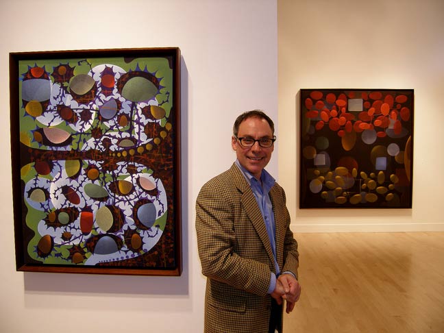
The men who ventured into Pointillism certainly had no idea how far that idea would go or that it would continue on into abstract painting as well. This painting, "Divide Me to the Left" 2008, Acrylic on Canvas 40" x 30" by Ed Kerns, reminds us of those early influences and how they affect the artists of today.


Take the time to study Pointillism and Divisionism and you start to see how pervasive it became in so many of the artists of that time. To me this painting represents an area where pointillism and abstraction seem to dance with each other. The subject matter in this particular piece seems to be dots, but not so much so that it would be strictly pointillist.

As you pan across the great spectacle, that is Art, you find so many artists who dabbled in pointillism at some point in their career. There's a certain something that gets addressed when you break down the subject matter into points or dots.

You'll find more images of Ed's work on his page at the Seraphin Gallery.

Go Here to see his collaboration with Elizabeth Chapman.

Image is from Seraphin Gallery.

.

Wednesday, November 05, 2008

Words As Paintings

It's hard to believe that this painting is made up entirely of words.
You don't hear much about language based painting these days, and yet the more you look the more you'll see that it's pervasive. Graffiti, our current avante garde is certainly language based and everywhere you look, artists are incorporating words into their works. It's not at all uncommon to find main stream artists whose work deals solely with the written word or text.


Henry Mandell is just such a one and his works are at times stunning and certainly thought provoking. His oeuvre is all about language and painting, but with a twist.

The image, "Orosius" 2008, ultrachrome pigment on canvas is from his Website. You really do need to see it larger to find out what's going on here. In my book, Henry gets big bonus points for providing such large images to study. At his site, when you click on an image from the gallery of partial images, a new page opens with the complete image. Click on it again for a massive enlargement.

Read his Artist Statement to get a handle on what he's doing. He's also represented by Miranda Fine Arts and you can read a shorter take on his Statement there and view their images.

Sunday, November 02, 2008

Painting Words & Math

.
It's always good to see art work in a context. There's more validity to what's happening on the canvas and it's fun to see how others react to work that we like.
.


The image is from a Show titled Happy In My Madness at the Sherborne House.

Andrew Crane is not afraid to scratch, scrawl, write or use text in his paintings. But he does it quite judiciously and his works have a certain refined restraint and calmness to them. What makes me happy is that he's not formulaic. So it's hard to pick just one painting to represent his whole oeuvre. I like the way he thinks about words, letters and numbers. Click on his name to see even more work.

.

Sunday, October 26, 2008

Photographic Pointillism

.
If there is such a thing, Michael Zacharias seems to be exploring it. Visit his Website and you can read about the concept, which sure sounds like pointillism to me.
.


The image, "Bulldozer" 2006, Lambda print mounted on aluminium, 125 x 125 cm, is from his page at Artreview.com where you can see 10 examples of his work.

It's great to see these younger artists revisiting pointillism and bringing fresh input to an important genre. Suddenly, pointillism seems postmodern.

What is a lambda print ? - Go here and here.

Tuesday, October 21, 2008

Big Fancy Dots

.
It's always great to "meet the artist", or in this case see who he is. And this is a great first impression. Meet Donald Traver. .


This image is from the First Thursday Gallery Openings in San Francisco,May '05 by Art Business.com. There are 4 installation shots of the show. This is a site I check frequently to see what's happening, Gallery Exhibition-wise in San Fran. Check out their main site and read all the great, helpful, encouraging articles.

To see images of work by Traver, you'll want to go to the Gregory Lind Gallery. Incredibly, they only have 4 examples of his work on His Page, so make sure you click on the two links to his previous Exhibitions at the bottom of the short Bio to see a wider range of his oeuvre.

.

Monday, October 20, 2008

Colour Cards & Phrases

.

This is such a simple concept and so straight forward that it boggles the mind. You have one of those "I coulda done that" moments - but you're really glad she did it cause she did it so well.

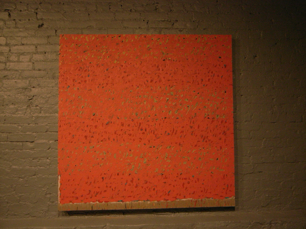
This is the work of E A Byrne and the above image and detail is one of her Art Phrase Colour Cards; a fantastic series that you really should check out. The top image and detail is from her page at Re-Title. Page one has 8 images from this series and page 2 has 8 images of other work. And incredibly, there's no information at all about the work there.

To read about her concept you'll need to go to either her page at Saatchi Online. where they also have the images of the work in this series, or to her Website where you can also view her other series and projects.
In general, when reading Artist's Statements and writings about their concepts, one needs to wear a pretty tall pair of boots. But this really is just fun and simple and good looking.

Both the middle and bottom images are from her page at Saatchi Online.


.

Sunday, October 05, 2008

Painting By The Numbers

Or rather, painting with numbers.

Joseph Woolridge.


At least a year or so ago I came across the work of Joseph Woolridge on re-title. Did a post about his work and was happy to hear from him. Since then it seems he's dropped from the radar. So it was a pleasant surprise to come across a review of an exhibition of his work at the Five Myles Gallery in Brooklyn in May/June o 08. The image is from Shift. Great article, good review.

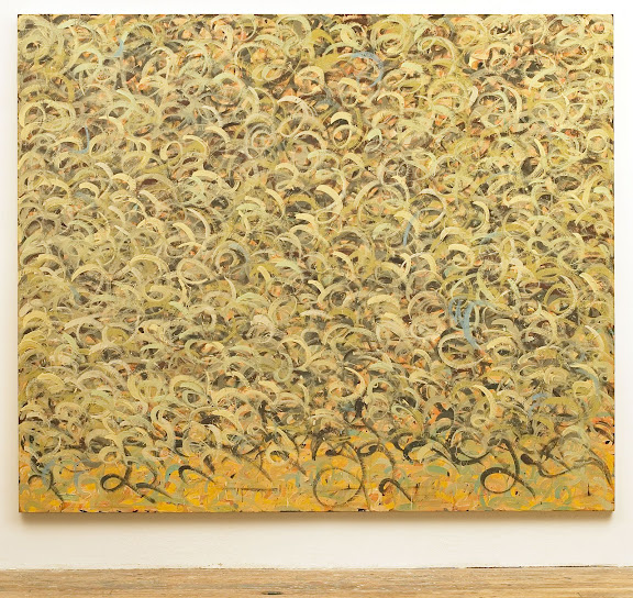
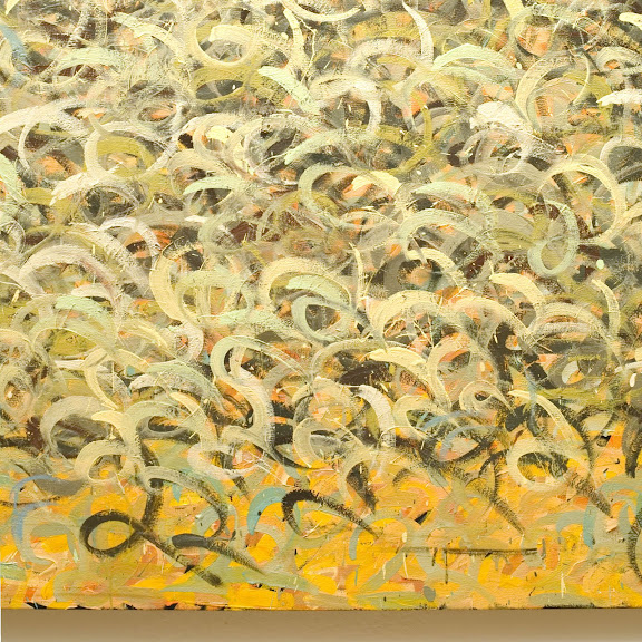
Joseph makes his paintings with numbers. He paints numbers.
Really. Usually with the number 2.


This is one of several images he sent me and is my favorite. Below is a close-up.