Sunday, March 30, 2008
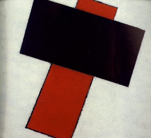
Russian Crosses
This is a tremendous joke.
On the left we have Kasimir Malevitch's Suprematist composition which sold for $17,052,500, (includes the buyer's premium) at Phillips New York: Thursday, May 11, 2000.
.
On the right - "Kitchen Suprematism" series (IV) 2005, photowork is by either Viacheslav Mizin or Alexander Shaburov, of the Blue Noses Group.
image from das artes plasticas
.
Saturday, March 29, 2008
Kuno Gonschior
Periodically an artist will strike me as somewhat of an hero. Sometimes it's as simple as the look on their face that describes their personality. (For all of the reading and research, we still tend to stereotype all artists.) Other times, it's because of the life they've lived and the experiences they've had. Mostly though, it's their persistence in a particular oeuvre that impresses me.
Click thumbs for largr image.
There are many artists who fit into this category, but it just so happens that I was looking at Kuno Gonschior's work today and was struck by the absolute consistency of his work through the years.
The painting on the left "Untitled", seems to be less about pointillism than it is about attaching bits of paint to the canvas. Done in 1959/60, it's the earliest example of his work on his website, which is all in German. This is about as straight forward as you can get; attach bits of paint (just one color, using a palette knife, probably) to what looks like raw linen. But it's well done and it works. Fast forward to 2006 and the painting on your right, titled "Landscape (Magenta)". He's absolutely made a lot of progress; the colors are enough to make you swoon. But he's still completely true to that first concept of attaching paint to canvas and gives us so much more than just 2 dimensions.
Some of us need to try this and that, searching for answers to questions we don't even know. It's just a real pleasure to see someone who found an answer and so eloquently reiterated it through the years.
Both images are from from his website Here's the link to his "Works" page.
You'll absolutely want to go here and take the beautiful virtual tour of his show at Galerie Frank Schlag & CIE.
Then go here to see another great virtual tour of his exhibit at Museum für Konkrete Kunst.
And you'll want to see the powerful new paintings (some from 2007) from his show that just ended March 8th at the Stux Gallery, New York.
Thursday, March 27, 2008
Italian Zest
Remember a while back when we presented all the Italian Artists? Well, I've still got a file or two left with some great work to share.
This is Agostino Ferrari. If you go Here, you'll see examples of his work from 1960, up though the 90's. It's quite an interesting visual journey. There's not a whole lot of images to weigh you down. In fact there are few enough to simply act as a teaser. But we can see his progression of ideas and experiments and finally he settles in on calligraphic gestures with a dynamic and minimal palette in the 80's.
These two works are 20 years apart and quite dramatic and different in their approach. The bottom image, "Evento F" 1986, is from Caldarelli.it where you'll find those examples of his works through the years. What a grand and theatrical presentation of calligraphic gesture ! It's as though we're looking at 3 actors on a stage. He's definitely come to a place where simple gesture can be and is the sole content in a work.
Then, 20 years later in 2006 he makes (top image) "Oltre la soglia", acrylic and sand on canvas. This image is from Artantide, where you can see lots of images of his work. You can click for EN (English), but it doesn't translate everything. So we're still left in the dark about his motives. But in this red piece, it's looks as though he's taken a red piece of paper with bold calligraphy, torn it and then arranged those pieces into a collage. It's a sly bit of Trompe L'Oeil, but it's still all about the calligraphic gesture that provides the basics for the painting.
.
Another site you'll want to check out that has many images is Centrosteccata. Although it's all in Italian, you'll thrill to seeing the zest and gusto and vibrancy he presents through his work; becoming a real virtuoso with calligraphic gesture from the 80's, clear through to 2006.
Tuesday, March 25, 2008
Alexander Echo
.
It was about five years ago that I discovered Cy Twombly. Awe-struck and amazed, for the next month it was an unending search for all things Twombly. A very similar feeling came over me when I came across this next artist, whose purpose behind his oeuvre is so very different. The bad news is that there's a limited amount of his work on the Internet. The good news is that he has a Website. So without further ado, and with great enthusiasm, I would like to introduce you to Alexander Echo.
.
Visit his Web site, where you can check out his paintings and drawings. See 7 more images of the artist and his work at Stefan Falke's Eye. (blog)
And one more great image Here.
Image is from his web site.
Monday, March 24, 2008
Thomas Ingmire / Brion Gysin
.
It was a pleasure to go though the artists listed under Ab/Cal, on the right side of my blog and to find artists whose works were similar. In fact, what became very clear is that as these many different artists experimented with letters, words, calligraphy and cursive, gestural mark making, they tended to do the same types of things; found the same answers.
Here we see Thomas Ingmire's "The Edge Of Light" (1998), 18” x 24,” acrylic on handmade paper mounted over canvas, on the left. On the right is Brion Gysin's "Germinations" 1959, Ink on paper.
As you can see, they seem to have come to the same conclusion in these two works that are 39 years apart. It looks like they're trying to show us the movement, the activity of writing, but without producing any specific letters or words. Writing without results. When we speak and when we write there's a natural cadence or rhythm involved. I believe that's what they're trying to show us here - a picture of the inertia of the act of writing.
The image of Ingmire's work is from his on-line Gallery
The image of Gysin's work is from Creativetime.org.
.
Wednesday, March 19, 2008
Artist At Work
Studios can be large or small and come in different shapes, with varying lighting situations. But regardless of all the variables, it's the artist who "makes" the studio. The artist's personality and endeavours truly give the place it's persona.
This is the studio of Bob Garlitz. You'll want to visit his blog Chromenos and check out his paintings and paintings in progress.
I don't know what the view is from the window - but I'll bet he's happy to have one. Daylight cannot be replicated.
Monday, March 10, 2008
Hassel Smith
Never heard of him ? You're not alone. Thanks to a post on Modern Art Notes we're now aware of this important artist. I for one, will be doing more research. Paintings like this inspire me no end.
.
More images here and here and an article here.
.
More images here and here and an article here.
Image is from the San Jose Museum of Art.
Sunday, March 09, 2008
Christmas Again
We had this fantastic ice storm; actually, that's not the best way to describe it. There was lots of wet, clingy snow and then rain and then freezing temperatures - repeat several times and then the sun comes out the next day and it's all sparkly and spectacular. The common complaint that could be heard everywhere is that the pictures people took just did not convey the beauty we were seeing and surrounded by. Every branch, trig or anything that ice could form on - it did. And it's been that way for a couple of days. Everything just sparkles in the sunlight.
Wednesday, March 05, 2008
comPairs
These two beauties were painted 23 years apart by two distinctly different artists.
The painting on the left is by Daniel Mendel-Black and was painted in 2006, the very same year that the painting on the right, by Gerhard Richter, sold at Sotheby's November Auction for $2,368,000.
You certainly can't help but notice the squeegeed, quasi rainbows in both; the vertical canary yellow, the addition of thick black strokes and some goldfish orange. They both even have the thin undulating green lines.
If you go to Daniel's page at the Mandarin Gallery and view the 12 works there (of which this is one), you'll soon come to the conclusion that he's not copying anybody. He's found his own oeuvre and is pursuing it fully.
But it certainly is interesting that Daniel's painting "#69" from 2006 should have so many elements that are similar to those in Gerhard's "Maria(544-4), 1983 - Image from Artnet.
Monday, March 03, 2008
Pointillism Now
As we all know, there was a time when pointillism was used in portraying realistic scenes and the purpose was for the eyes to blend the colors, rather than the artist's brushes. Now, fast forward a hundred and twenty years and we have artists who thoroughly celebrate the individual points or dots of color. No need now for a realistic scene - we have plenty of photographs and Google Earth for that. Now we can appreciate the simple, basic dots of color just for themselves. And there are more than a few artists who explore the many possibilities of using dots, whether random or organized, as the sole content in their work. So there's not a lot to figure out here. This is simply eye candy. A mood maker, actually; soothing and beautiful.
This is Heidi Van Wieren. Try as I might there doesn't seem to be any good biography or info about her. There are lists of her accomplishments and education, but nothing else of personal interest. She was born in '73.
Her paintings are about capturing and holding light. And she uses the unorthodox material of Elmers Glue. Elmers glue and ink in layers. Whoever took the photos did a great job of allowing us to see exactly how her paintings "work". They really do hold the light and have a wonderful depth to them.
But I'm particularly captivated with the random dots as content. There's just this easy, comfortable, relaxing presentation of an atmosphere filled with floating dots of color. No political or emotional messages to unravel. No hidden meanings or art historic resemblances. Just a simple quietness; a soothing comfort. There's a pop, zen quality to them.
The above image is "Sky One III", Elmer's Glue/PVA & Ink on Panel 28" x 24", 2004.
Top image is "Green Scene I", Elmer's Glue/PVA & Ink on Panel 38" x 46", 2001.
And both images are from the Roy Boyd Gallery in Illinois. They have 19 examples of her work.
Klein Artworks has an installation shot of her 2003 show and 10 examples of her work.
And Margaret Thatcher Projects has 5 examples of work from 2006.
Sunday, March 02, 2008
Finding Oil
The price of gas is currently on all our minds and affecting our budgets, so I thought I'd post this pic and link to other pics of a new oil platform by Statoil.
Go HERE , take your time and snoop around - you will be amazed.
Click on Topics and then Pictures.
Image is from www.Statoil.com.
Subscribe to:
Posts (Atom)