Sunday, September 28, 2008

Odds & Ends


Just one of those nights when I should've gone to bed early, but instead I had a nice big Dagwood sandwich, a bowl of soup and some dessert. So now it's time to rummage through my tremendously packed Favorites file folders and see just what I've got in there.


This first item is just too cool - bone china that looks like used beer cans. You could do a whole post about this and all the different meanings. The image is Lei Xue "Drinking Tea" 2004-2008, bone china - from the Art Addict.


Next up:
This site was just a neat slice-o-life, for me. Lots of pics of different people with their Jack Russell Terriers. Pretty cool site - Suave Stylin Jacks


And finally,

this is what it looks like when a plane breaks the sound barrier by going faster then the speed of sound.


Image is from Randy Ward's Site.


.

Saturday, September 27, 2008

Abstraction and Words

.

The freedom of abstraction is amazing, sometimes overpowering. Maybe adding words or text to the work is like a lifeline to reality; some way to still keep in touch with the here and now, as we let loose and set out on our painterly adventures. For me it's the reason to keep on painting. I mean, sometimes when doing an abstract we get a little lost and suddenly, finding our way through to a conclusion seems like work. But staying focused on the thought that I want a work to convey (even when I make the words difficult to read), is what becomes the bigger/better reason to tackle the painting and enjoy myself as well.
.
The image is of a painting from Carmen Pombo's Web Site.
.
Click on image for larger view.
.

Tuesday, September 23, 2008

Indecipherable

.
I've had several discussions with other artists about freedom of speech as one of the components or facets of language based painting. And although it sounds a bit nutty, I feel that the ultimate level of free speech comes when no one can understand what you are saying. Suppose there is something quite personal that you wish you could get out, but actually it's nobodies business. Well, there's a wonderful release in being able to express yourself without the fear of recrimination, by just simply making those written thoughts unreadable.

.
This would be a good time to revisit the work of Alexander Echo. And by the way, he doesn't subscribe to this train of thought at all. But seeing his work again, reminded me of how the written word, so powerful and meaningful, can also be presented in ways where only the beauty of the designs of the letters, or the gestures themselves become the focus and there is nothing for us to do but to appreciate the act and the marks of writing.


I'll let you do your own homework on Alexander Echo; he's got quite an interesting oeuvre and his Web Site will answer your questions about his fascinating work.

And he's also one of my Art Heroes.

Both images are from his web site.

.

Sunday, September 21, 2008

Calligrafist Goes Dotty !

.
.

For those of you who are new to the blog, I don't consider myself to be an art critic and I certainly don't have thorough information on any of the artists presented here. This blog is about the fact that I'm interested in Painting that is about writing or language. In searching the Internet daily for these things, one encounters a lot of useful information and images which can be shared, saved and discussed here. This has been a fascinating and rewarding journey as I encounter artist after artist who have briefly visited this particular oeuvre or made a career of it.


Ulfert Wilke was interested in calligraphy and language and you'll find the sweetest, concise little bio of him at The Daily Palette; which is the source for the above image - "009", ink on paper . Six Hand Six also has a short bio that sheds even more light on this artist's train of thought and they have plenty of images here, to whet your appetite for more. The middle and bottom images are both from Six Hand Six.


I'm immediately drawn to works with words and letters, etc. and am completely curious as to the how and why the artist would pursue that genre.
But Ulfert just plain blows my mind. How did he get from calligraphy and abstraction to doing dots ?? On the right is a piece titled "Celeste" 1964, that I at first thought might be the work of Alan Maddox, because of the X's. It's a huge departure from his other works. And then you have the beautiful painting at the bottom titled "Ryoanji Black #5" 1964. This excites me tremendously. Why ? Because my oeuvre is language based painting and abstract pointillism (dots).
I wonder what the connection is between the calligraphy and the dots? You can see examples of his B&W calligraphic brush paintings here. TIn looking through images from different sites, there's really nothing that looks like an evolutionary middle ground. The closest thing might be his "Zero through Nine" lithograph series at Tamarind. For me this bottom painting is just a wonderful, simple thing of beauty.
Calligraphy and dots - who knew ??


.

Saturday, September 20, 2008

Say What You Mean - Mean What You Say

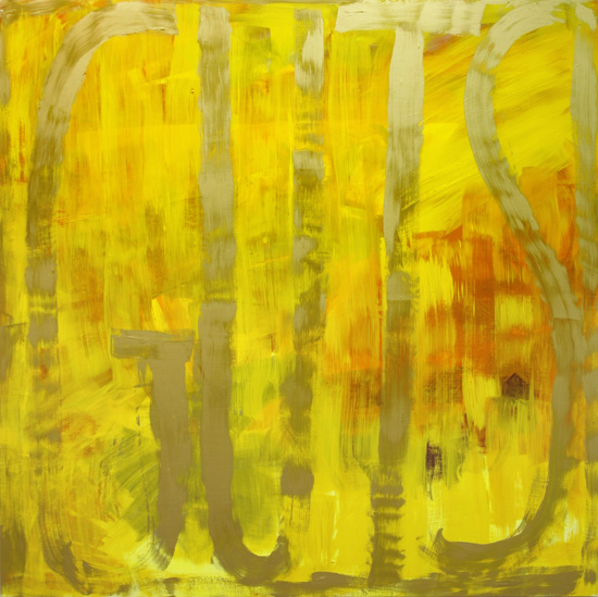
Male or female, you gotta love an artist with Guts; which is the title of the yellow painting below. That image is from the Bellwether Gallery where you'll find 42 examples of her work and other information. You can also see installation shots of her Sept, 07 Exhibit there, titled' Dana Frankfort: DF. There's nothing like seeing paintings in the context of a gallery or home to get the gist of their full personality. And that's something that comes across in each of her works.


Dana Franfort is all about painting one word, two or three words or sometimes even a very short phrase. But that is the sole content, composition and construction of her paintings. Well, and then there's the color; loud, bright, "hello, I'm over here" color. The truly amazing part of her oeuvre is how she manages to create a feeling of atmosphere, a dept of field.
There's a short interview at Artslant that gives pretty quick insight into her oeuvre. It's pretty straight up and straight forward. At the end of the interview she's asked which artists "challenge and excite you, both historically and currently?". The seven artists that she lists is quite a surprise. Check it out.


The bottom painting, titled "BELIEVE BELIEVE BELIEVE" 2006 Oil on canvas on panel, 45 x 84 inches, is from her Nov, 2006 Show at the Kanto/Feuer Gallery.


She's also represented by the Inman Gallery.


.

Thursday, September 18, 2008

Disco Daze

So there I was at J.C. Penny's at the Mall, heading for the cookware section to look for a rice cooker/steamer. In front of that section was a display of items that were 50% off. I didn't notice it at first, but the music was good. And since there were no other customers to distract me, I just kinda settled into snooping around and found a couple of real bargains.


But then it DID hit me. They were playing disco music from the good years when the genre was at the top of it's game.


aaaahhhhhhh Happy dancing music. No irony or anger; no explicit sex or politics, no threatening gestures - just good music: and in Penny's, no less !!!


I didn't even have to close my eyes to go back to those wonderful, full tilt, happy, dancing times. Working as a Light Man in a BYO after hours Disco had it's perks, to be sure; but mostly it was the music and the dancing to it that was the real high.

.

Monday, September 15, 2008

Onward & Upward

It has been very challenging and rewarding to revisit an older painting and rework it. I probably shouldn't even be admitting this, but my current project is to go through my library of paintings and find the mediocre or failed ones and rework them. The usual solution seemed to be dots because almost anything can become an abstract background for abstract pointillism. But I may have seen the light and come to the knowledge that I don't have to totally obliterate the background with dots. These latest works have contained fewer dots and allowed the former painting to participate more strongly and find a new staring role.


Here we have "The Difference Between Cherries" (and I never did really care how that was going to be interpreted) which I signed and dated in 2004. Back then it was just the 3 cherries and the calligraphy and for the longest time I tried to pretend it was finished and had some merit. Finally, facing the truth that it was just another lame attempt, I put it away.

Three days ago I got it out and hung it in the new "the next painting to get redone spot" under the window in the hall; so it's the first thing I see in the morning when exiting the bedroom. The brown "structure" started out as the tracing of a shadow. The leaping figure is from the next morning's NYTimes and is so representative of how I feel about being able to attack this painting anew. I don't have the answers yet on how to finish it in this new style, but that's just fine. And if I need to let it rest some more and work on something else, that's beautiful too.

Please watch this video about Jose Parla. I've got a whole file brimming with info and images that I've been saving for a post that will do him justice. But this vid is pertinent now because of what he says at the very end. So many artists will tell you to paint every day - I like what Jose says; when he's not inspired, he just waits.


.

Sunday, September 14, 2008

Historical Mysteries

Vivienne Koorland's paintings all look antique and not in a good way. They don't hold their "age" well. Upon closer inspection, it's not just the appearance that's ominous, but the content as well. She's the daughter of a Holocaust orphan and many of her paintings are about the many finer points of that catastrophe.

Some of her works have realistic or representational features in them that are quite meaningful and historic.

But as is always the case, I'm drawn to the indecipherable writing. Maybe it's the puzzle/mystery thing that our mind wants to figure it out. There are some words to be found here and there and so we keep searching. It would be great to know the personal story behind each work.

Here are some links if you like to pursue her work further.

Artthrob

Google Images

6 images at Columbia edu


.

Wednesday, September 10, 2008

Contemporary Calligraphic Painting

Or should we call it Pwrainting ?

The big question of the day is - whats the best term to use for identifying work like this??
Your suggestions would be appreciated.


The image above is a work titled "Magical, Luxurious Denial".
.
When changing my tiny studio around I saw it was possible to set up some lights for picture taking. So this afternoon I further advanced the situation to facilitate any future photo sessions.
.


Been wanting to get some better pics of a couple paintings and also see how well my setup was working. But try as I might, it seems everything is off square just a touch. Guess I need to see if my camera has a grid or find one that does.
The above painting is titled "Roundelay" and contains a word puzzle in the top portion that reads - Certain that you were part of the play.


It's always fascinating to watch people react to this painting titled "Moron". Some try their best while others doggedly pursue it until they solve the poem correctly, which is - "Everyone is just exactly where they're supposed to be." And then, amazingly, there are those who will get it in a snap.
.

Tuesday, September 09, 2008

Illegible Writing

That's exactly what draws me to this piece by Thierry Alet. Letters are recognizable and it feels as if there are words and something's being said - but it's all "Greek" to me and so we're left with the decorative and conceptual aspects only. There are no pine trees or lighthouse here, but only written language for us to ponder.


The image is from Madinin-Art , not an English speaking site; and there lies the problem in understanding his oeuvre. The only English explanation of his work that I could find is at AICA-SC.org, with two beautiful images in blue from that exhibit. There's a small amount of info, but enough to get a glimpse into the concept and process.

Monday, September 08, 2008

More Collage

Going through my "Favorites" tonight: got so many folders packed with artists I want to share that it's past ridiculous. And each day as I check my Art news sites & Art Blogs, I'll come across an artist and save him to my Favorites for later. Tonight is one of those Laters.
By the way I am totally loving my Google Reader. Not everything works well on it (I gotta see pics !), but when you have over 50 Blogs to stay on top of - it really helps a LOT !

OK, back to art.
This is Emilio Lobato and the painting, titled - "Monument of a modern Ruin II" is from his page at the Nuart Gallery where they have a whopping 48 examples of his work.

By the way, I sent them an email letting them know that by far, they were about the best Gallery Web Site I can ever remember coming across. When it comes to concise and easy navigation and all the stuff you want right there without a bunch of clicks - well you've just got to check out their ARTISTS page !!

But I digress: it's all about Emilio !

He's also represented by the William Havu Gallery were you'll find many more of his oil and collage works.

.

Sunday, September 07, 2008

Contemporary Collage


Collage is a wonderful medium to work in. Everything is ready made, so it's just a matter of pick and choose. The colors are pre made and the lines already drawn and the realism done. This sets you free to be creative in many new ways.


In the Statement on her Web site,
Suzi Matthews explains how she came to do collage and why she specializes in numbers, words and especially letters. It's always a fascinating story how artists come to their oeuvre and hers is quite simple and compelling. Who knew that specializing in the collaging of text could be so varied and beautiful.


Both images are from the Morgan Lehman Gallery which has a dozen images of her work and in the BIO, she expands just a bit on how her oeuvre has changed.

Another source for images of her work is Apartment Therapy. Although there are a couple from the other sites, it's worth the click to see the different ones.

More and more I've come to notice that some artists use a process and try to intuitively allow that process to evolve into a work of art. Instead of projecting or producing a preconceived idea, they let the medium and the process take them on a journey.

.

Saturday, September 06, 2008

Change Of Mind

.
I've got the painting from the last post hanging above my desk and also have the picture from that post as my background on my PC. It's always great to find a point where you can take a break to study and enjoy a painting mid-stream. It feels done for the moment, so I guess I'll just let it rest and once again pack my mind with images of work by other artists.
.

This is a wonderful little piece from 2006 by Mohammad Muhraddin and is from ArabsArt where they have 13 images of his work.

If you like abstract, collage and indecipherable writing, this is your man. Please visit his website. His Gallery groups his work into phases and it's quite incredible how he's gone from realism in the 50's to his current oeuvre (2007). An amazing artistic journey.
.

It's always fascinating and enlightening to see how other artist's work morphs through the years. Very encouraging. This afternoon I rearranged my file of pics of my own paintings historically rather than alphabetical by title. Lots of good memories and great food for thought.

.

Thursday, September 04, 2008

YEE - Haaaaaa

Just exactly how many different ways can you change the furniture around in a room that's 10' x 12', that serves as a bedroom, workout room and studio ??? - Way more than I ever thought possible. This last attempt is working splendidly and I'm going forward on a painting that I've stared at for several months. My little "studio" actually feels spacious. So it's a real joy to get "back to it".

And there's always been this pesky situation of - where do I photograph my paintings. A friend had given me 2 stands with 4 great lights - but, where to put them; in my room, of course, and that's where they are now and please consider this a test pic.


As per my oeuvre; there's an abstract background, then a few representational items (the house shape with the heart and the dark house shape with the orange roof), then the writing, then covering the whole thing with tracing paper, then a piece of second generation collage (which I see as a chimney with brown smoke coming out), then more writing and now the pointillist process. . . . . . . .
Please click image to enlarge.

The original poem underneath is;
.
If I told you that (said) I loved you
and didn't mean it,
would you cry
or wouldn't you notice,
because the words felt so good
in your gullet of a heart.
.
- - which is pretty rough.

So when the title came to me out of the blue - "Claims Of Insufficiency" - and I wrote it on the painting and applied the piece of collage; aaaahhhh

I was able to move on.

Monday, September 01, 2008

Dottillism

.
Periodically I get frustrated with myself; why did I ever start doing dots - why do I continue to pursue that?
And then, out of the blue, I'll come across yet another artist who does dots. A smile will cross my face, a happiness will lighten my spirit and I'll know that it's OK.


This is Alan Green who came to dots late in his career. The image is from, and you can see more of his work at Annely Juda Fine Art.

.