Wednesday, December 31, 2008

Another New Year

A lot of blogs have done their list of impressive Artists or Shows and when the end of the year comes it certainly is a time for reflection and we usually try to say something important.

I've had several thoughts about what to say at this special time, but they seem to dissolve and fade. So I think I'll just remind us that this is a great time to count all our blessings large and small and to resolve to try harder to do those things which we've put off or ignored.

Wishing you all a Wonderful New Year !
.


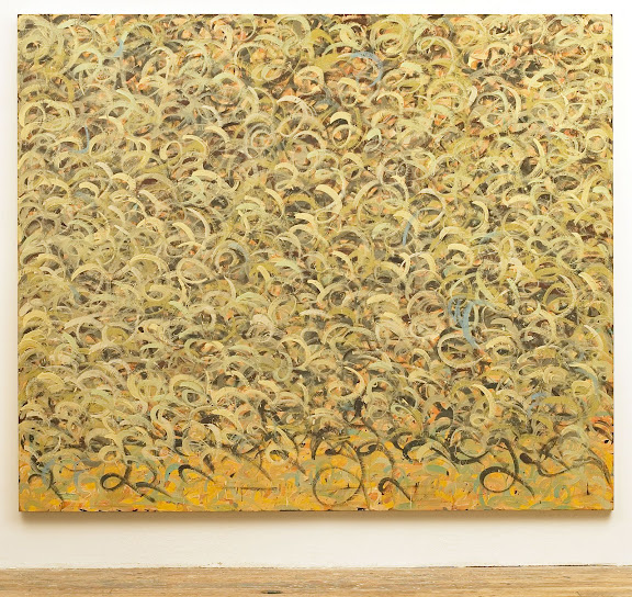
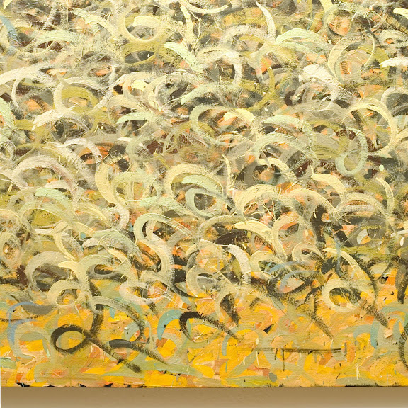
Phillip Allen is an artist I've admired since first seeing his work. What a mind. And ain't it great to be in these postmodern times where artists have the freedom to make work like this ? The image is from his current show "Sloppy cuts no ice" at The Approach Gallery in London, where they so generously provide 20 installations shots of the show.

Wednesday, December 24, 2008

Merry Christmas

One of the many good things about this season is that it brings out a little bit of the child in all of us. With that in mind I'll let you enjoy this video from Vernissage TV. . . . .
.


The artist is Gunther Forg and when seeing these paintings, the child in me wants to paint too.

Thursday, December 18, 2008

Grand Studio

.
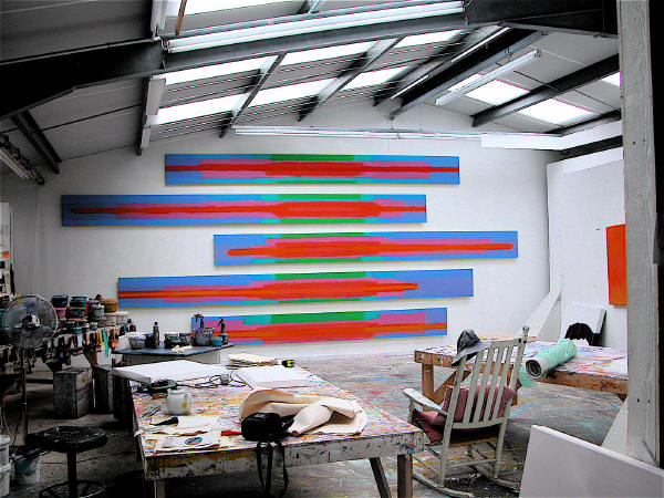
I had never heard of Trevor Bell, but seeing this picture of his studio from an interview at artcornwall, piqued my interest. Though it's not the normal fare on this blog, you'll forgive me for having a soft spot for minimalism and his work, to me, is sort of in that direction.
.

There is not much I can say about the work since I'm unfamiliar with it, but I thoroughly enjoyed the visit to his studio via and courtesy of Art Cornwall. The video is over 9 minutes, so sit back and enjoy your visit.


Trevor Bell from artcornwallvideo on Vimeo. Pictures of his work Here, and Here .

.

Monday, December 15, 2008

Abstract and a Story

.
This painting pretty much grabs your eyeballs by the roots and makes you want a closer look and the colors are about right for this time of year too. Doesn't this make you want to know what prompted her to start writing into her painting ?

.


Marie Evans has a nice Website where she displays 3 distinct styles of painting. The Text Paintings are by far my favorite and hold a lot of promise.

.

Friday, December 12, 2008

Tracing Shadows.

Earlier this year I had contemplated doing a series of "shadow paintings". By that I mean that when the opportunities arose, tracing random shadows on the canvas would produce subject matter, tone and volume. The two premier canvases are still hanging on the wall in a state of limbo. The compositions fascinate me just enough to keep me pleasantly confused.
So it was with piqued interest that I viewed this video from wooster collective. It really is a very good short story, that gives you a peek into one artist's life and his thinking process.
.

Monday, December 08, 2008

Small Dots

.
The long story is that I had torn out an b&w ad from the NYTimes and taped it to my bedroom door. And for about a year I would see this everyday. There were many times when different thoughts about some of the possibilities for turning this into a work of art would gel and then dissipate. Actually, I rather enjoyed it just the way it was. Something very reassuring about this guy sitting in his lofty apartment overlooking Central Park; what with his stone floors and vast window views which he's ignoring while he reads the paper with a cup of coffee - just like I would. (click for larger view)
Well, finally the day came and I affixed this to a 16x20 canvas and proceeded to color it; found a stopping point and started with the dots, when suddenly I realized that I was using all the same size dots. Hadn't I graduated to using dots of different sizes and not completely covering the canvas ? Oh well, guess I'll do just one more like this. And then, tired of strategically applying the colored dots, it seemed to be time for the silver. Before too long, by golly, it was done.
.

Having seen the original "under painting", I'll always look into the painting and find the guy drinking his coffee, sitting at the long counter with the bowl of fruit. I'm continually surprised by the way this painting fascinates me and keeps my attention in spite of the almost haphazard way in which I applied the color and the dots. It was an experiment, of sorts, of trying to be casual; not being to precious with it.
To tell the truth, sometimes I really miss the original (at top) and wonder how else it might have turned out. But I'm at peace with the final product and find myself comfortably staring at it, just like when it was taped to the door. It's titled "Surprising The Angel Of Defeat".
.

Sunday, December 07, 2008

Dots and Gesture

I wonder if the Pointillists ever stopped to consider the flood gates they were opening, simply by deconstructing painting to each bush stroke of color ? At the time, their approach was so very radical, even scientific. That's really quite difficult for us to understand since we're surrounded and bombarded by every imaginable type of visual stimulus.
.


What a beautiful symphony of colored dots, large and small and flourishes of gesture we have here. We've left realism and pointillism way behind. Here in 2008, artists can simply paint their emotions. There are no restrictions, no restraints. It's as if we've finally arrived at a galaxy that used to be far, far away.

This image, "It was as if I had Opened a Door", acrylic and resin on aluminum 28.5" x 26" is by Bernal Koehrsen.

She's represented by the Blue Gallery in Kansas City. See more of her work HERE.

Saturday, November 29, 2008

Philip Maltman

It's been about 5 or 6 years now since I first came across the work of Cy Twombly. I remember the amazement; the disbelief that someone could have that sort of freedom and be such an Art Star. I guess that I was so used to the regular completely color filled canvases of AB EX that this sort of thing seemed so new(to me) and radical. For a month or so I would stay up nights searching for any image or info about him. I was totally enamoured with and mesmerized by this free, wild style of gobs and smudges and writing and drips and gesture; which brings us to a discussion about the work of one very talented, Philip Maltman.

One could be forgiven for presuming, at first glance, that this was the work of Twombly. But in a minute one realizes that this is neither Twombly nor a look-a-like effort. Philip Maltman is his own man and in complete control of his very honest oeuvre. These beautiful gestures and colors are his alone. I was hard pressed to find one or two images to post that would best represent him. His oeuvre is definitely not formulaic and at times wide ranging. Upon finding Mr Maltman's work on the Web, I searched everywhere, trying to find more examples and information and when finally I was able to contact him, he generously responded. The question I pressed him with was - Just exactly how do you go about doing what you do ? He's well represented on the Web and I had already read several of his "Artist Statements", but I wanted to know what made him pick up a brush and go about painting the way he does in layman's terms.


Here was his straight forward response:
"Philip Maltman - Notes on Painting October 2008
It always begins with looking. A beach, a landscape, a garden, a table littered with natural objects, things which I regularly photograph. I print images and draw selected sections. These are pencil and watercolour sketches which are like a “loosening up” or training session. I do not deliberately use these as preliminary sketches. I will occasionally exhibit them but more often than not they remain in sketchbooks to be scanned from time to time as “aides memoire”.
In the studio I will look at the photographic images say, a group of stones, shells, seaweed with sunlight reflecting off interspersed pools of seawater.
I will choose a colour for the ground anything from white through greys to pinks and purples to black. This ground can be dependent on the colour of sand in the original, or maybe sampled from the original digital photograph with Photoshop which can throw up interesting surprises.
Occasionally as in a recent landscape based picture, the whole ground was painted pink because a couple of patches of light in a distant field were pink. Preparing grounds, which are always one colour, is an ongoing activity. Experiments in colour are also made without reference to source material.
Back to the beach then, I will paint the stones, shells, seaweed, and light in broad strokes, not descriptive detail, using oil paint. While it is still wet I will very quickly work into each area of paint with my fingers aiming to destroy the figurative element of the image and create an abstract “equivalent”. This has to work first time so there is a bit of the Zen Calligrapher’s practice in psyching oneself up ready to pounce. But of course if it doesn’t work I will modify with washes of white spirit, sometimes bitumen is introduced with some diluted oil to colour it. Usually I allow the liquid paint to run vertically to further destroy illusions of pictorial space.
I am aiming at a flat surface with coloured marks which might evoke a feeling of the original image although not in a figurative sense.
Next, using amongst other drawing materials, pencil, oil pastel and wax crayon I will improvise a sort of skating across the surface of the work highlighting, circling, scribbling and generally drawing into and around the paint. Words, letters, and numbers are always a temptation at this stage but I find it difficult to compose and position areas of text.
I will often acquire maps/charts of the areas that I am working on so numbers and letters can be “legitimately” incorporated. I feel that I need an overpowering non-sentimental reason to introduce what I feel is essentially an entirely separate art form (writing) and the reason is rarely there.
Single letters are more abstract, signs and symbols which usually refer to objects from the original image are used along with the letters and numbers from the charts.
These devices are used to make the surface of the painting reflect an existence which has innumerable layers of invisible waves, rays, signals, gases and creatures; imperceptible causes and effects; constant changes in light, sound, air pressure, weather - Life!
Everything is buzzing with atomic vibration therefore painting can never be still. That said, I can be persuaded by the work in progress to slow down and add/subtract marks, washes words and colour.
I participate with paint and I love its movement. I feel a strong relationship with all my materials and whilst they do not always co-operate they definitely participate like a group of dancers (Contemporary Ballet).
When a painting is finished or stops it is as if the dancers are exhausted, what’s done is done and can never be repeated exactly. But we will, of course, try to do it all again tomorrow!
"

.

He may be on the other side of the planet, but it feels like a discussion over tea. I was already a fan, but after reading this I saw his work in a better light; it made more sense and had more depth, more meaning.

You'll want to visit all the links below because all the works are different and you can see just how he leans in different directions.

Axisweb

Rowley Gallery

Piersfeetham Gallery

NuMasters

Escape Bar & Art (scroll to the bottom of page)

Flickr

And here's a real treasure trove; Maybole.org - 10, Paintings 1, Paintings 2 & Paintings 3

Friday, November 28, 2008

Contemporary Post Modern Abstract

.
It wasn't all that long ago that I discovered the captivating work of Anselm Reyle. To be sure, he made an impression on me and I've kept an ear and eye out to see where he was going, ever since. Seems he's doing real good lately; what with pieces coming up at auction and fetching six figures and now he's on the cover of Art Review for December.
So it was a real treat to come across the slide show of his current exhibit titled "White Earth" at Almine Rech Gallery.

I started this post thinking I could explain or at least introduce his work to you. But in lining up some links and seeing his expanded oeuvre, I'll let the work speak for itself.

He's represented by Gagosian Gallery with 16 great images and was also in the group show; Yayoi Kusama, Steven Perrino, Anselm Reyle (wow, 3 of my favorites) in Mar/April 08. And he was part of another fantastic group show in Sept/Oct 07; Grotjahn, Hirst, Parrino, Reyle, Richter. (Be sure to click on the View Work on the LEFT side of the page.)
Here's an interview with Reyle and here's an article about his work going to six figures.

The image is from and article about Reyle in ARKEN.
You'll want to visit their site and read their articles on other artists.

Wednesday, November 26, 2008

Contemporary Eastern Calligraphy

.
Calligraphy as art has a long, beautiful history on the other side of this planet. To us, that word usually means wedding invitations or business cards and not much more. But over there . . .
A little research on the web will open your eyes to a whole different appreciation of Eastern calligraphy.
.


This untitled work by Reza Mafi (Iranian, 1943-1982), sold for $134,500 at Christies international modern and contemporary art October 30, 2008 at the Jumeirah Emirates Towers Hotel. Browse through the catalogue and get the art flavor of another part of the world and you'll also see how importantly calligraphy figures into things. Christies Lot Note is tremendously concise and informative and for me, inspiring. And what I found surprising was the prices for works by artists we've never heard of. It rather puts things into perspective.
You can see other wonderful and different works my Reza Mafi at AskArt.
.

Thursday, November 20, 2008

What Makes Art !?

.
This is a bit unusual for artwork on my blog. As I search the Internet, my interests are focused on works with writing or pointillism. But I just couldn't pass up on posting this image.
It reminded me once again that ART happens. And when it does it is wonderful and special and well, it just makes life better. I'm convinced that you can't teach art. You can show people how to do this or that or copy a style, but real art comes into existence by itself. Yes we can plan for it and work in that direction, but I'm still convinced that real art somehow just comes together.
.


This piece just bowls me over. It's hilarious ! But it really does work somehow and is strangely beautiful and poetic. Just a few simple lines and some color and you have this transfixing personality that captivates you. The image, "Blossom" 1996 by MARGOT BERGMAN is from her page at Corbett vs. Dempsey. She has some other great pieces and you'll want to read about how she works, but this really is a masterpiece.
.

Tuesday, November 18, 2008

Strange Lookin Dots

.
If you've been following the fall auctions in NYC you're aware that the painting, "No. 2" by Yayoi Kusama went for $5,794,500 at Christies PostWar & Contemporary Evening Sale Wednesday night. (I'm not showing it here because the pics just don't do it justice.)
Always a fan, it stirred me to Google her again.


She is THE original Dot Woman and any research you do will keep you entertained. I was pleasantly surprised by the works they have at MOMA . One piece in particular, titled "Accumulation of Stamps, 63." 1962 (one of sixteen they have in their collection), really caught my eye. Most are quite different from any I've seen before.

The Roslyn Oxley9 Gallery has some exellant images of her infinity nets and you'll want to check out the pics from her Exhibits there.

Image is from Artinthepicture.

.

Monday, November 17, 2008

Dots - PERIOD !

.
The human imagination is a funny and fascinating thing. There never is an end to all the surprises in store from our compatriots on this planet, especially when it comes to creativity.


Here we have a work by Alexandra Dipple; a collage actually, of dots and full stops from discarded newspapers. The image, a detail from "Dots and Full Stops, no.2", is from re-title. You'll want to visit them to see the other images of her work and read the explanations that go with them. It's all very fascinating. Another place to find her work is at the Axisweb site.
.
.

Friday, November 14, 2008

Drawing Dots

.
Why would anyone draw a dot ? I guess someone who was taking their time and considering simple things.
Alan Green wanted to make "ordinary paintings" and in many of his works he uses dots to accomplish that. But what may have seemed ordinary to him is quite special and sometimes spectacular.
.


The image, Drawing No. 3642003, mixed media on paper 50 x 34 cm is from Annely Juda Fine Art. You'll want to read their statement about him HERE, to get a handle on just what he was about. What's rather fascinating is that the works from the 70's are all squares. The Tate has 25 images from that period, that I find quite boring.

What really turns me on are the images of his work HERE. I think some of these are just stupendous.

Note; It's unfortunate that although the images in the last link are from Annely Juda Fine Arts, you can't access them from their site to see a larger version. If you find a way, please contact me.

Monday, November 10, 2008

Pointillism In The Future

.
The men who ventured into Pointillism certainly had no idea how far that idea would go or that it would continue on into abstract painting as well. This painting, "Divide Me to the Left" 2008, Acrylic on Canvas 40" x 30" by Ed Kerns, reminds us of those early influences and how they affect the artists of today.


Take the time to study Pointillism and Divisionism and you start to see how pervasive it became in so many of the artists of that time. To me this painting represents an area where pointillism and abstraction seem to dance with each other. The subject matter in this particular piece seems to be dots, but not so much so that it would be strictly pointillist.

As you pan across the great spectacle, that is Art, you find so many artists who dabbled in pointillism at some point in their career. There's a certain something that gets addressed when you break down the subject matter into points or dots.

You'll find more images of Ed's work on his page at the Seraphin Gallery.

Go Here to see his collaboration with Elizabeth Chapman.

Image is from Seraphin Gallery.

.

Wednesday, November 05, 2008

Words As Paintings

It's hard to believe that this painting is made up entirely of words.
You don't hear much about language based painting these days, and yet the more you look the more you'll see that it's pervasive. Graffiti, our current avante garde is certainly language based and everywhere you look, artists are incorporating words into their works. It's not at all uncommon to find main stream artists whose work deals solely with the written word or text.


Henry Mandell is just such a one and his works are at times stunning and certainly thought provoking. His oeuvre is all about language and painting, but with a twist.

The image, "Orosius" 2008, ultrachrome pigment on canvas is from his Website. You really do need to see it larger to find out what's going on here. In my book, Henry gets big bonus points for providing such large images to study. At his site, when you click on an image from the gallery of partial images, a new page opens with the complete image. Click on it again for a massive enlargement.

Read his Artist Statement to get a handle on what he's doing. He's also represented by Miranda Fine Arts and you can read a shorter take on his Statement there and view their images.

Sunday, November 02, 2008

Painting Words & Math

.
It's always good to see art work in a context. There's more validity to what's happening on the canvas and it's fun to see how others react to work that we like.
.


The image is from a Show titled Happy In My Madness at the Sherborne House.

Andrew Crane is not afraid to scratch, scrawl, write or use text in his paintings. But he does it quite judiciously and his works have a certain refined restraint and calmness to them. What makes me happy is that he's not formulaic. So it's hard to pick just one painting to represent his whole oeuvre. I like the way he thinks about words, letters and numbers. Click on his name to see even more work.

.

Sunday, October 26, 2008

Photographic Pointillism

.
If there is such a thing, Michael Zacharias seems to be exploring it. Visit his Website and you can read about the concept, which sure sounds like pointillism to me.
.


The image, "Bulldozer" 2006, Lambda print mounted on aluminium, 125 x 125 cm, is from his page at Artreview.com where you can see 10 examples of his work.

It's great to see these younger artists revisiting pointillism and bringing fresh input to an important genre. Suddenly, pointillism seems postmodern.

What is a lambda print ? - Go here and here.

Tuesday, October 21, 2008

Big Fancy Dots

.
It's always great to "meet the artist", or in this case see who he is. And this is a great first impression. Meet Donald Traver. .


This image is from the First Thursday Gallery Openings in San Francisco,May '05 by Art Business.com. There are 4 installation shots of the show. This is a site I check frequently to see what's happening, Gallery Exhibition-wise in San Fran. Check out their main site and read all the great, helpful, encouraging articles.

To see images of work by Traver, you'll want to go to the Gregory Lind Gallery. Incredibly, they only have 4 examples of his work on His Page, so make sure you click on the two links to his previous Exhibitions at the bottom of the short Bio to see a wider range of his oeuvre.

.

Monday, October 20, 2008

Colour Cards & Phrases

.

This is such a simple concept and so straight forward that it boggles the mind. You have one of those "I coulda done that" moments - but you're really glad she did it cause she did it so well.

This is the work of E A Byrne and the above image and detail is one of her Art Phrase Colour Cards; a fantastic series that you really should check out. The top image and detail is from her page at Re-Title. Page one has 8 images from this series and page 2 has 8 images of other work. And incredibly, there's no information at all about the work there.

To read about her concept you'll need to go to either her page at Saatchi Online. where they also have the images of the work in this series, or to her Website where you can also view her other series and projects.
In general, when reading Artist's Statements and writings about their concepts, one needs to wear a pretty tall pair of boots. But this really is just fun and simple and good looking.

Both the middle and bottom images are from her page at Saatchi Online.


.

Sunday, October 05, 2008

Painting By The Numbers

Or rather, painting with numbers.

Joseph Woolridge.


At least a year or so ago I came across the work of Joseph Woolridge on re-title. Did a post about his work and was happy to hear from him. Since then it seems he's dropped from the radar. So it was a pleasant surprise to come across a review of an exhibition of his work at the Five Myles Gallery in Brooklyn in May/June o 08. The image is from Shift. Great article, good review.

Joseph makes his paintings with numbers. He paints numbers.
Really. Usually with the number 2.


This is one of several images he sent me and is my favorite. Below is a close-up.


Pointillism, Divisionism, DOTS

.
Seems like there's a missing link here. We're all familiar with the first two terms, but when you enter the realm of just Dots, it's wide open; there are no parameters.


Came across this lovely image of "For Bernard Jacobson", 1979 by Howard Hodgkin at the Government Art Collection, UK. Aside from his loud simple abstracts, he's know for painting his compositions with the support in the frame so that his painting encompasses the entire thing. I hadn't really thought about his doing dots before.

Pointillism and Divisionism were very focused genres that delt with realism and it's abstraction using dots. When it comes to doing abstract pointillism or abstracts with dots, there's no cohesive approach among artists. It's completely wide open and each artist brings their own craft and mentallity to this area of expression.

.

Saturday, October 04, 2008

A Painting of Words

.

Even though this is what I search for all the time, there are still moments when I sit back and am just a little amazed that we're to the place, artistically, where we can do a painting with just words. Instead of realism or abstraction, the composition and content is completely and all about words/letters..
The works shown here are by Thierry Alet.
Can't tell you a thing about him; it's all in French. But I did want to show you a couple of images of his work - because, unfortunately you can't find these images on the site that hosts them. Go figure.
It's fantastic how these paintings draw you in. They're like a mystery that must be solved. We see recognizable letters and what seem to be words and so we try to get meaning from it. I'm sure these are French. But he does do English, as in the Dream Series.

Images are from the H. Heather Edelman Gallery.

Impasto Pointillism


How do you pick just one ? All his paintings are bright and pretty.
The image is of "Landscape(Blue)", by Kuno Gonschior from his Web site.
.

Friday, October 03, 2008

OK !


Now I'm "feelin it" and am ready for bed. Yee Haw !
Yup, I can live with this now.
I really don't know what I'm doing with this html thing. So far the changes have taken and nothings blown up or disappeared. I'm happy with the look, so it's time to move on and get to bed before 3 in the morning.
There's a very long version of how I worked in this furniture warehouse down in Georgia. It was an absolute mess - the kind of mess where you need to take "before" pics. Anyway, I transformed the place into an actual functioning, clean, organized warehouse - no mean feat !!! And here I am standing in the very last section that needed attention.
This is the kind of feeling I have right now - of accomplishing something against all odds. Perseverance is a really cool thing.

Thursday, October 02, 2008

Just Not Feelin' It Yet


This is Sam Reveles and both images are from the CRG Gallery. Although they put a much better spin on it, to me he's just a big happy scribbler. And I see it as just that - somebody having a good time and making something pretty. Sometimes I'm really glad I didn't go to college and get my head filled with all that other stuff; glad that I can see it just like the average working man and appreciate the shear physicality of it.

This last year I've really come to appreciate that annoying question that common folk tend to ask when encountering an abstract or contemporary work of art - "What does it mean ?" I've tended to take for granted all my reading and studying and how it's helped me to understand the why of it all and forget that without that information some paintings can look downright silly, even preposterous. And even though it always boils down to weather or not you personally enjoy the work, I've come to understand that it's an honest question that deserves an honest simple answer. Yes there are reasons for paintings being important and it's helpful to have that information so that one can appreciate an artist's work on different levels.


Sam is also represented by Dunn and Brown Contemporary where they have installation shots from his exhibits.

.

Wednesday, October 01, 2008

It Ain't Over Till . . . .

.
This has been quite an experience ! Who knew ??
And this is how my mind looks now. . .


A while back I came across a wonderful Blog called Beta Blogger For Dummies which is a tremendous resource for anyone interested in blogging! There have been many ideas on the back burner and finally I decided to take the plunge. After following the instructions on his blog to change to a three column template I set about tweaking all the variables I could; and wouldn't have been able to do it without out some extensive reading of his different posts over the course of a couple days. But here we are !

The main purpose was to bring more organization and sense to my side columns. So now, everything about the blog and blogging is on the right and all the artists whose work you can view by clicking on their names, are on the left. When starting this blog, everything was abstract calligraphy to me. You'll notice some new headings now in the left column - these will fill out as I move artists into the appropriate category.

Image is from Cheimread, where you'll find more wonderful pics and installation shots of work by Otto Zitko.

.

New Beginnings For A Better Blog

Five hundred and some posts later I feel like it time to bump things up a notch. The goal is to add a third column and make this blog a better research tool. I've been questioning several things about this blog for a while now and wondering when and how to make some adjustments. Without boring you with the details, lets just say that I'd like to take this in two or three directions at once. So I hope you'll bear with me, cause this is what my brain feels like right now.


Looks like we've got a Cy Twombly Jr on our hands here. This is Philip Maltman and the image is from NuMasters.com. You can rest assured I'll be doing a thorough post on him in the near future and work out a compairison between HIM, Kikuo Saito and Cy Twombly.

Sunday, September 28, 2008

Odds & Ends


Just one of those nights when I should've gone to bed early, but instead I had a nice big Dagwood sandwich, a bowl of soup and some dessert. So now it's time to rummage through my tremendously packed Favorites file folders and see just what I've got in there.


This first item is just too cool - bone china that looks like used beer cans. You could do a whole post about this and all the different meanings. The image is Lei Xue "Drinking Tea" 2004-2008, bone china - from the Art Addict.


Next up:
This site was just a neat slice-o-life, for me. Lots of pics of different people with their Jack Russell Terriers. Pretty cool site - Suave Stylin Jacks


And finally,

this is what it looks like when a plane breaks the sound barrier by going faster then the speed of sound.


Image is from Randy Ward's Site.


.

Saturday, September 27, 2008

Abstraction and Words

.

The freedom of abstraction is amazing, sometimes overpowering. Maybe adding words or text to the work is like a lifeline to reality; some way to still keep in touch with the here and now, as we let loose and set out on our painterly adventures. For me it's the reason to keep on painting. I mean, sometimes when doing an abstract we get a little lost and suddenly, finding our way through to a conclusion seems like work. But staying focused on the thought that I want a work to convey (even when I make the words difficult to read), is what becomes the bigger/better reason to tackle the painting and enjoy myself as well.
.
The image is of a painting from Carmen Pombo's Web Site.
.
Click on image for larger view.
.

Tuesday, September 23, 2008

Indecipherable

.
I've had several discussions with other artists about freedom of speech as one of the components or facets of language based painting. And although it sounds a bit nutty, I feel that the ultimate level of free speech comes when no one can understand what you are saying. Suppose there is something quite personal that you wish you could get out, but actually it's nobodies business. Well, there's a wonderful release in being able to express yourself without the fear of recrimination, by just simply making those written thoughts unreadable.

.
This would be a good time to revisit the work of Alexander Echo. And by the way, he doesn't subscribe to this train of thought at all. But seeing his work again, reminded me of how the written word, so powerful and meaningful, can also be presented in ways where only the beauty of the designs of the letters, or the gestures themselves become the focus and there is nothing for us to do but to appreciate the act and the marks of writing.


I'll let you do your own homework on Alexander Echo; he's got quite an interesting oeuvre and his Web Site will answer your questions about his fascinating work.

And he's also one of my Art Heroes.

Both images are from his web site.

.

Sunday, September 21, 2008

Calligrafist Goes Dotty !

.
.

For those of you who are new to the blog, I don't consider myself to be an art critic and I certainly don't have thorough information on any of the artists presented here. This blog is about the fact that I'm interested in Painting that is about writing or language. In searching the Internet daily for these things, one encounters a lot of useful information and images which can be shared, saved and discussed here. This has been a fascinating and rewarding journey as I encounter artist after artist who have briefly visited this particular oeuvre or made a career of it.


Ulfert Wilke was interested in calligraphy and language and you'll find the sweetest, concise little bio of him at The Daily Palette; which is the source for the above image - "009", ink on paper . Six Hand Six also has a short bio that sheds even more light on this artist's train of thought and they have plenty of images here, to whet your appetite for more. The middle and bottom images are both from Six Hand Six.


I'm immediately drawn to works with words and letters, etc. and am completely curious as to the how and why the artist would pursue that genre.
But Ulfert just plain blows my mind. How did he get from calligraphy and abstraction to doing dots ?? On the right is a piece titled "Celeste" 1964, that I at first thought might be the work of Alan Maddox, because of the X's. It's a huge departure from his other works. And then you have the beautiful painting at the bottom titled "Ryoanji Black #5" 1964. This excites me tremendously. Why ? Because my oeuvre is language based painting and abstract pointillism (dots).
I wonder what the connection is between the calligraphy and the dots? You can see examples of his B&W calligraphic brush paintings here. TIn looking through images from different sites, there's really nothing that looks like an evolutionary middle ground. The closest thing might be his "Zero through Nine" lithograph series at Tamarind. For me this bottom painting is just a wonderful, simple thing of beauty.
Calligraphy and dots - who knew ??


.

Saturday, September 20, 2008

Say What You Mean - Mean What You Say

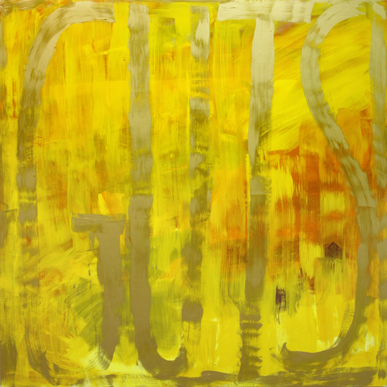
Male or female, you gotta love an artist with Guts; which is the title of the yellow painting below. That image is from the Bellwether Gallery where you'll find 42 examples of her work and other information. You can also see installation shots of her Sept, 07 Exhibit there, titled' Dana Frankfort: DF. There's nothing like seeing paintings in the context of a gallery or home to get the gist of their full personality. And that's something that comes across in each of her works.


Dana Franfort is all about painting one word, two or three words or sometimes even a very short phrase. But that is the sole content, composition and construction of her paintings. Well, and then there's the color; loud, bright, "hello, I'm over here" color. The truly amazing part of her oeuvre is how she manages to create a feeling of atmosphere, a dept of field.
There's a short interview at Artslant that gives pretty quick insight into her oeuvre. It's pretty straight up and straight forward. At the end of the interview she's asked which artists "challenge and excite you, both historically and currently?". The seven artists that she lists is quite a surprise. Check it out.


The bottom painting, titled "BELIEVE BELIEVE BELIEVE" 2006 Oil on canvas on panel, 45 x 84 inches, is from her Nov, 2006 Show at the Kanto/Feuer Gallery.


She's also represented by the Inman Gallery.


.

Thursday, September 18, 2008

Disco Daze

So there I was at J.C. Penny's at the Mall, heading for the cookware section to look for a rice cooker/steamer. In front of that section was a display of items that were 50% off. I didn't notice it at first, but the music was good. And since there were no other customers to distract me, I just kinda settled into snooping around and found a couple of real bargains.


But then it DID hit me. They were playing disco music from the good years when the genre was at the top of it's game.


aaaahhhhhhh Happy dancing music. No irony or anger; no explicit sex or politics, no threatening gestures - just good music: and in Penny's, no less !!!


I didn't even have to close my eyes to go back to those wonderful, full tilt, happy, dancing times. Working as a Light Man in a BYO after hours Disco had it's perks, to be sure; but mostly it was the music and the dancing to it that was the real high.

.

Monday, September 15, 2008

Onward & Upward

It has been very challenging and rewarding to revisit an older painting and rework it. I probably shouldn't even be admitting this, but my current project is to go through my library of paintings and find the mediocre or failed ones and rework them. The usual solution seemed to be dots because almost anything can become an abstract background for abstract pointillism. But I may have seen the light and come to the knowledge that I don't have to totally obliterate the background with dots. These latest works have contained fewer dots and allowed the former painting to participate more strongly and find a new staring role.


Here we have "The Difference Between Cherries" (and I never did really care how that was going to be interpreted) which I signed and dated in 2004. Back then it was just the 3 cherries and the calligraphy and for the longest time I tried to pretend it was finished and had some merit. Finally, facing the truth that it was just another lame attempt, I put it away.

Three days ago I got it out and hung it in the new "the next painting to get redone spot" under the window in the hall; so it's the first thing I see in the morning when exiting the bedroom. The brown "structure" started out as the tracing of a shadow. The leaping figure is from the next morning's NYTimes and is so representative of how I feel about being able to attack this painting anew. I don't have the answers yet on how to finish it in this new style, but that's just fine. And if I need to let it rest some more and work on something else, that's beautiful too.

Please watch this video about Jose Parla. I've got a whole file brimming with info and images that I've been saving for a post that will do him justice. But this vid is pertinent now because of what he says at the very end. So many artists will tell you to paint every day - I like what Jose says; when he's not inspired, he just waits.


.

Sunday, September 14, 2008

Historical Mysteries

Vivienne Koorland's paintings all look antique and not in a good way. They don't hold their "age" well. Upon closer inspection, it's not just the appearance that's ominous, but the content as well. She's the daughter of a Holocaust orphan and many of her paintings are about the many finer points of that catastrophe.

Some of her works have realistic or representational features in them that are quite meaningful and historic.

But as is always the case, I'm drawn to the indecipherable writing. Maybe it's the puzzle/mystery thing that our mind wants to figure it out. There are some words to be found here and there and so we keep searching. It would be great to know the personal story behind each work.

Here are some links if you like to pursue her work further.

Artthrob

Google Images

6 images at Columbia edu


.